Honouring heritage, embracing tomorrow
What happens when rich design heritage meets forward-looking creativity? From the iconic legacy of a global sportswear brand to the vibrant emergence of a GenZ coffee phenomenon, our two cases of Asics Tiger and Chamberlain Coffee represent a juxtaposition that underscores Kontrapunkt's profound respect and understanding for design and storytelling across geography, audience, and platform.
As a strategic branding and design agency, we pride ourselves on navigating the intricate balance between classical craftsmanship and creative stewardship. Creative Denmark, a non-profit organisation dedicated to amplifying the impact of Danish creativity, recognised this duality in our approach by featuring two distinct yet characteristic cases: ASICS Tiger and Chamberlain Coffee.
Controls space
Controls space
Controls space
Controls space
![]() /
/ ![]()
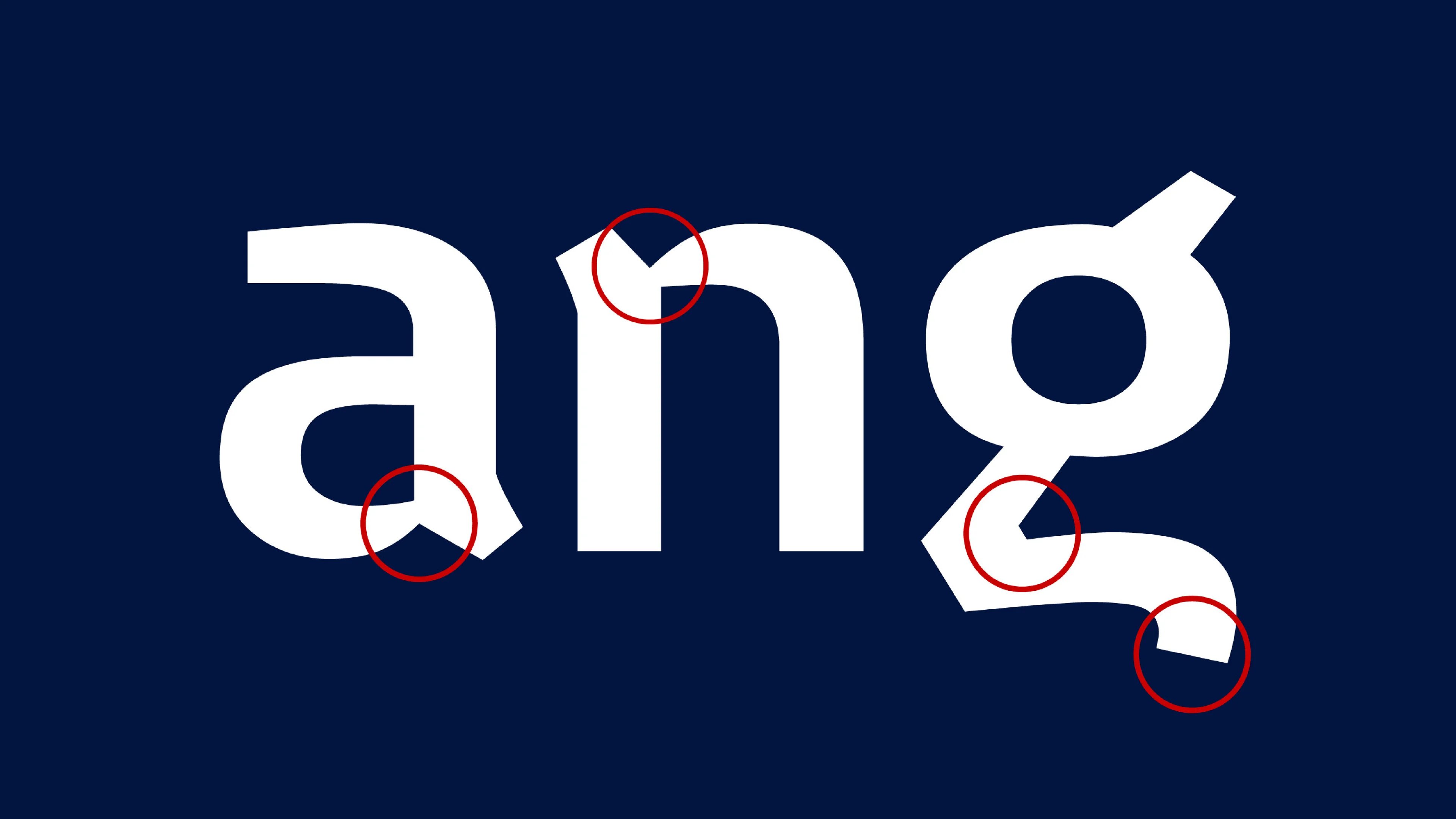
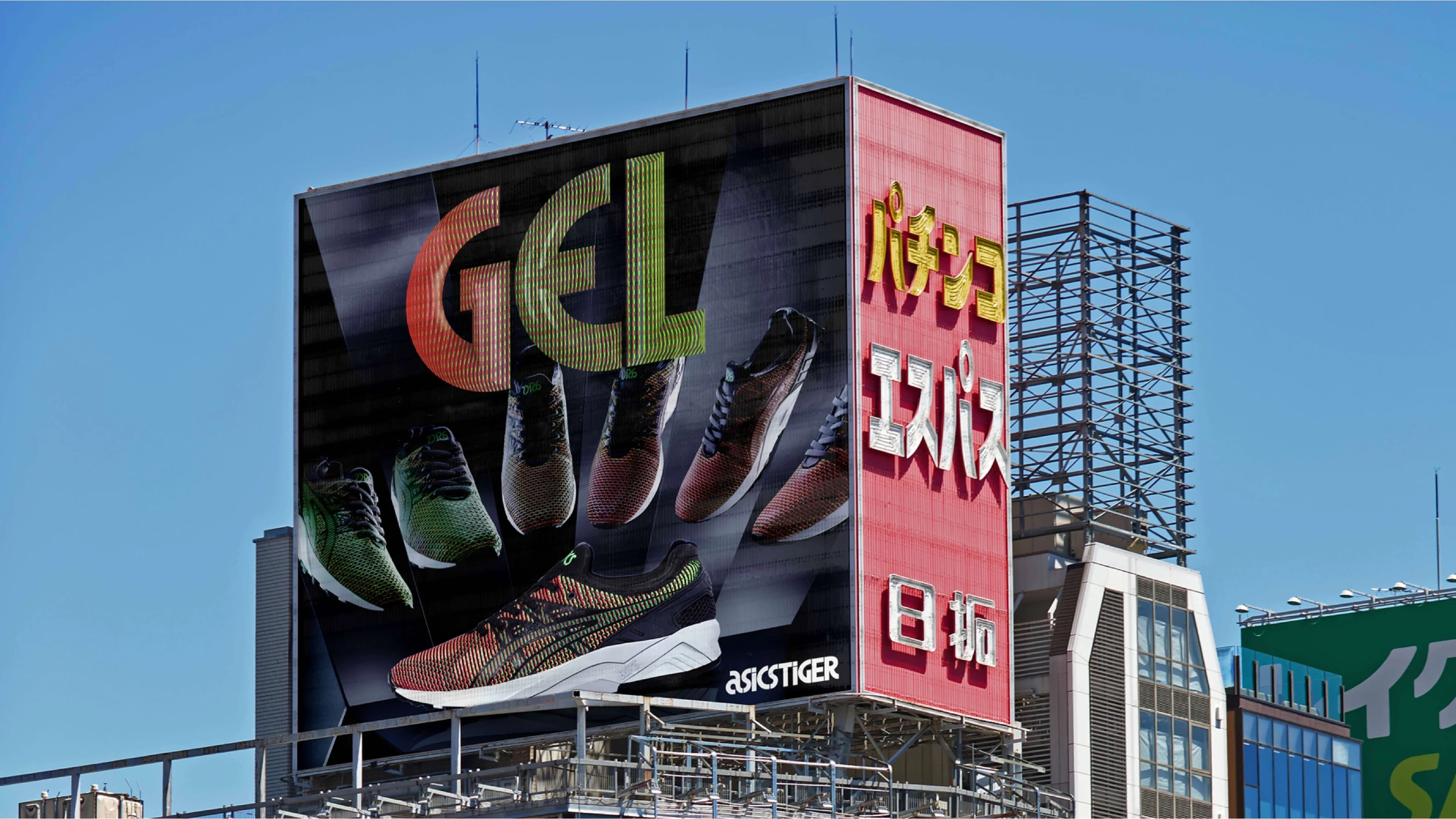
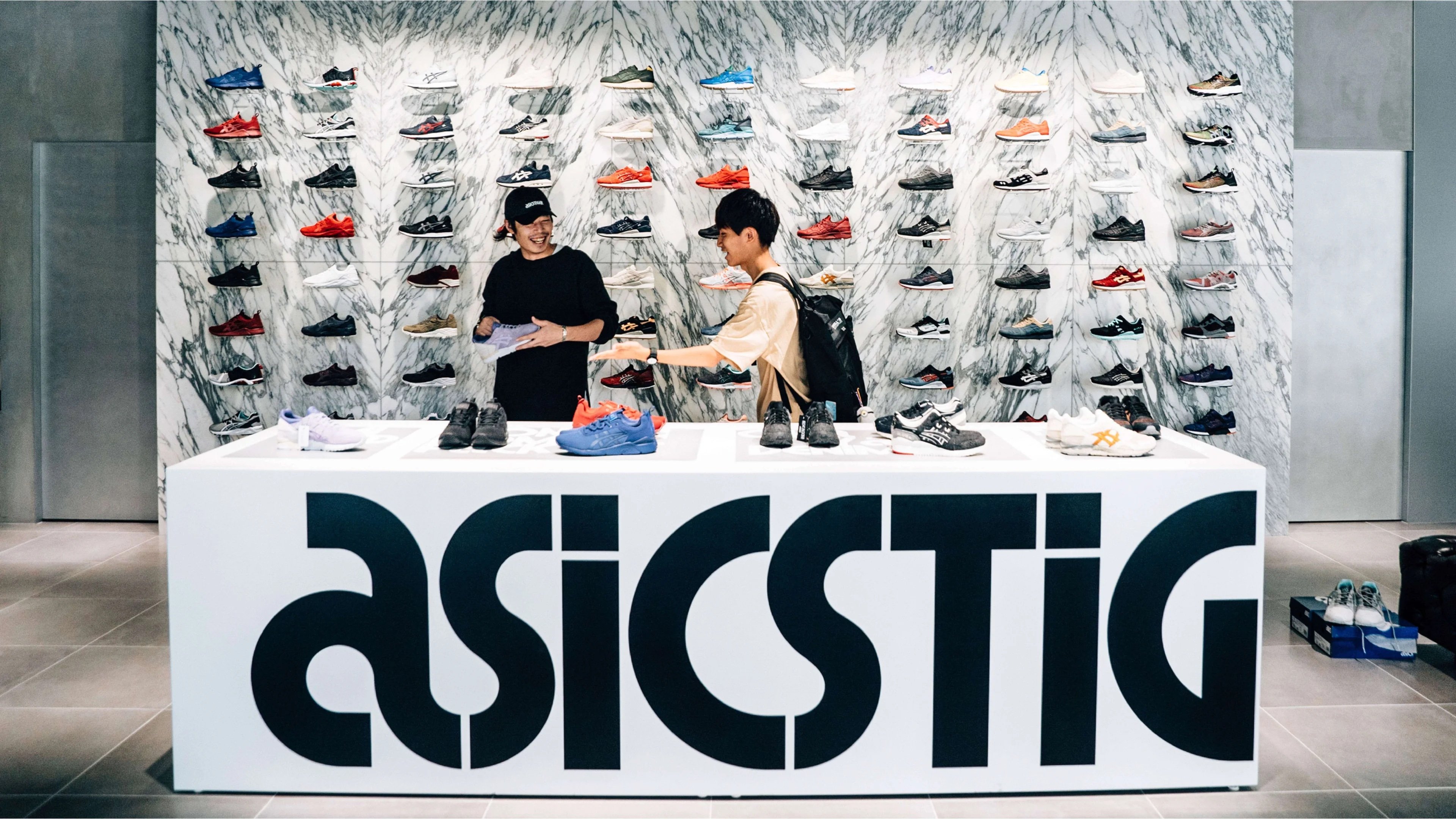
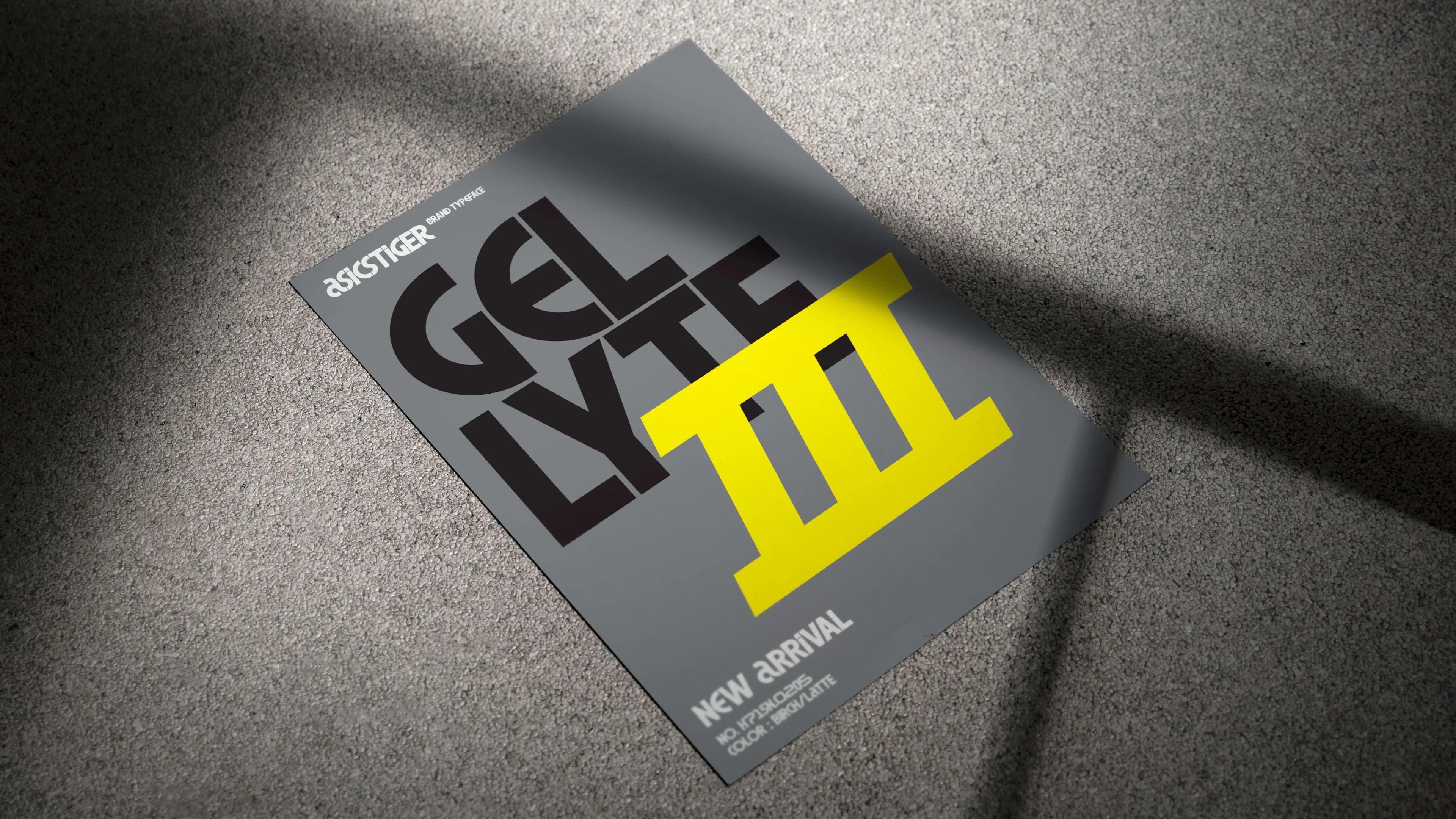
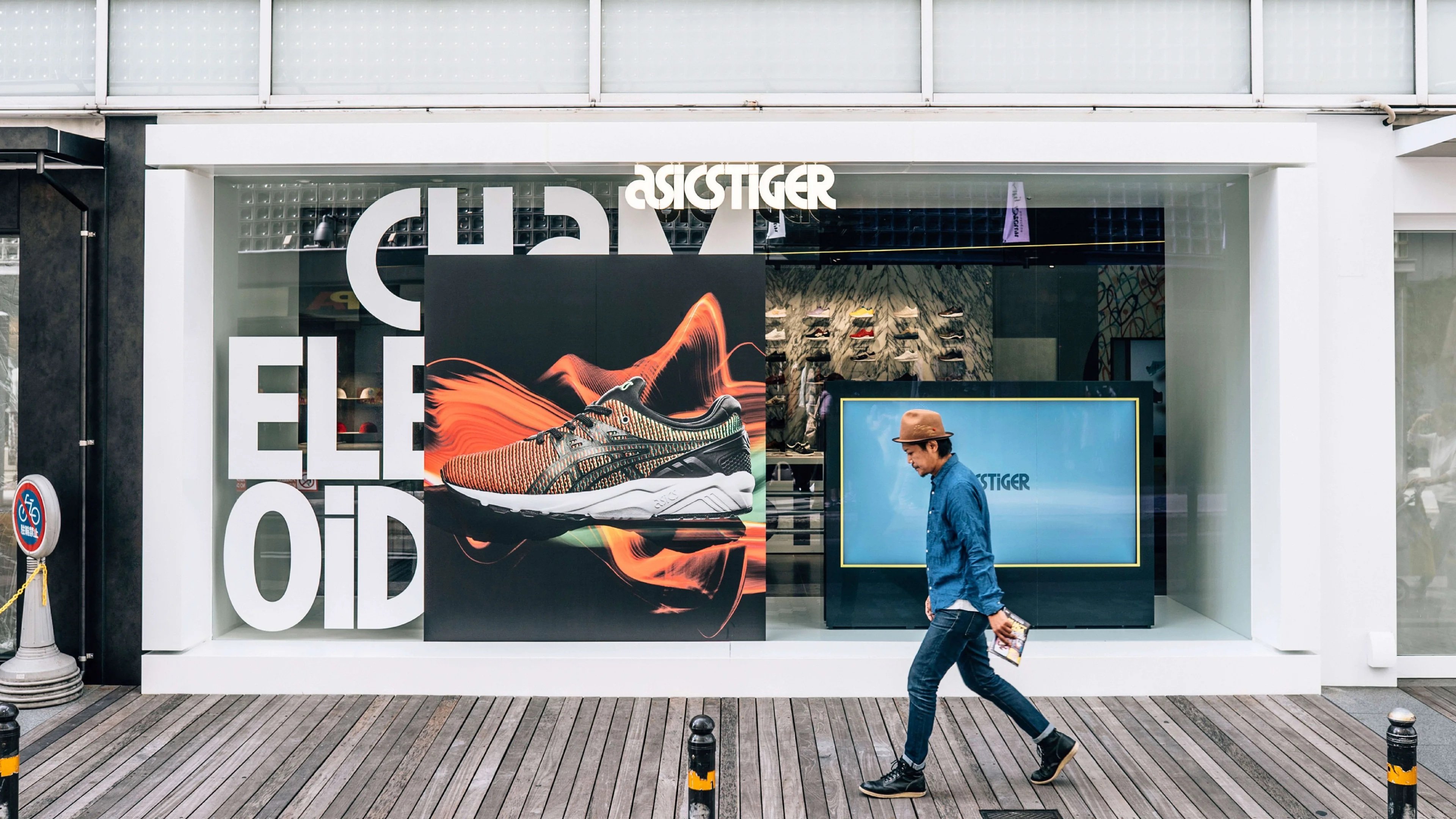
ASICS Tiger, a bespoke typeface
The ASICS Tiger brand relaunched in 2015, drawing inspiration from its iconic designs from the 1970s to 1990s. Following this relaunch, in collaboration with Bruce Mau Design, Kontrapunkt crafted a bespoke typeface for ASICS Tiger, honouring their rich heritage while embracing contemporary elements. The ASICS Tiger typeface is a defining brand element with all features referencing the legacy and prominence of the original Herb Lubalin logo design. Whether arraying the facade of the Osaka flagship store or printed on a shoebox leaflet, the typeface seamlessly integrates into the brand's identity, encapsulating its expressive and energetic spirit while staying true to its Japanese roots.
“
Typeface design is integral to Kontrapunkt's identity and has been since the very beginning. Typography's power lies in its reach across every aspect of a brand. For us, typefaces extend beyond letters; they embody storytelling and communication – and it is evident when you look at how we infuse our typefaces with historical references, visual cues, and symbolic meanings rooted in each brand or company. Chamberlain Coffee and ASICS Tiger represent this in their own way.
Rasmus Michaëlis, Head of Type Design & Partner at Kontrapunkt
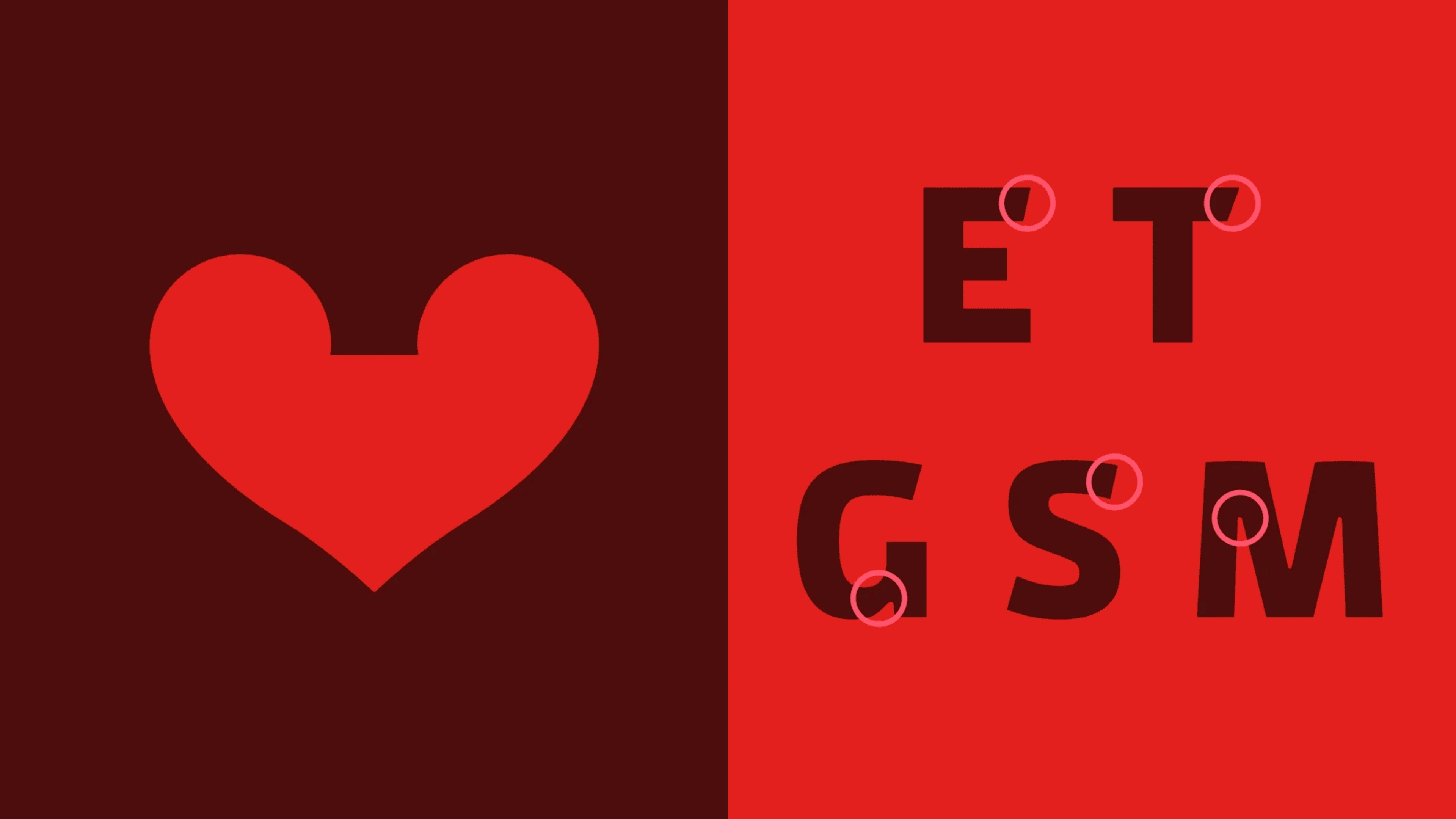
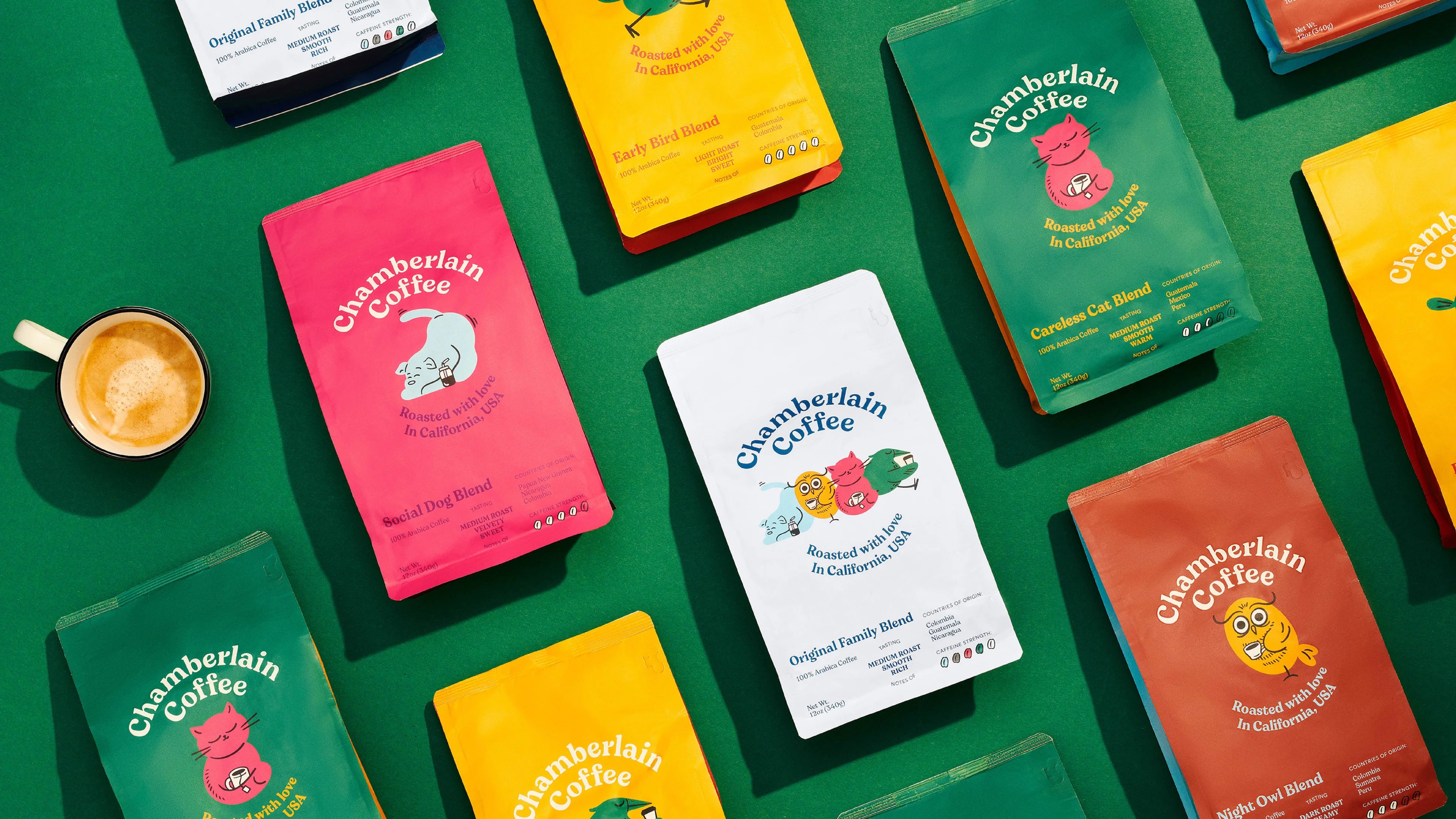
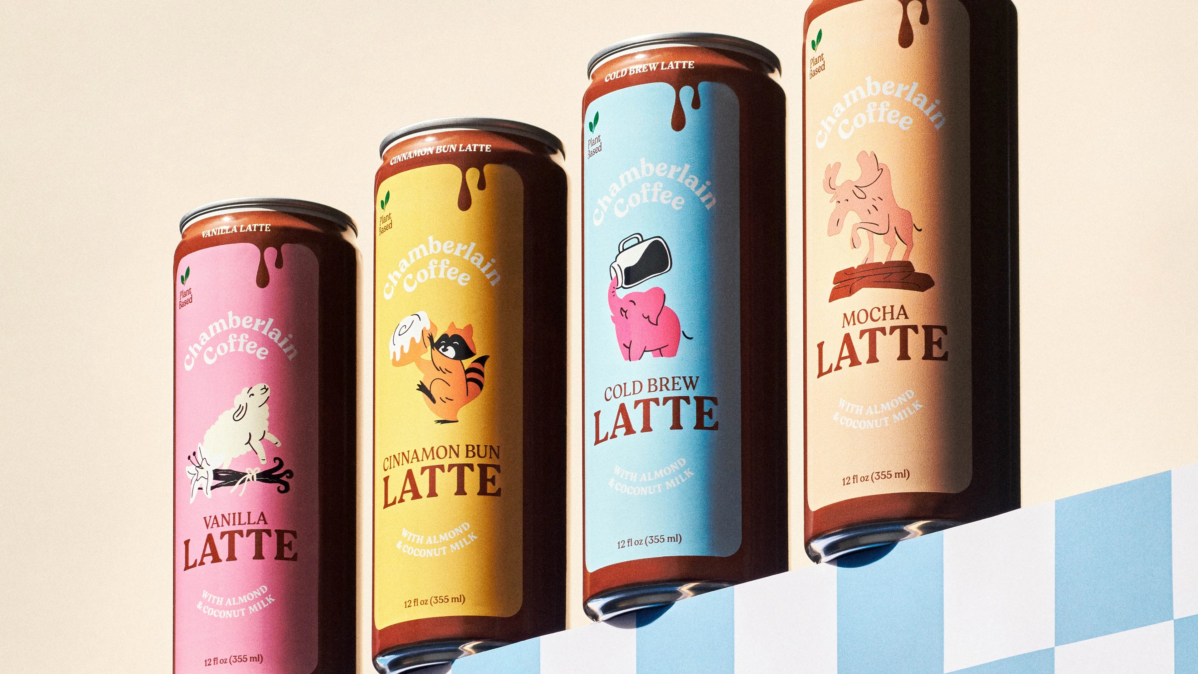
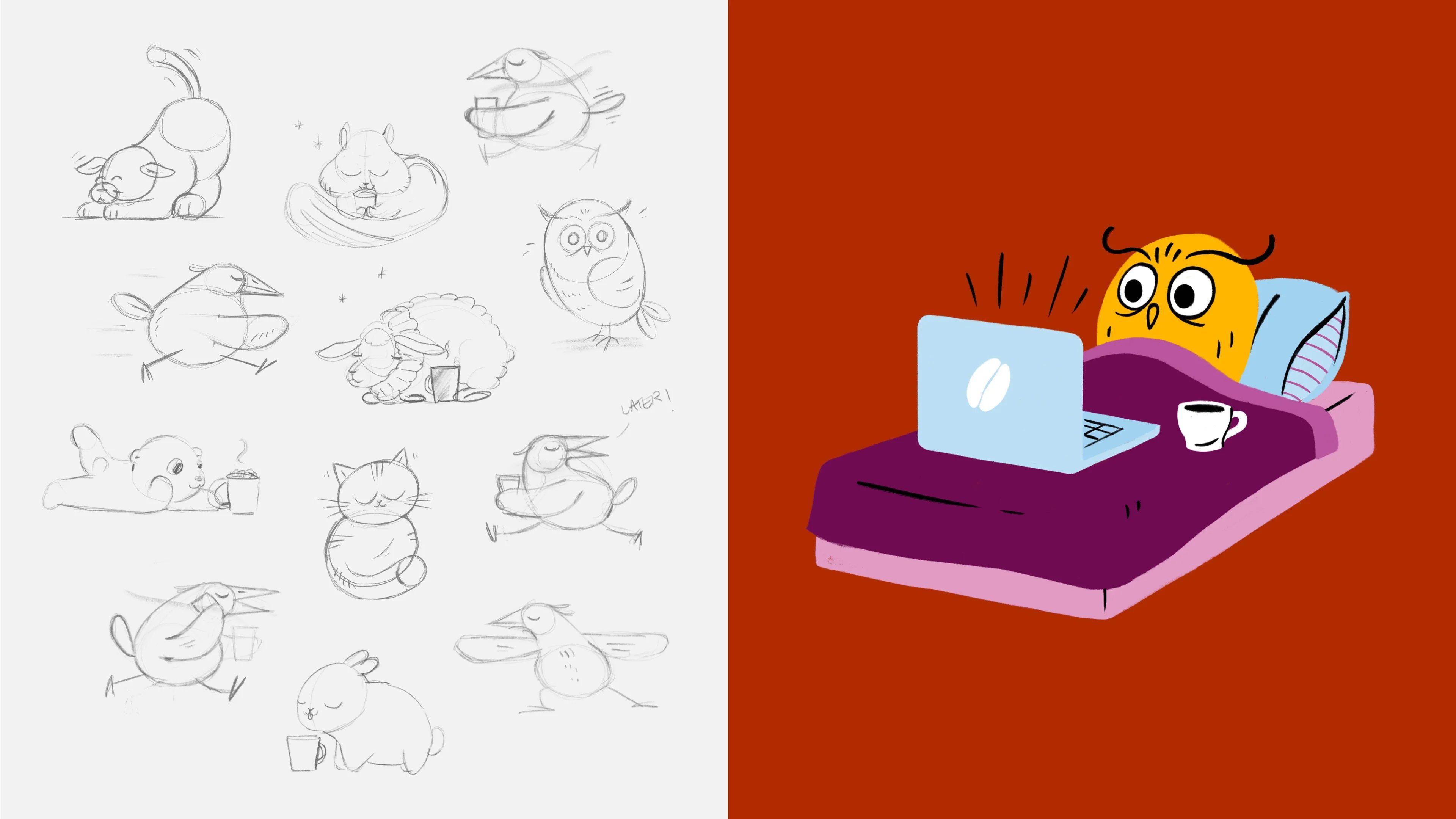
Chamberlain Coffee, a youthful coffee phenomenon
While typography plays a big part in where it all started almost four decades ago, our collaboration with Chamberlain Coffee exemplifies our versatility anno 2024 and beyond. This coffee brand is a lively demonstration of forward-thinking design, community engagement, and vibrant aesthetics.
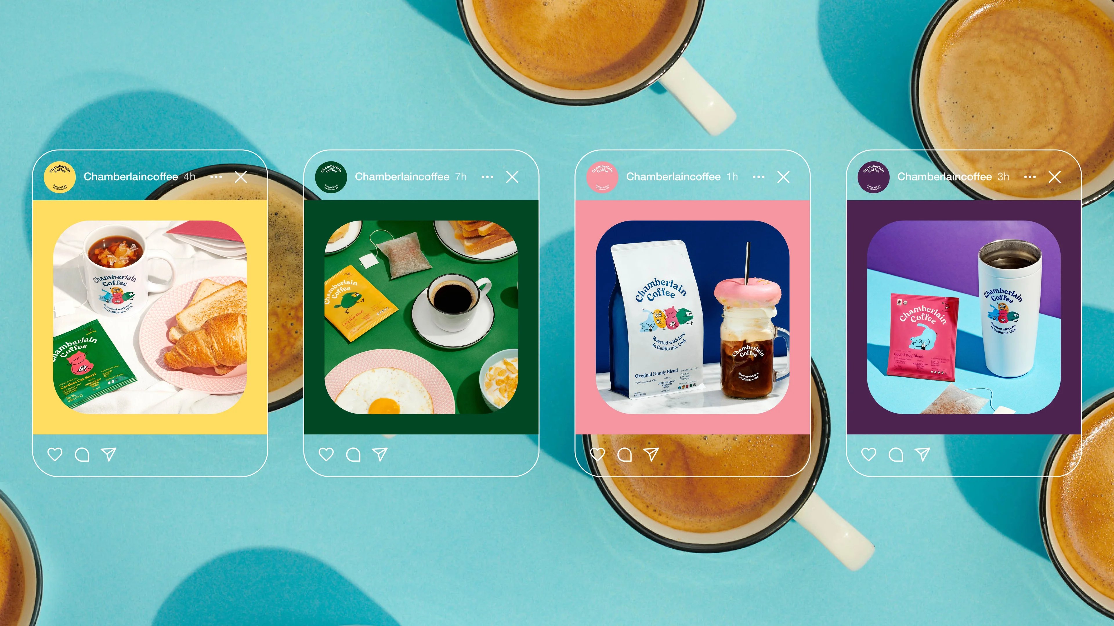
Chamberlain Coffee isn't just about coffee; it's a vibrant community that resonates with a growing GenZ audience and challenges the conventions of traditional coffee brands. Through dynamic packaging and engaging characters, we've brought Chamberlain Coffee's universe to life, fostering a sense of belonging and collectibility among consumers.
Controls space
Controls space
Controls space
Controls space
![]() /
/ ![]()
Our vibrant journey with Gen Z coffee maven Emma Chamberlain began in 2020 and continues to revolutionise today's coffee market. With a brand core and visual identity brimming with excitement and vitality, Chamberlain Coffee is a vivid example of our commitment to the ever-changing demands of different markets — and, like the coffee queen herself, choosing innovation and joie de vivre, leaving dullness and stagnation in the dust.
Craftsmanship, Curiosity, Courage
Typographic craftsmanship lies at the core of Kontrapunkt's foundation, where each stroke and curve reflects decades of dedication to the art of design. While we esteem our heritage, we are also constantly in motion, pushing boundaries and developing ourselves within branding and design. From motion design and 3D to interactive maps and illustrations. As we continue to evolve and grow, our values of craftsmanship, curiosity, and courage remain steadfast.
“
At Kontrapunkt, our values — courage, curiosity, and craftsmanship — guide our approach to every project, our creative and strategic work, and the parameters for our growth as an agency.
Philip Linnemann, Executive Creative Director & Partner at Kontrapunkt
Ultimately, the two cases of ASICS Tiger's legacy-driven typeface and Chamberlain Coffee's vibrant brand identity serve as a small, yet illustrative, glimpse into the breadth of our work in branding and design – across geography and generations.