Crowns, lions and hearts in the digital realm
The calendar is displaying December, and the year is coming to an end. At Kontrapunkt, we’re gathering with a slightly more nostalgic sentiment. Throughout the four weeks of December, we'll delve into our archive — some entries more recent than others — and stroll down memory lane, exploring the various decades of Kontrapunkt design.
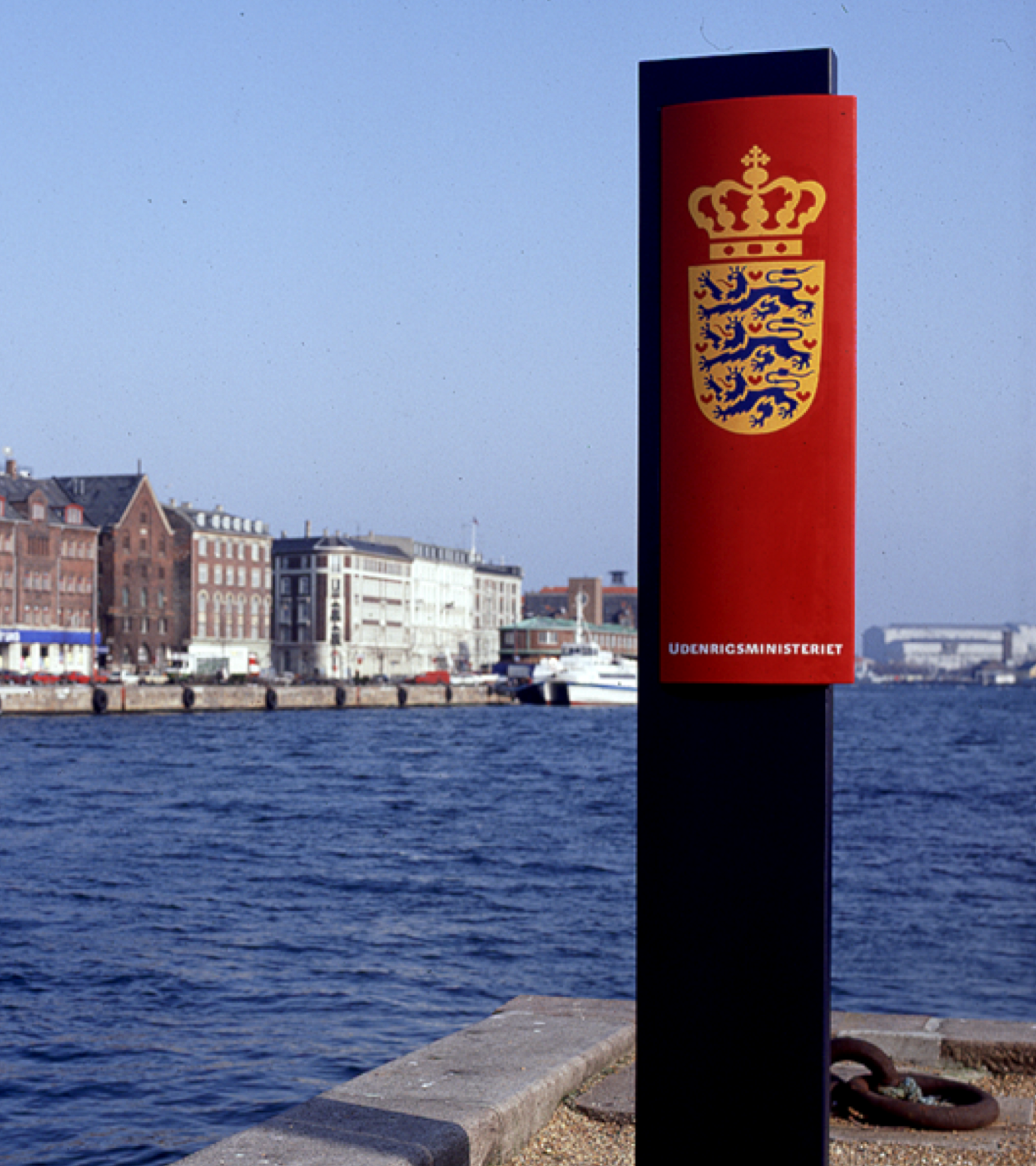
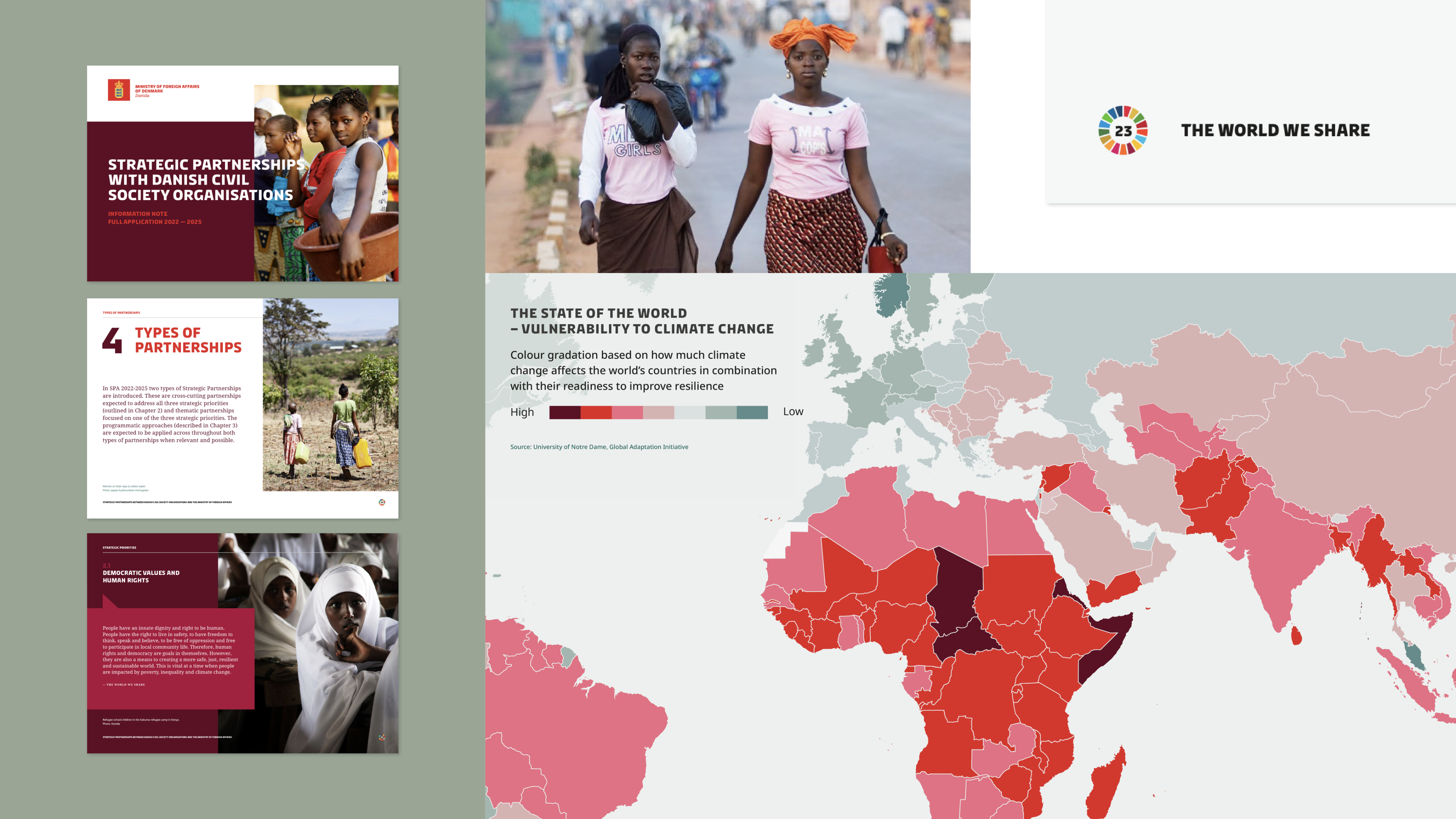
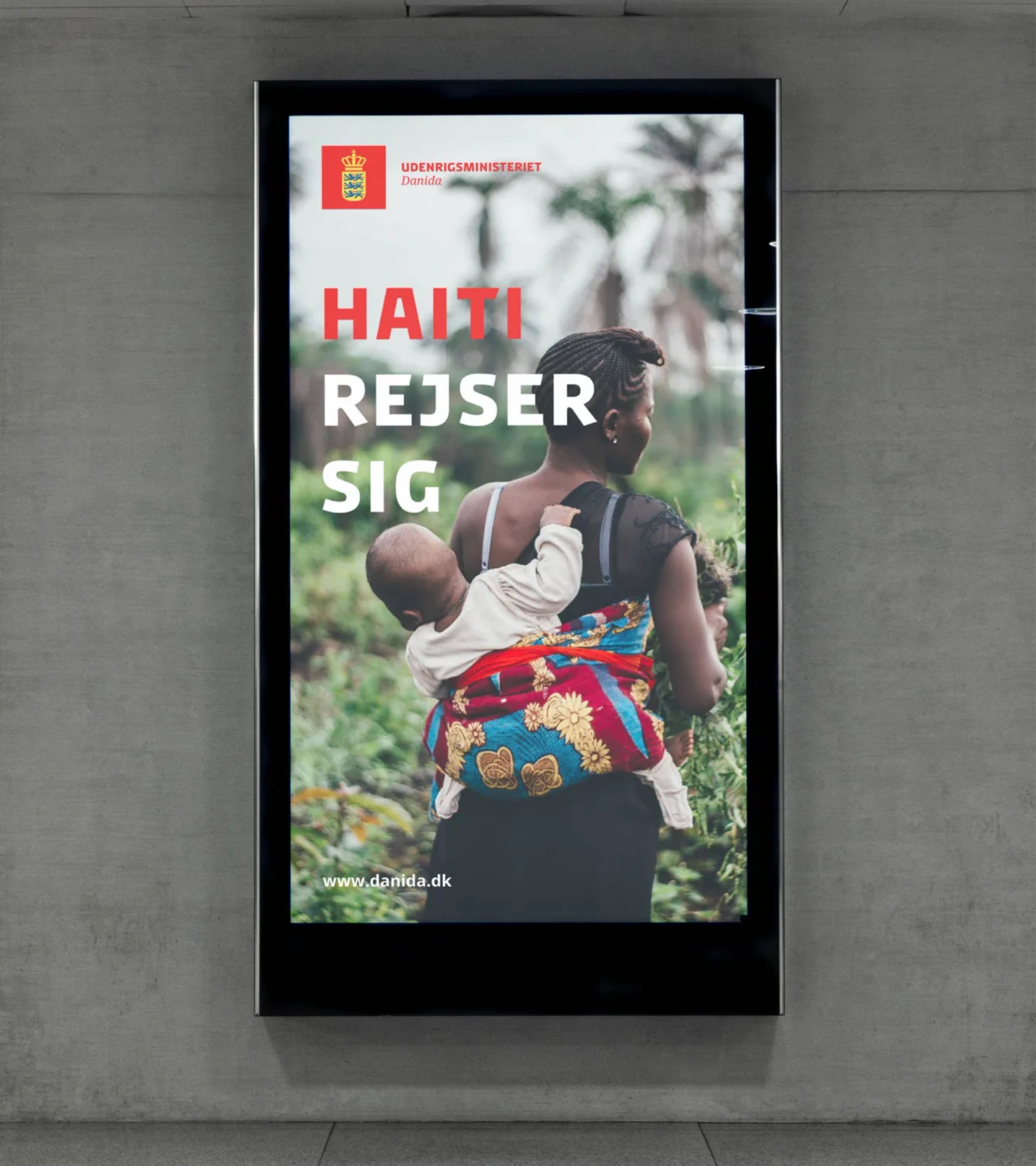
The Ministry of Foreign Affairs has the whole world as its workplace. It functions across more than 100 Danish embassies and consulates worldwide, securing Denmark’s position in the political, cultural, and economic arenas to keep the Danish population informed about international affairs. For over two decades, the ministry has successfully balanced Danish roots and future aspirations in its visual identity, ensuring the impact of Danish heritage and symbols in both digital and analogue realms.
Denmark’s business card
In 1991, the Ministry of Foreign Affairs invited five design studios to design a new visual identity for the ministry, seeking a blend of formality, history, and future-proofing. The goal was to develop a robust design suitable for use as Denmark’s international business card. Kontrapunkt’s take on the competition was to give the ministry a heraldic design, integrating the wings of history while exemplifying the qualities and expertise of The Ministry of Foreign Affairs as a representative for Denmark out in the world.
Kontrapunkt won the competition, beginning a decade-long collaboration between The Ministry of Foreign Affairs and Kontrapunkt.
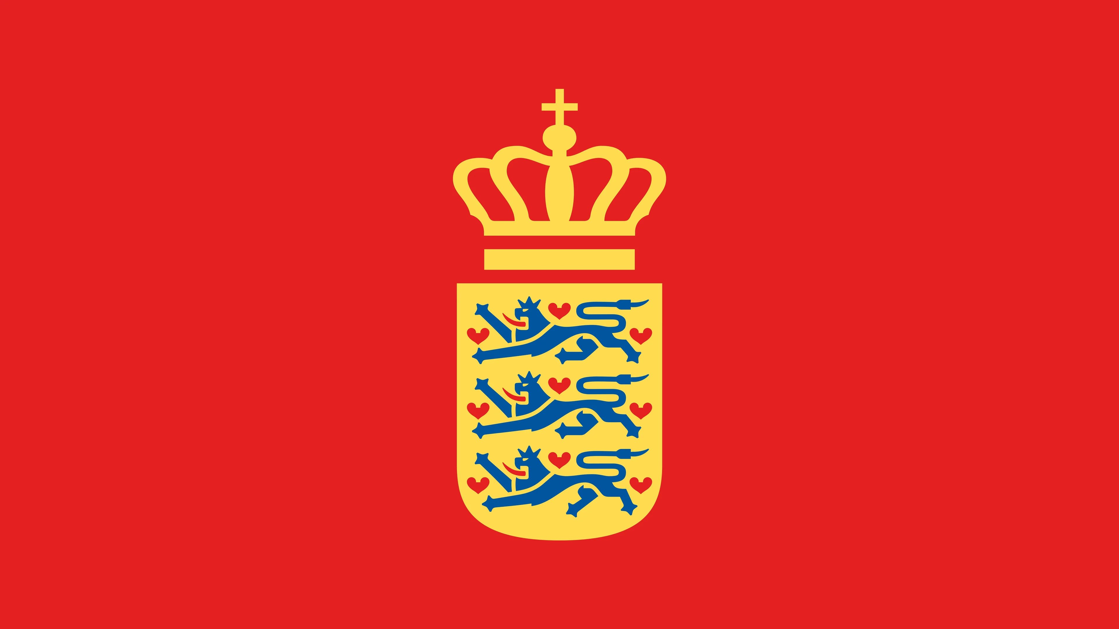
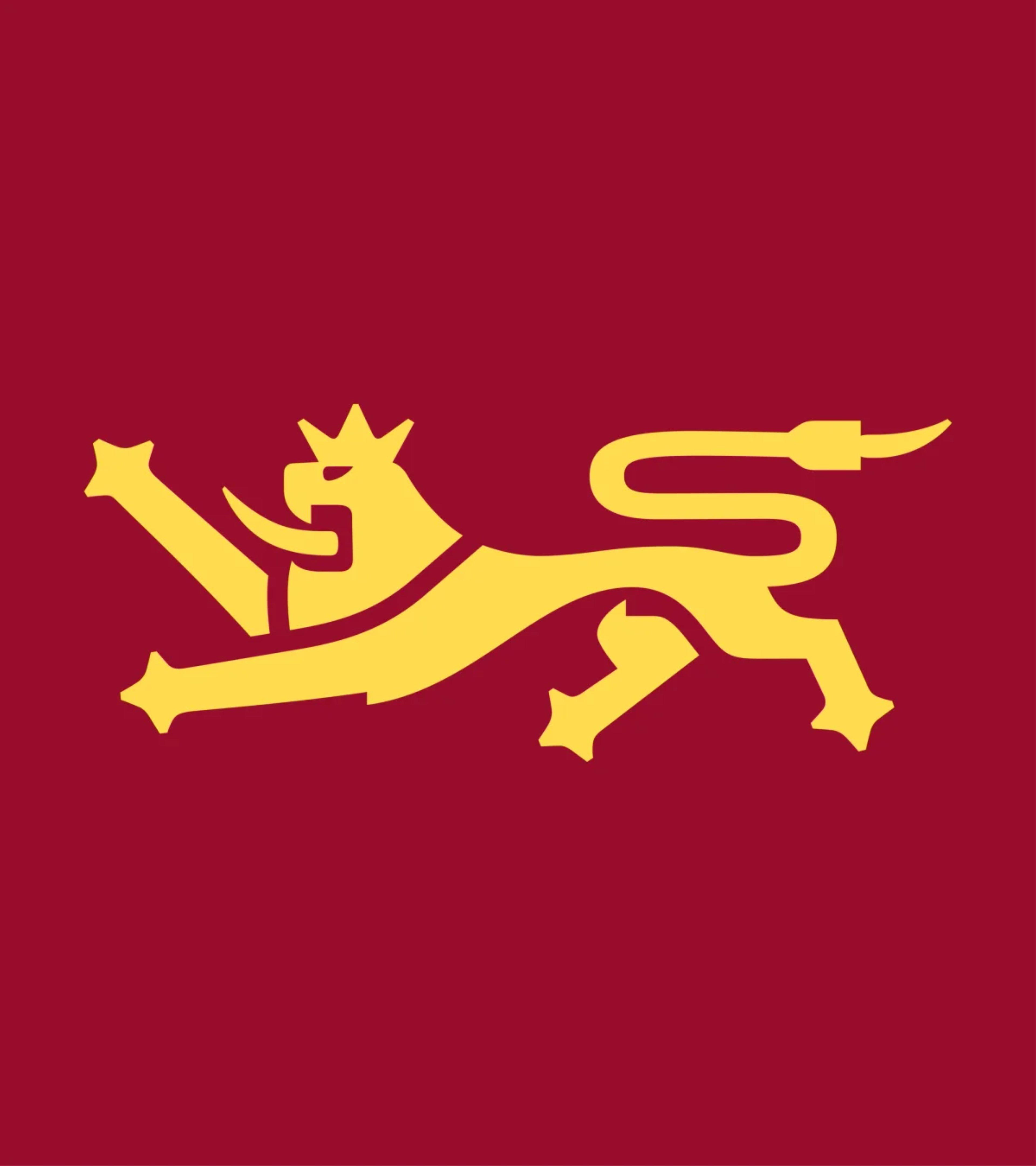
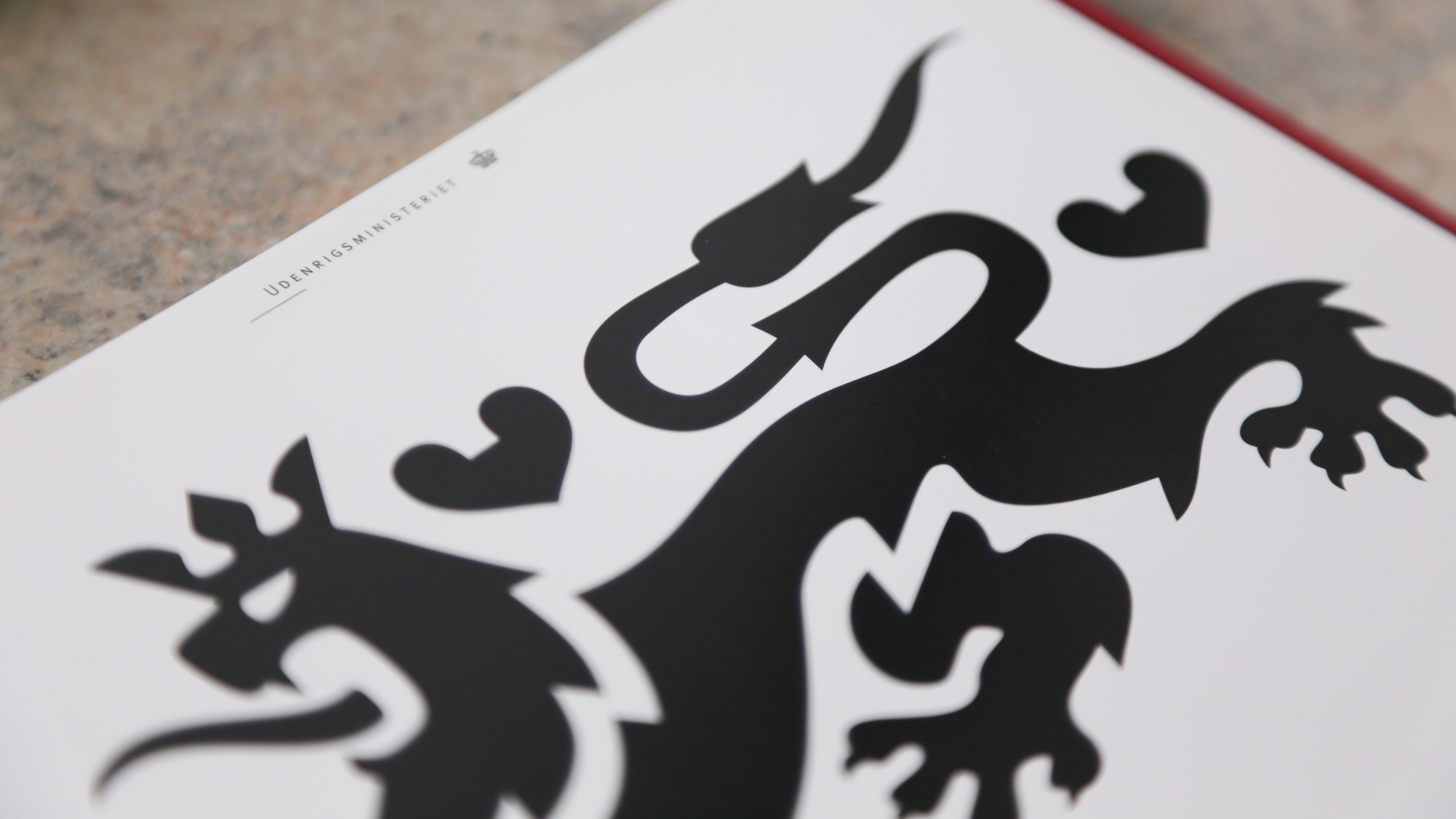
The lion, the crown, and the heart
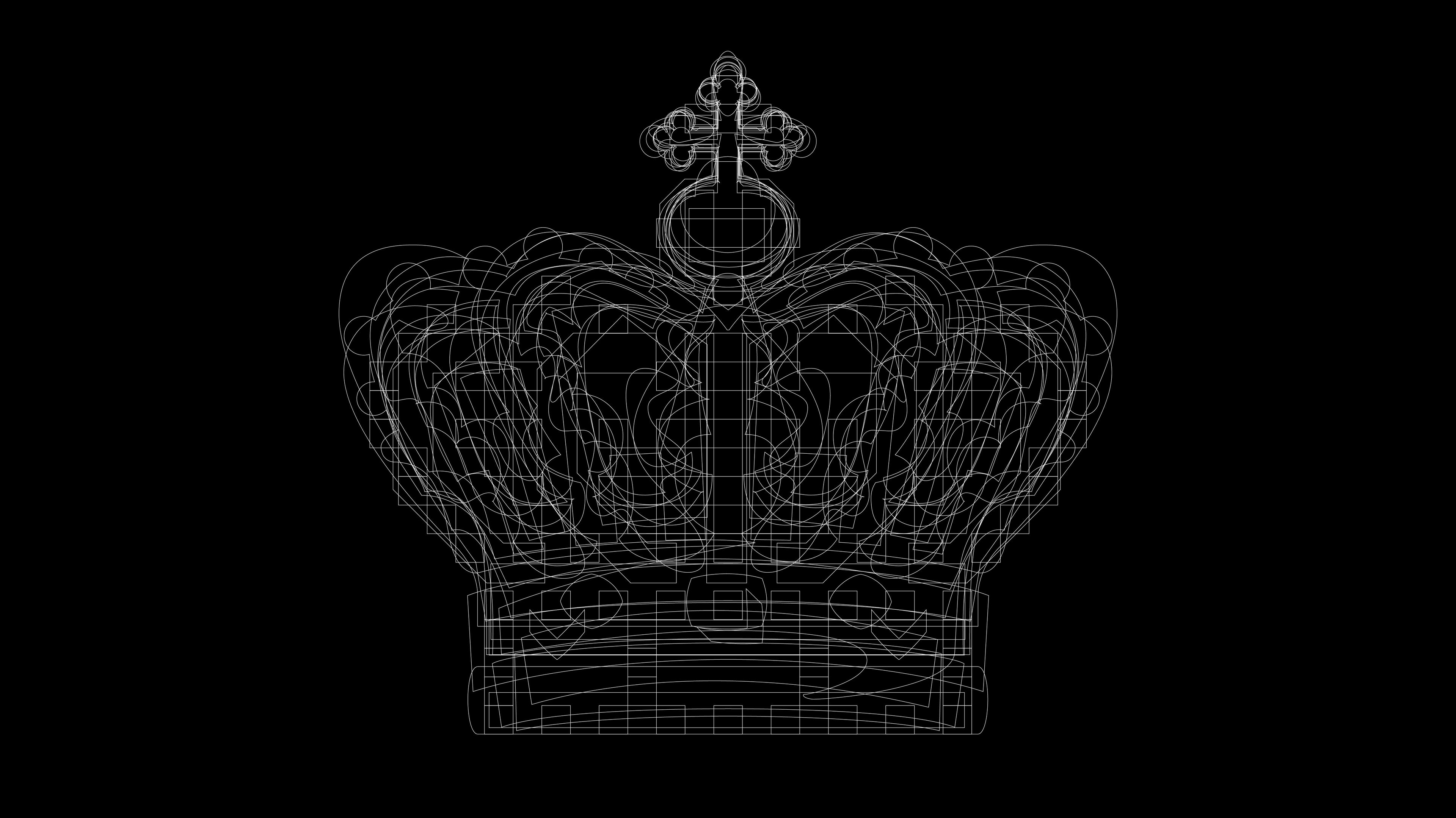
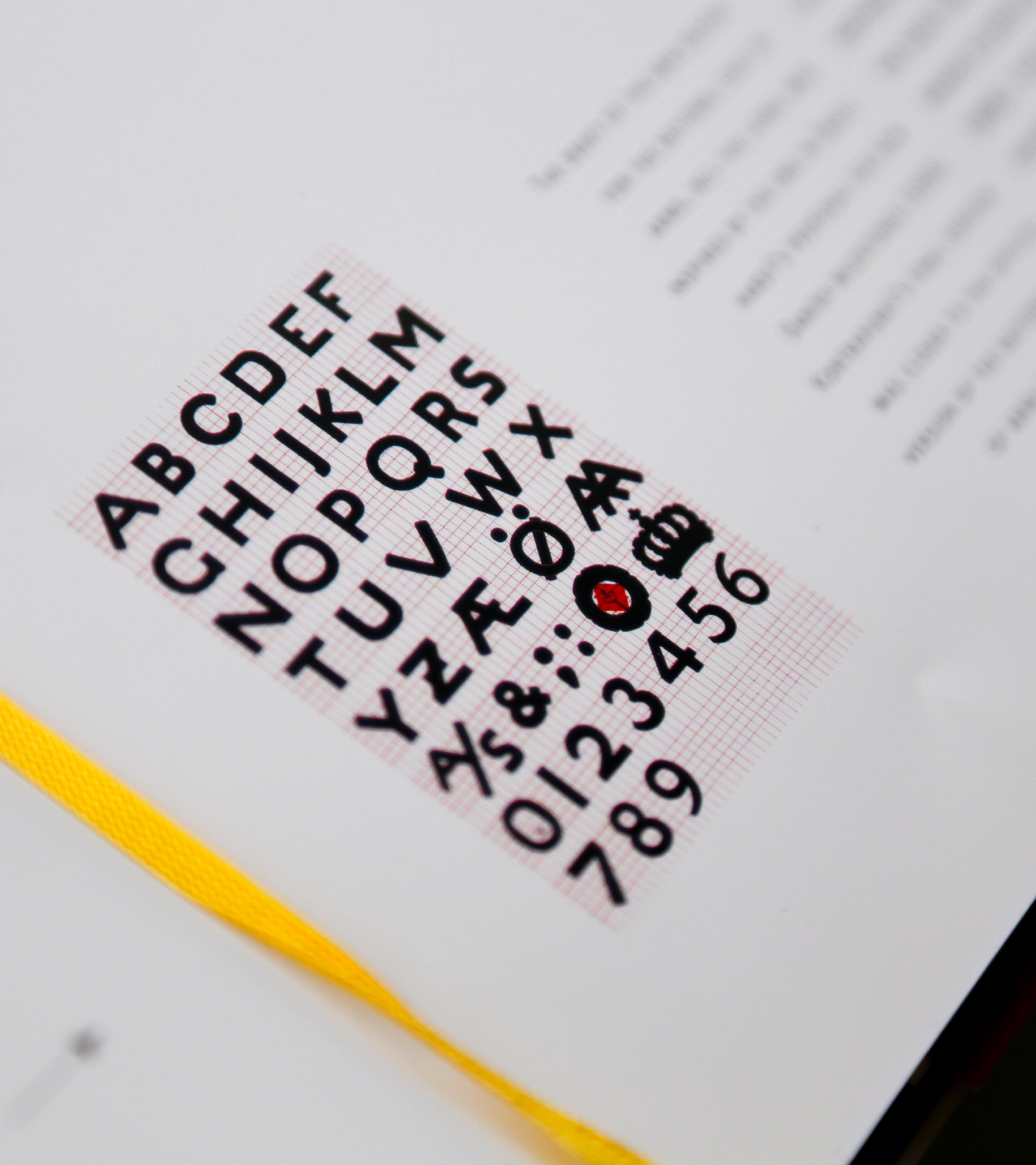
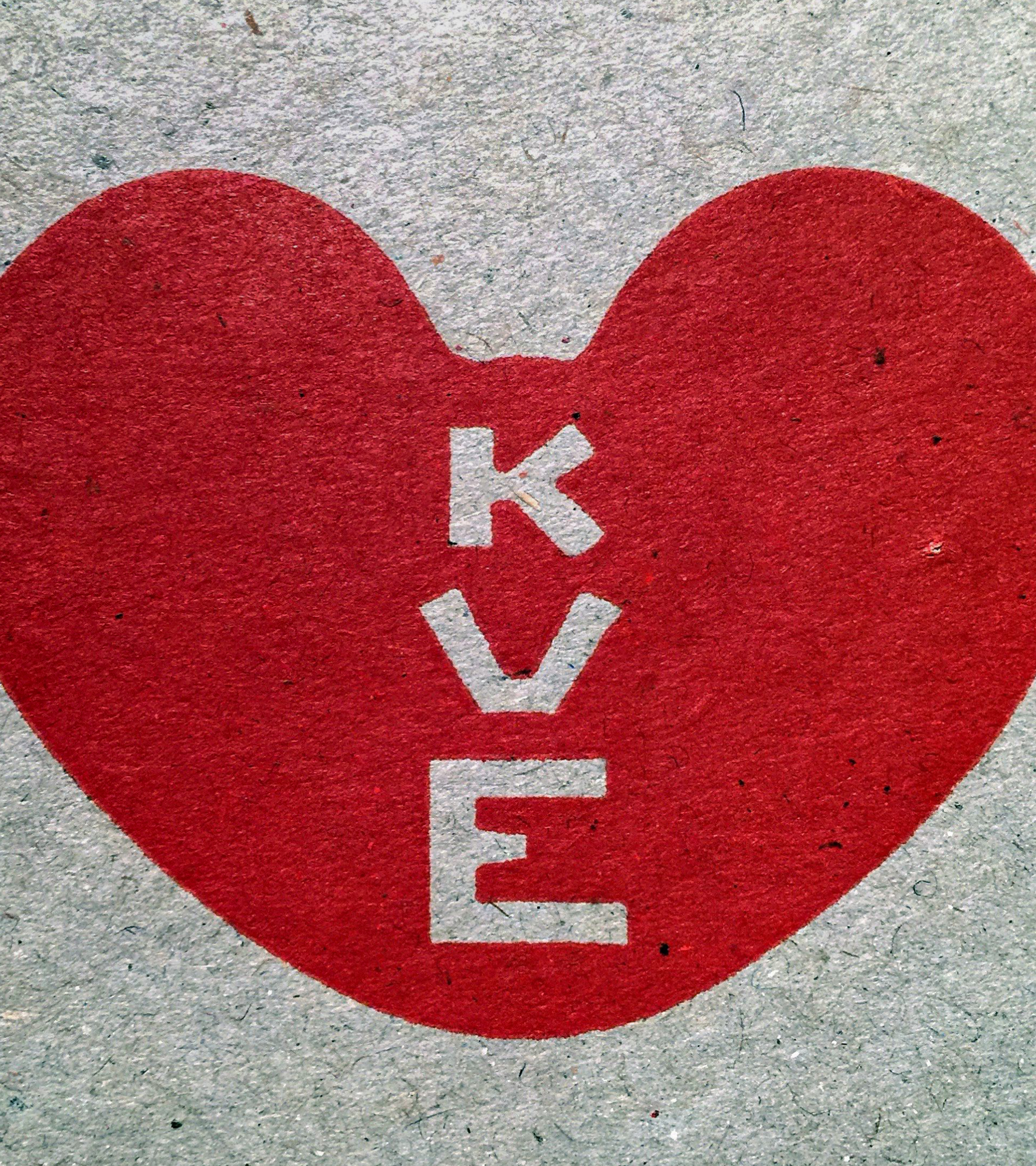
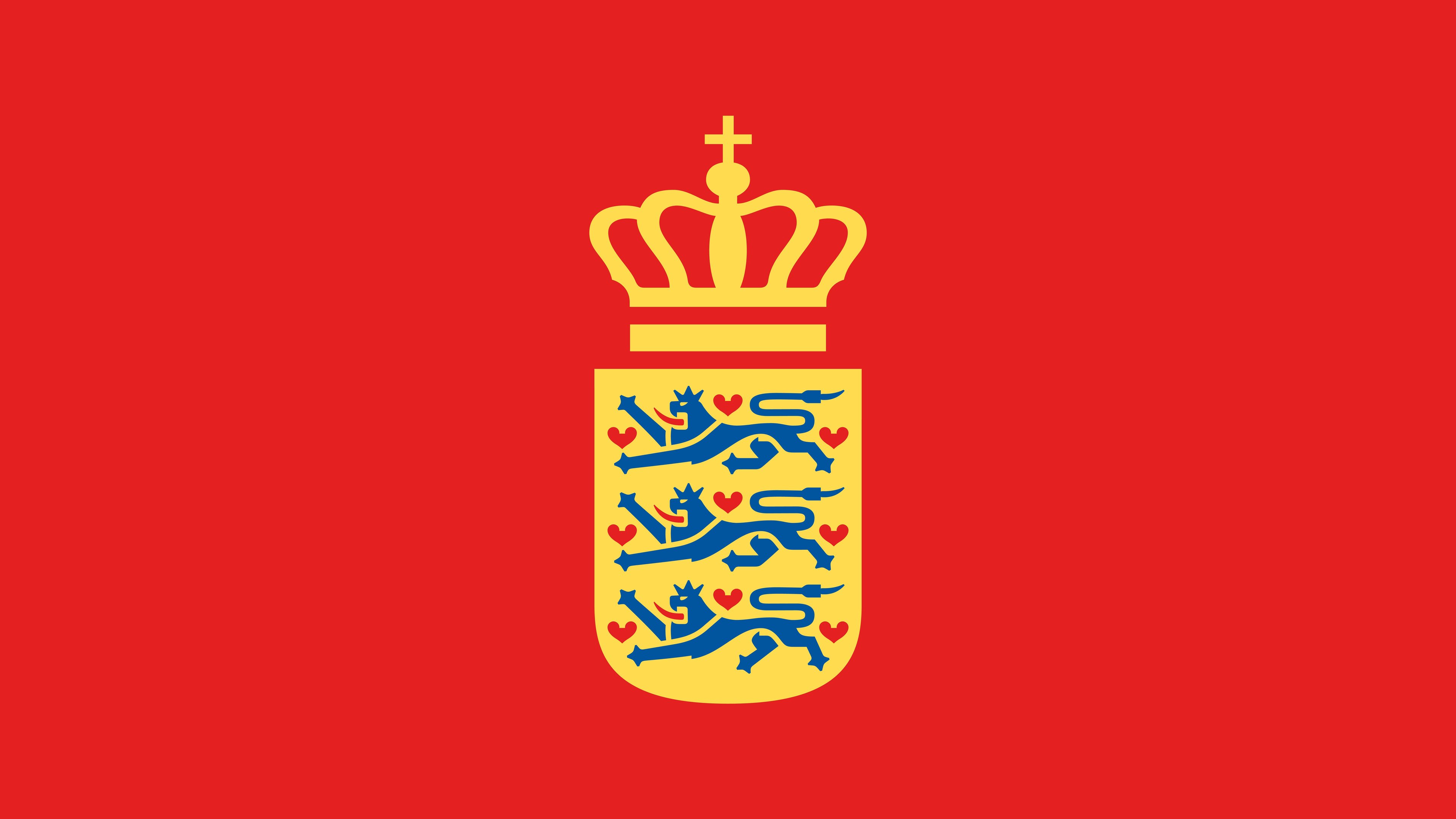
The description of the logo and identity programme designed for the ministry could almost be mistaken for a fairytale. Based on redesigning the national coat of arms with a crowned shield, three lions, and nine hearts, the design delves into Denmark’s visual and symbolic history. The accompanying typeface, influenced by Knud V. Engelhardt’s impact on the Danish typeface tradition, reflects Danish robustness and pays a little tribute to his iconic heart.


From print to digital
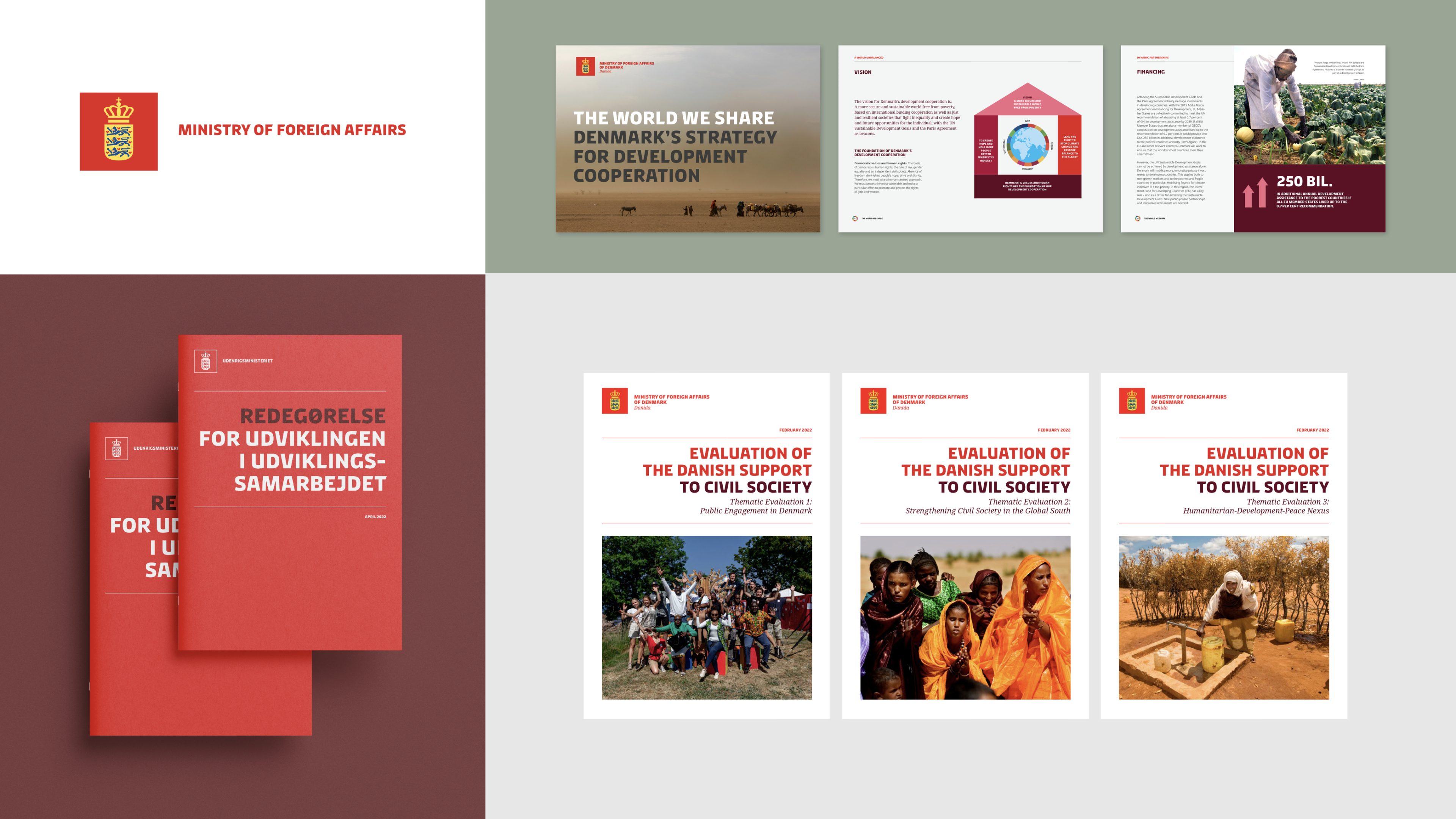
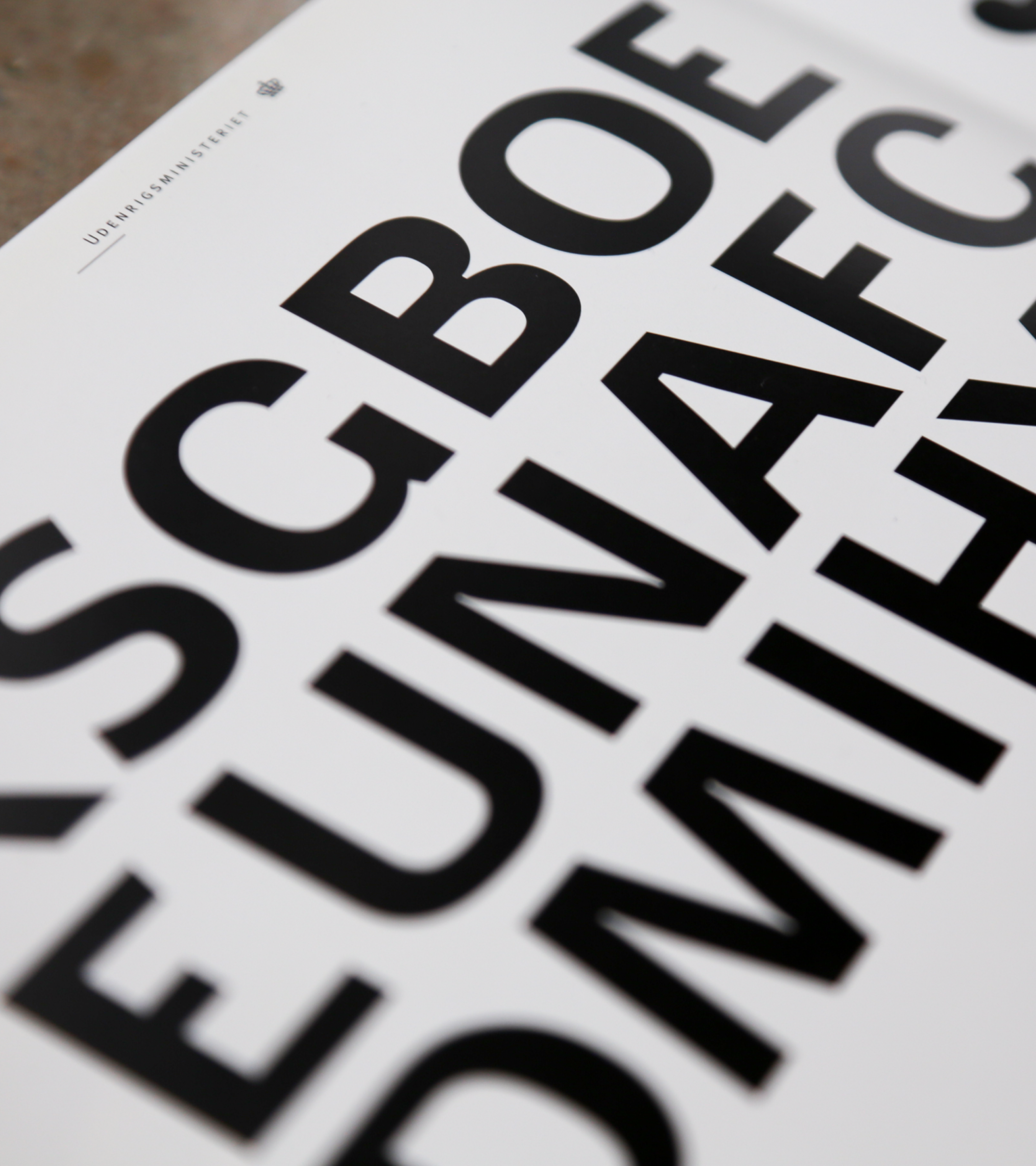
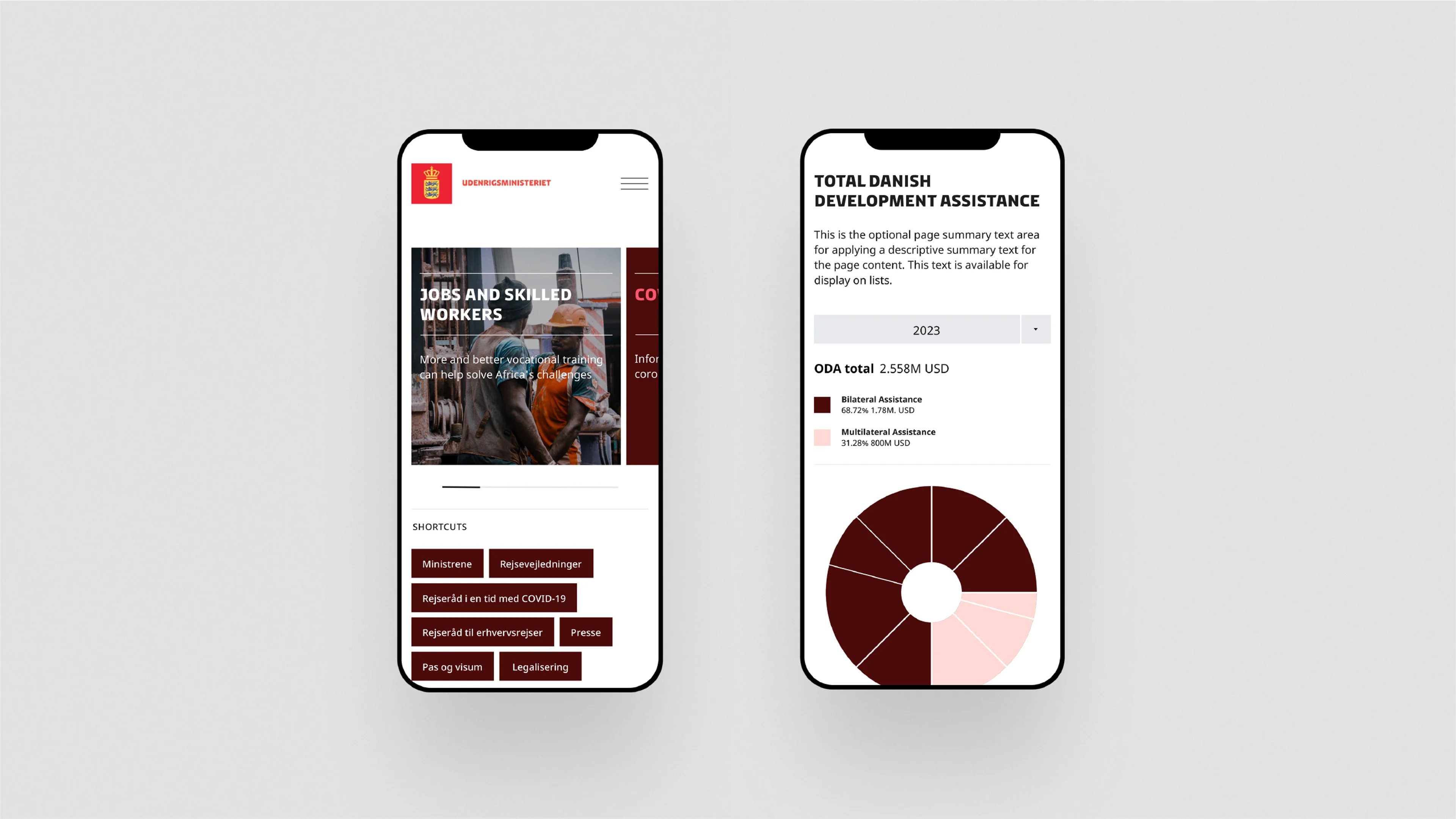
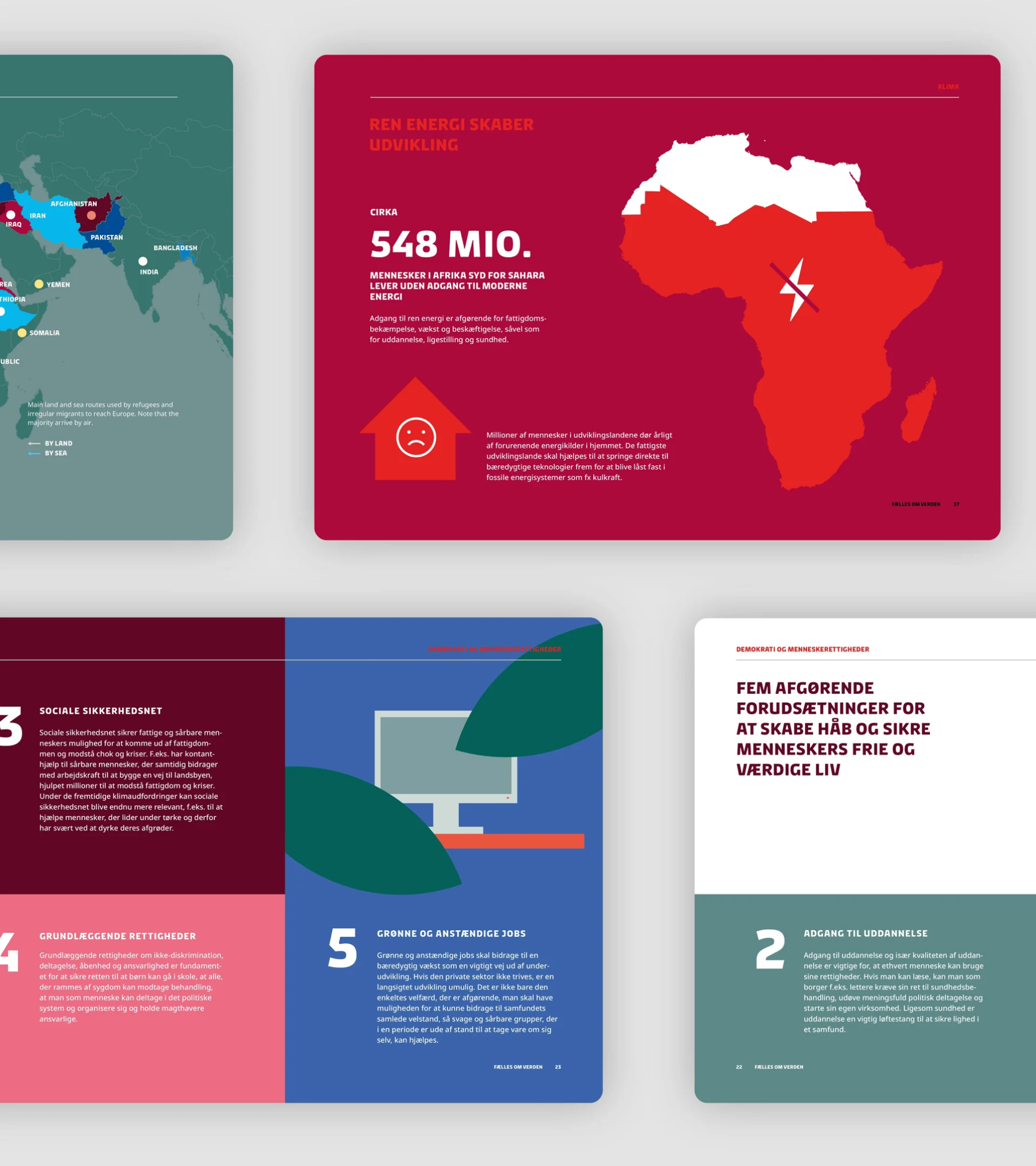
In 1991, the ministry’s design program primarily focused on print and stationary mediums. As the digital landscape emerged, Kontrapunkt adapted the design in 2016 to ensure its seamless transition to digital platforms. Collaborating strategically, Kontrapunkt revamped the entire identity, reintroducing a bespoke typeface, colours, and visual elements tailored to the dynamic nature of democracy. This comprehensive approach facilitated the ministry’s effective expression in the global and digital spheres, showcasing its presence worldwide and on the World Wide Web – ensuring the enduring impact of Danish heritage and symbols in both digital and analogue realms.
Controls space
Controls space
Controls space
![]() 1123 / 3
1123 / 3![]()
Learn more about the case
Making the Ministry of Foreign Affairs seem less foreign