Crown jewels do not age
The history of the crown. Approximately one month ago, the Danish population could observe the welcoming of a new government once again. Just in time for the new year, two ministers, one former and one future, had the pleasure of being part of an ancient ritual. They exchanged gifts and sarcastic notes in front of a backdrop depicting a singular yet, recognisable emblem. A crown.
New Year. New Government. Timeless Design
Great design ages well. Some of the new ministers may do, too (we'll refrain from being the judge of that). Nevertheless, we see a tendency in the design to survive the figurehead of the ministry it depicts. Since the first redesign of The Ministry of Foreign Affairs in 1991, the little customised crown has survived minister after minister, quickly followed by the redesign of the Ministry of Employment in 1993, the Ministry of Finance in 1994 and the Ministry of Education in 1996.
The visual emblem is founded on a crossroad of history and contemporary logo design. It comes in many variations embodying the respective institutions of state that it represents. At the same time, it's an emblem that reminds us of an exciting story from the pioneering days of Kontrapunkt. As January marks a new beginning, we're taking a few steps back to tell the crown's history.
Incorporating a humanistic perspective
It's 1989, and the (at the time) reasonably new design bureau was preparing proposals for two important design pitches. The first, a new visual identity for the Ministry of Foreign Affairs and the second, a new identity and wayfinding for the National Museum of Denmark.
As Kontrapunkt sat together to discuss the path ahead, they observed a commonality between the two potential clients. Although one was a ministry and the other a museum, they were both state institutions stuck with an old, uniform visual identity, which didn't give any apparent clues to the citizens about what the institution actually stood for.
As such, the design proposals became an opportunity to adjust the perception of state institutions – to create a recognisable identity portraying their authority. Still, more importantly, it became an opportunity to connect with the perspective of its citizens, who were essentially acquiring their services.
The ambition behind the design proposal was to understand the human interaction at play. Kontrapunkt was asking the critical question of whether a design could bridge the perception gap between the state and society.
Updating history
As for any state institution pre-1990s, the National Museum of Denmark and the Ministry of Foreign Affairs didn't have a unique visual identity expressing their story. Both respective logos with the heraldry - the crown & the coat of arms - were visualised in a stereotypical and, put simply, out-of-date manner.
So the question for Kontrapunkt was apparent, how can we bring history into the future?
How could Kontrapunkt alter the crown-emblem into a logo that resonated more directly with its viewer – the citizen? The institutions in question needed to appear more modern while maintaining a sense of authority.
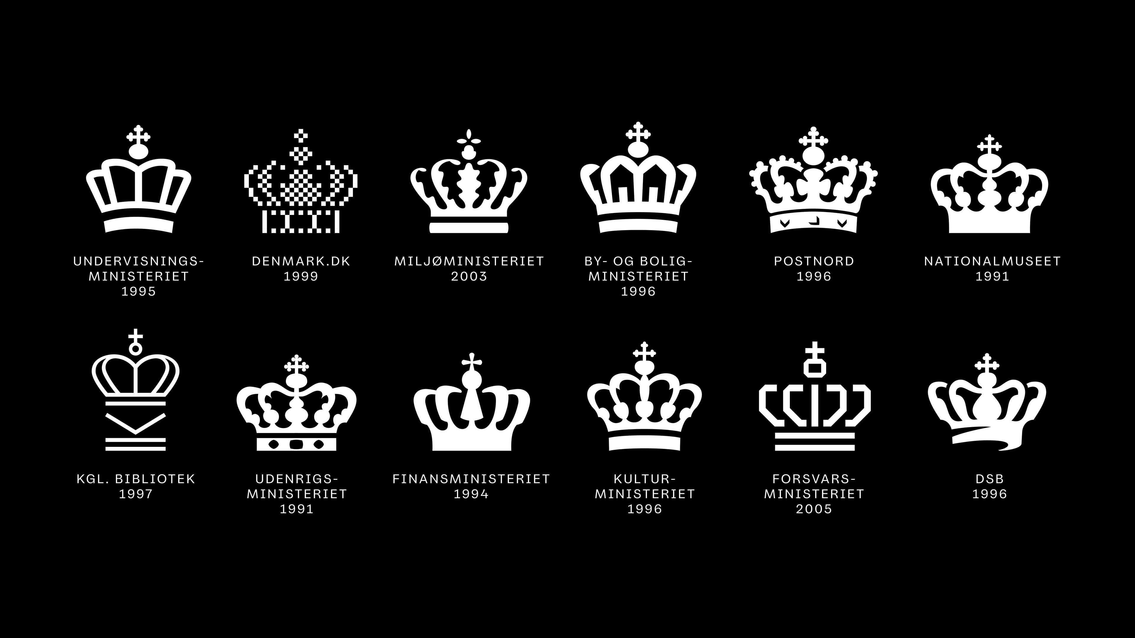
Kontrapunkt began by developing a contemporary logo based on the existing heraldry. The introduction of new colours and shapes brought new context and the opportunity to explore brand architecture in which the crown was a common element creating visual coherence across the various institutions.
With the two proposals, Kontrapunkt had designed a straightforward narrative of how to depict the history and the future, and the narrative resonated with both the Ministry of Foreign Affairs and the National Museum of Denmark.
A double and a pathway
The two wins for Kontrapunkt were closely followed by a lively debate, from resentment to enthusiasm - the contemporary designs were new - but, as we see today, they were indeed timeless. The result of this novel approach was picked up by other ministries, who saw an opportunity to express themselves with greater individuality - as the revised designs allowed for a unique story to be told. And this is precisely what happened. What followed was the redesign of multiple Danish Ministries and State Institutions, all built in close visual coherence.
The customisation of the crown represented an opportunity for telling the story of each individual ministry - the keyhole became a feature of the Ministry of Finance, an open book for the Ministry of Education, and oak leaves for the Ministry of Environment.
“
The idea of incorporating stories into the design of the crown has since been followed by a large number of other designers - to our great delight.
Bo Linnemann
Founder of Kontrapunkt
With a symbol that holds itself timeless throughout multiple governmental changes, the hope is that as new governments emerge, they will keep an eye-to-eye relationship with the citizens they serve. This is a great reminder that, although politicians come and go, design based on a strong narrative stands the test of time.
Great designs are timeless
Good luck to everyone embarking on the quest of being a minister for the next three-four years.
More on crafting crowns and futureproofing history
A logo fit for the Queen is another beautiful tour de force in crafting a crown, and our redesign for The Danish Parliament is founded on a similar aim of Bringing History Into the Future.