DSB's 25-year design odyssey
The calendar is displaying December, and the year is coming to an end. At Kontrapunkt, we're gathering with a slightly more nostalgic sentiment. Throughout the four weeks of December, we'll delve into our archive – some entries more recent than others – and take a stroll down memory lane, exploring the various decades of Kontrapunkt design.
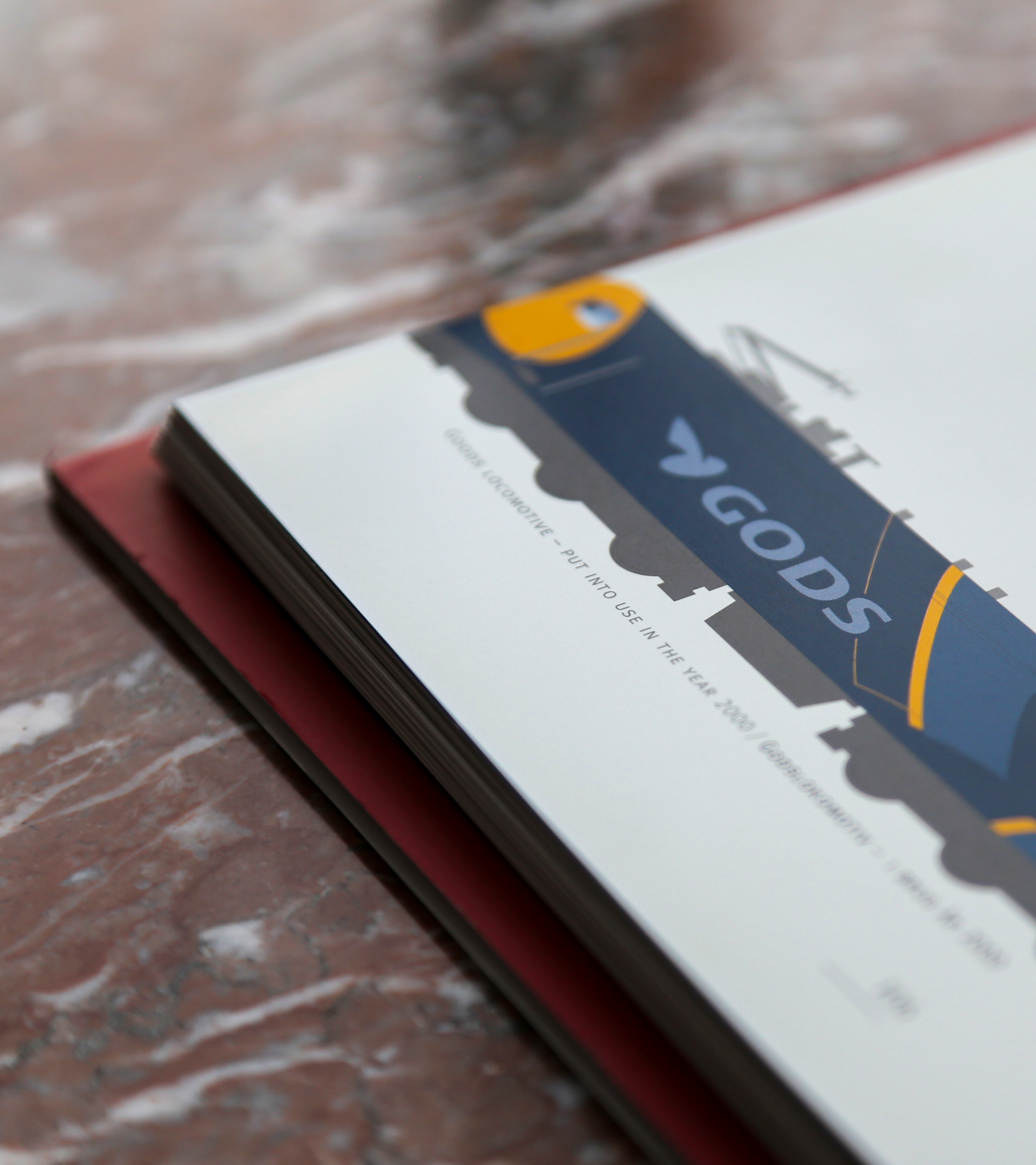
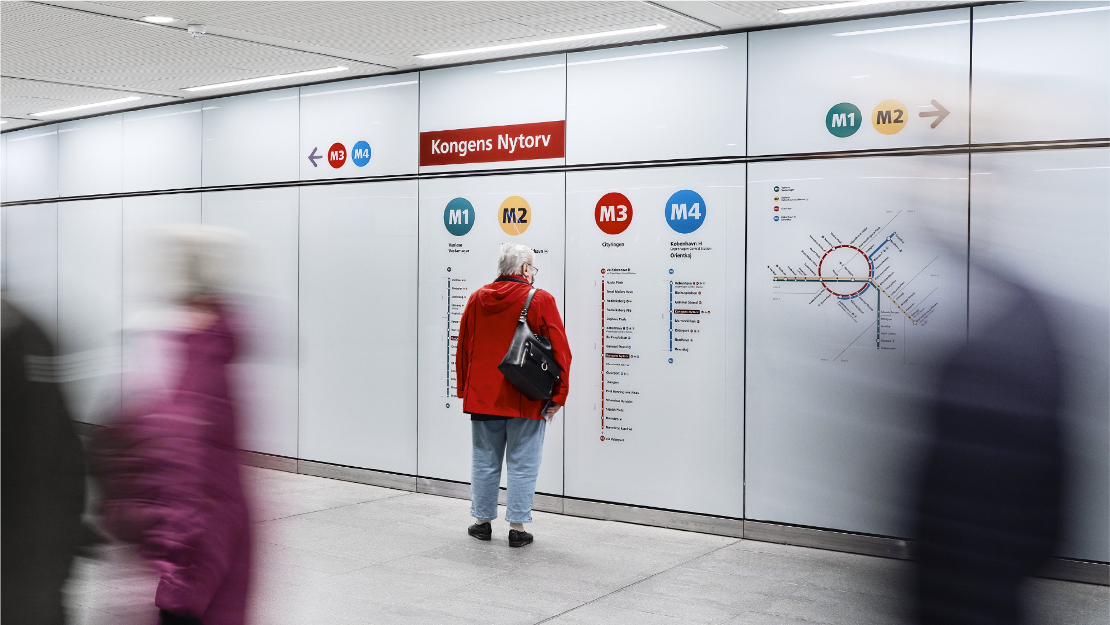
DSB (Danish State Railway) is Denmark’s largest transportation company. With approximately 500,000 daily passengers, 167 million boardings every year, and 231 stations nationwide, the iconic DSB identity meets millions of Danes every single day. Like the rail network itself, our work for DSB is far-reaching as it touches every corner of Denmark and has been doing so since 1998. Over the years, DSB has used design as a management tool to express change in the company’s business era; hence, our collaboration manifested what DSB stood for on the threshold of a new millennium.
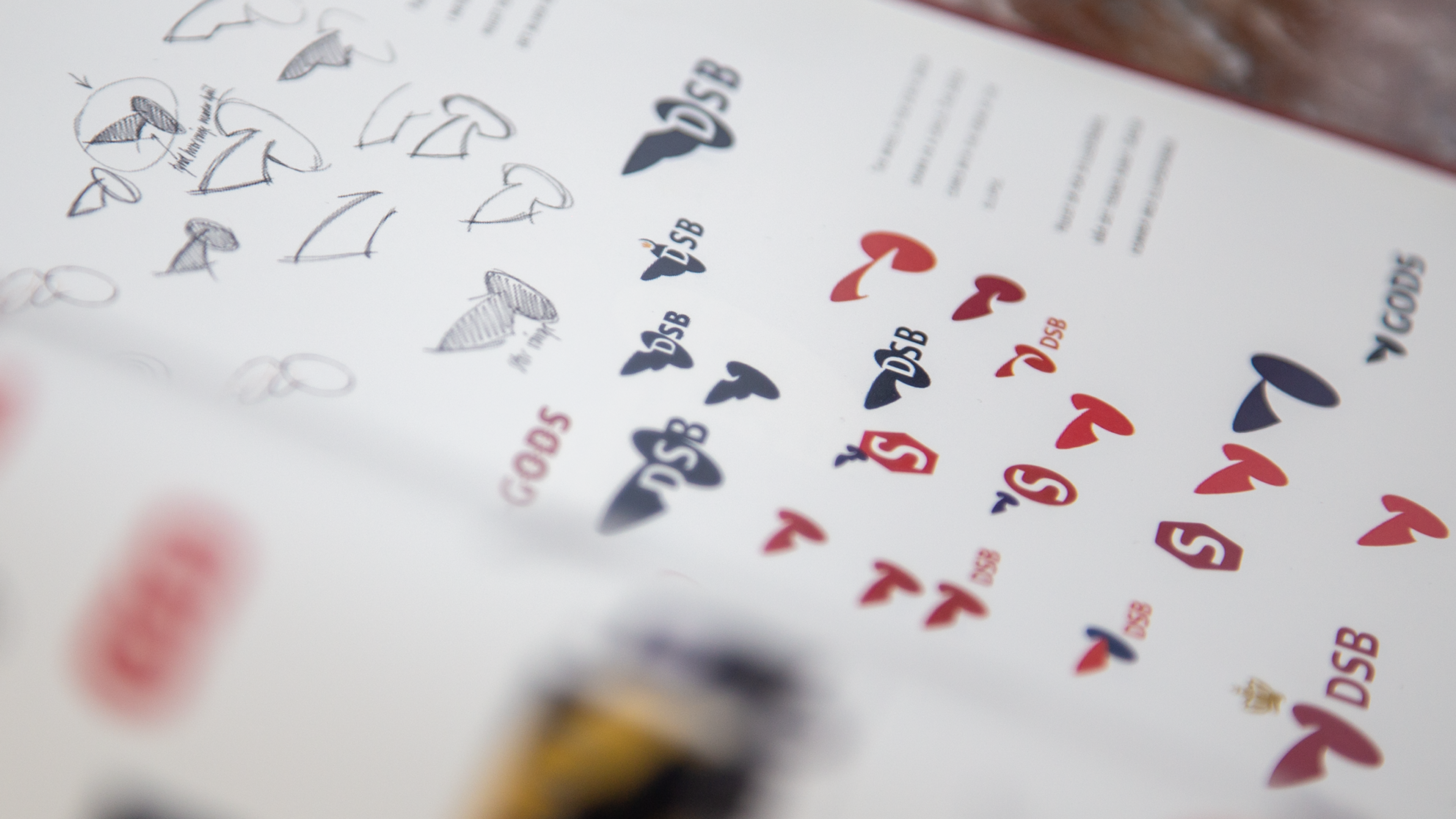
The 1998 evolution of the DSB Logo
The design from 1998 had the requirements of facing the future while respecting the company’s roots. The new identity should visualise DSB’s new value base – focusing on customers' needs and being a business rather than a government service while still expressing DSB’s old virtues: Tradition, credibility, and environmental awareness. The logo design is an example of connecting past and future beautifully by creating a contemporary design of the 150-year-old crowned winged wheel. A design DSB had taken out of the design program for a period of 25 years. The updated wheel was presented in an elliptical form with one wing, occasionally wearing a crown – symbolising the development, pace, and dreams DSB had entering the new millennium.
Typographic Transformation
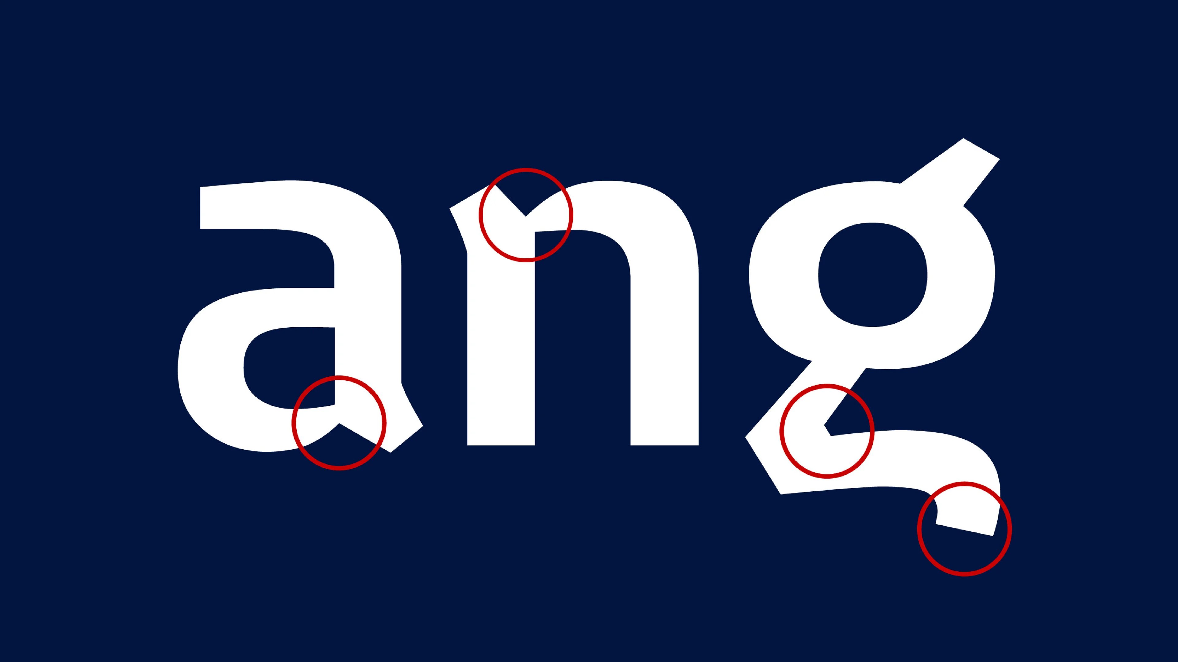
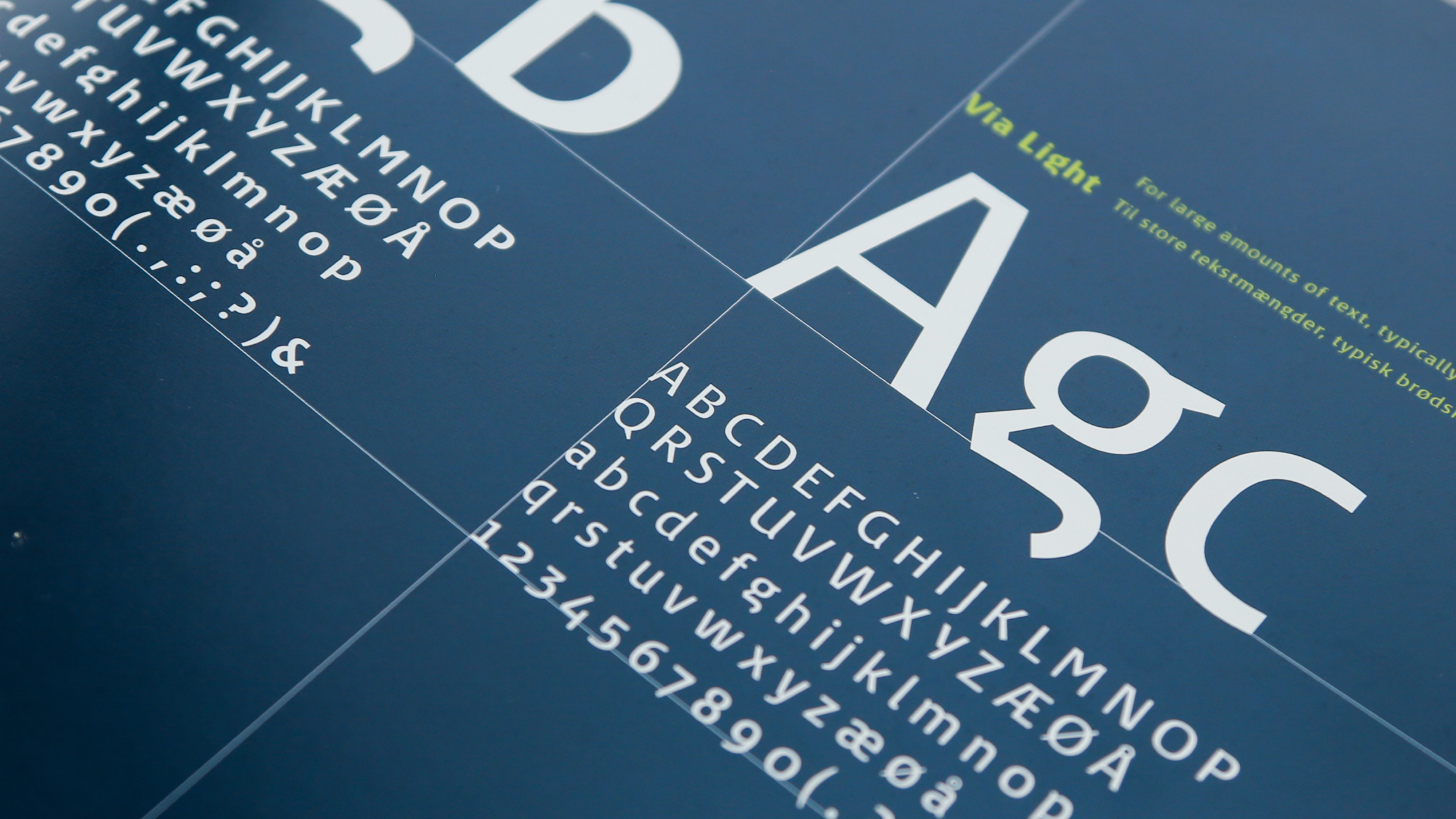
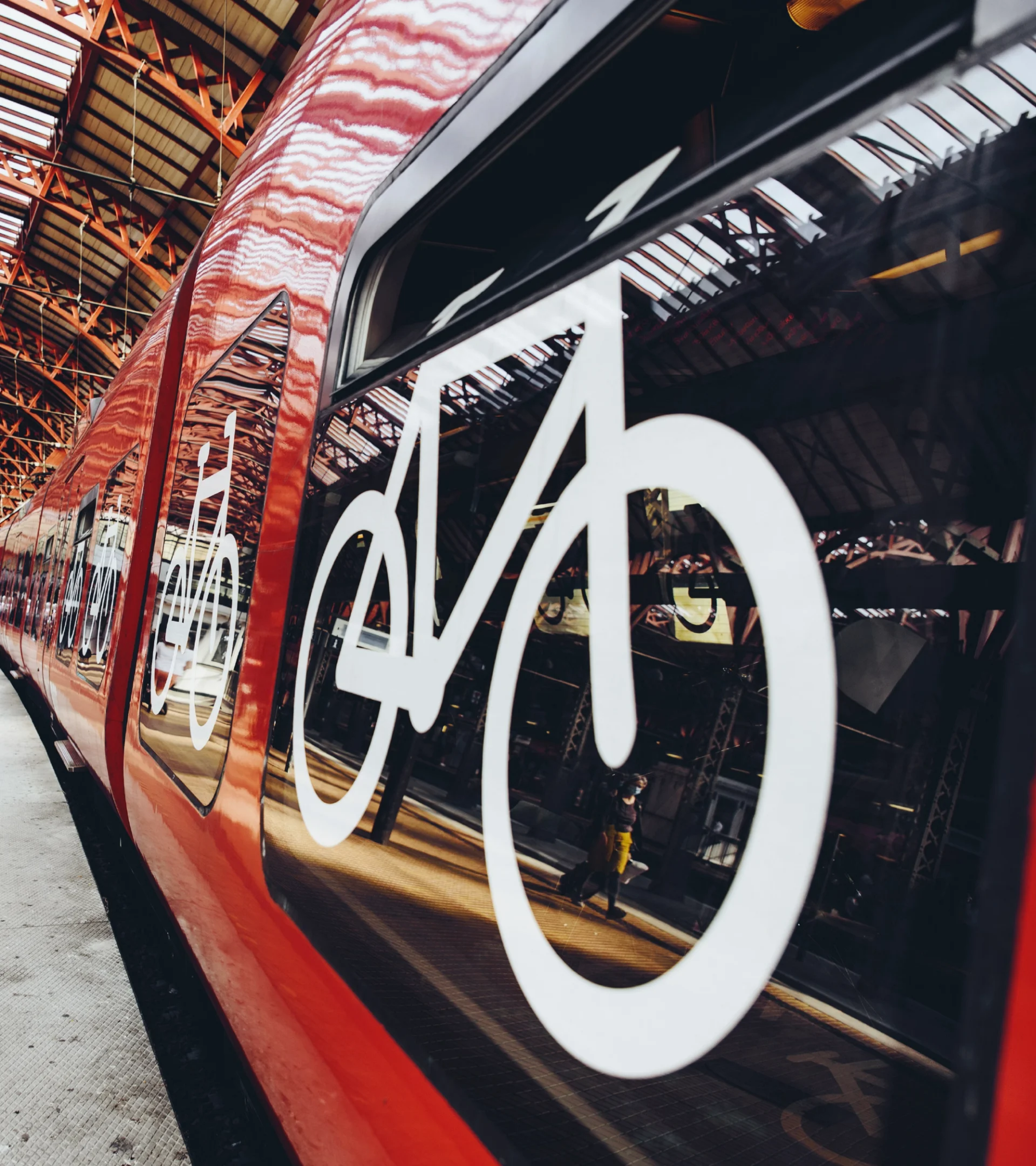
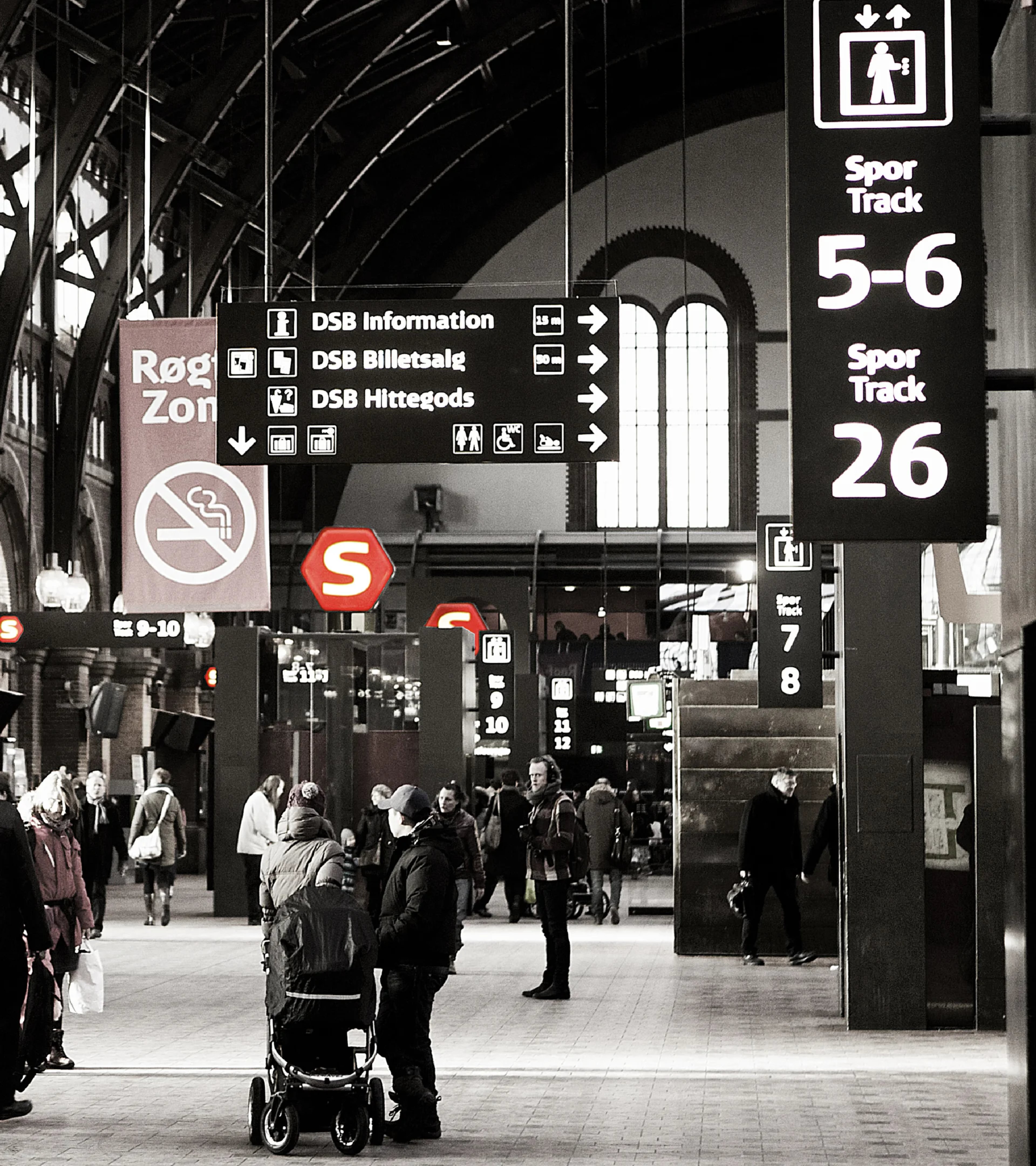
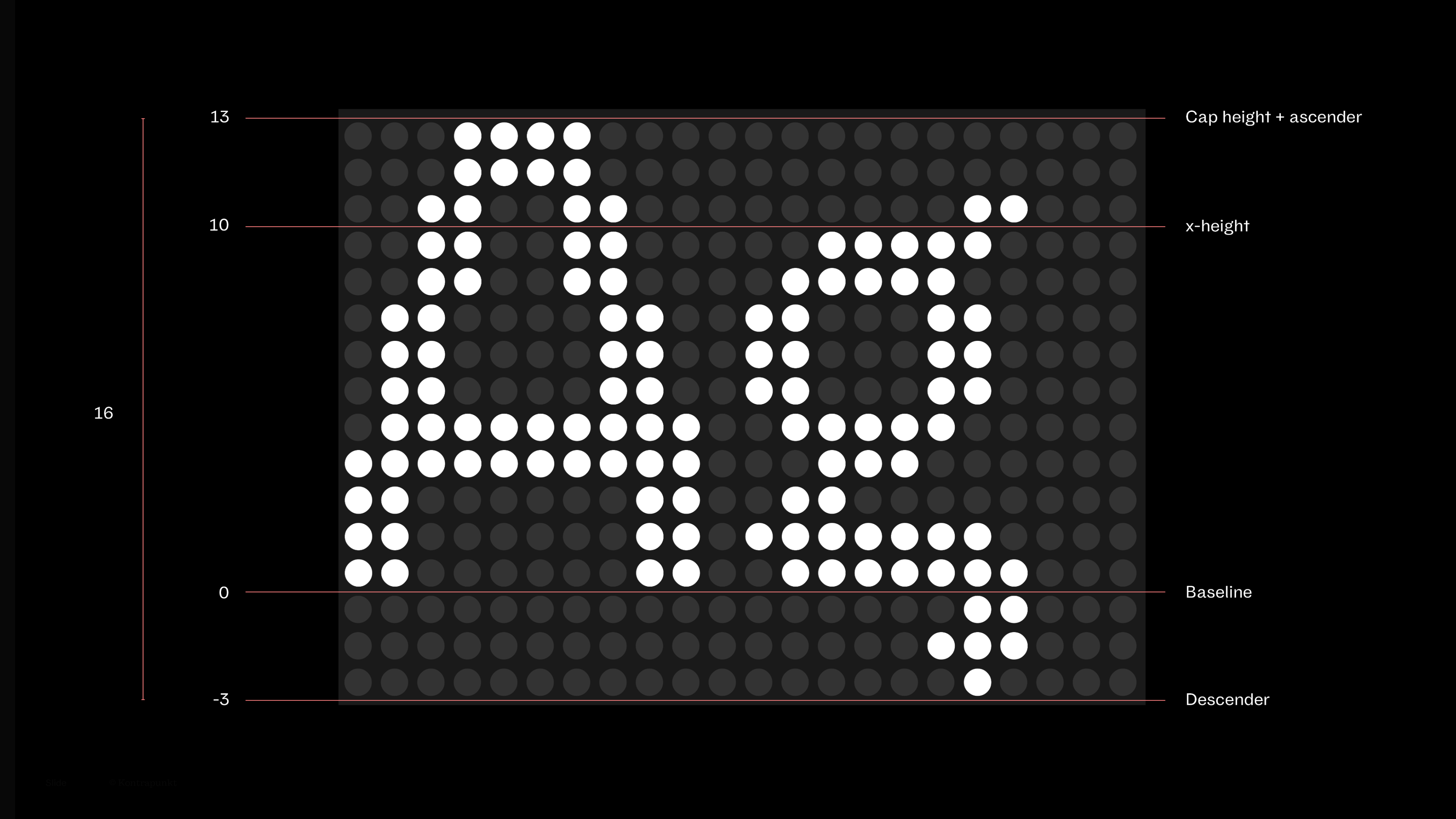
Typography is a key identity maker for DSB. Think about it – how much of the communication with the passenger is in writing? Signs, trains, schedules, ads, and on the stations – no matter where you need to seek information, it was important that DSB was recognised, even in the absence of a name and logo. The typeface found inspiration in railway systems around the world. Like the Paris Metro and the London Underground, the bespoke typeface Via uses negative writing on a dark blue base to enhance readability. Furthermore, the typeface was designed to be more legible than the Helvetica DSB used before, through longer up and down strokes, open shapes, blunt angles, and non-parallel lines.
Controls space
Controls space
Controls space
Controls space
![]() /
/ ![]()
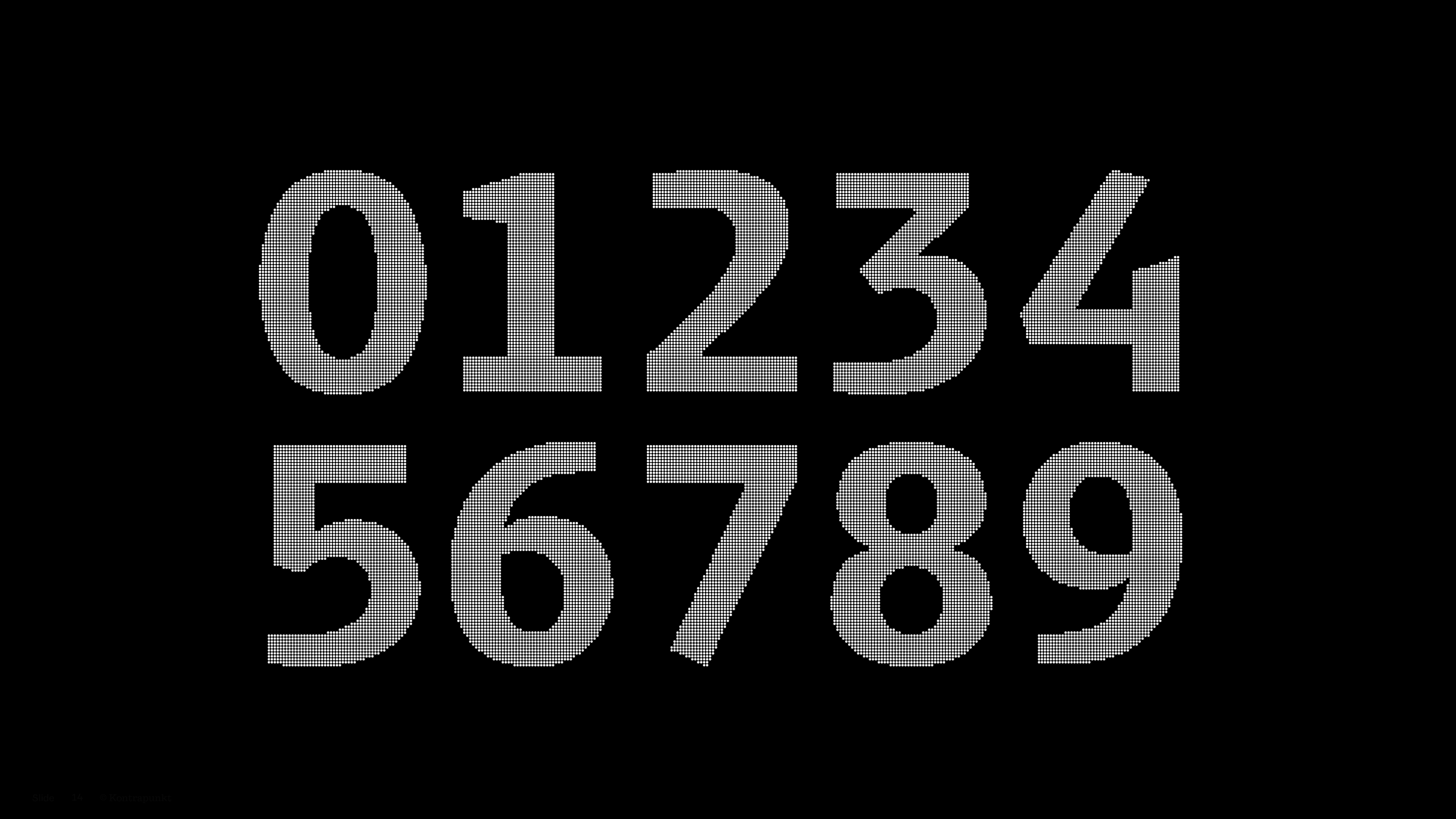
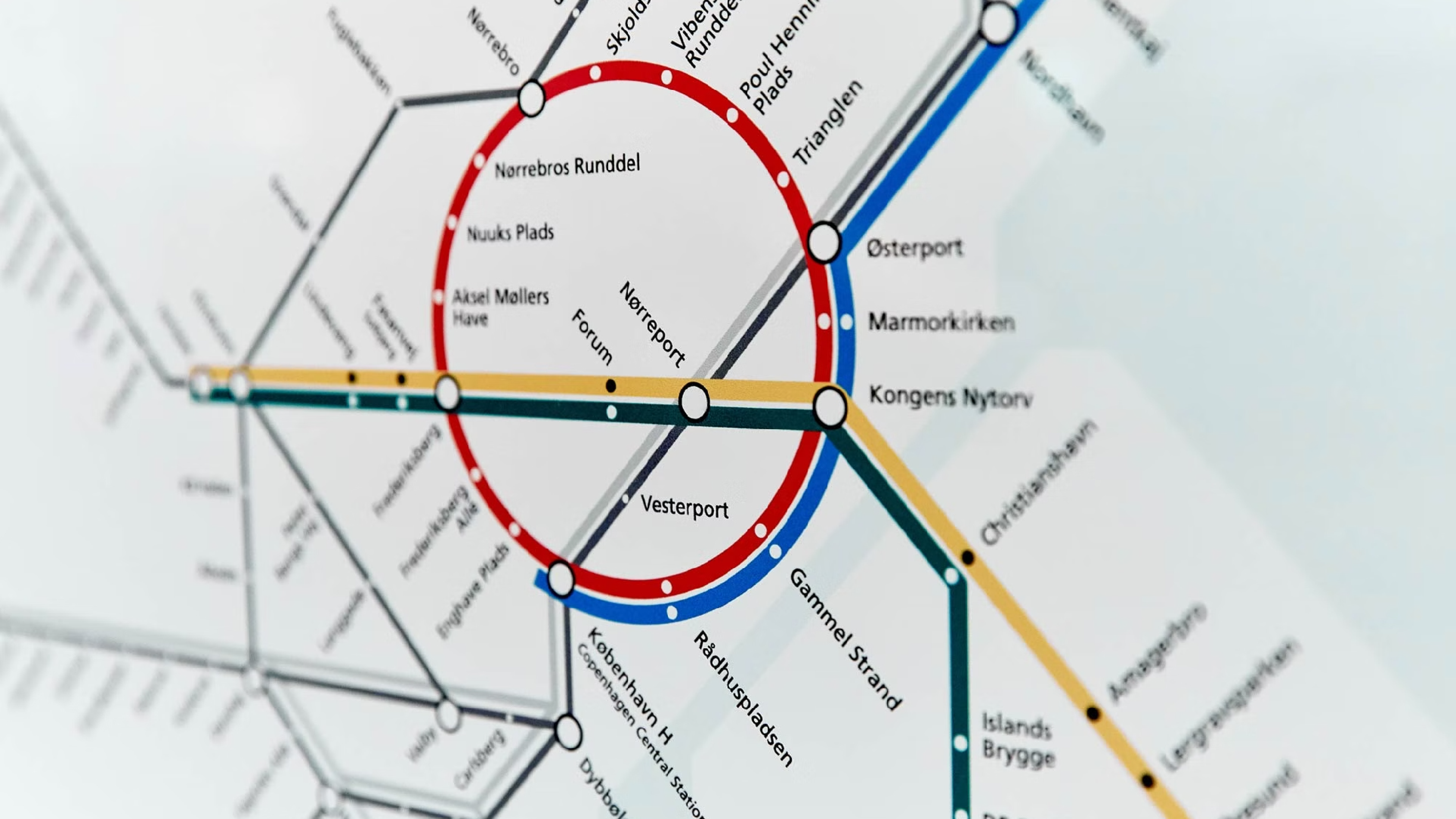
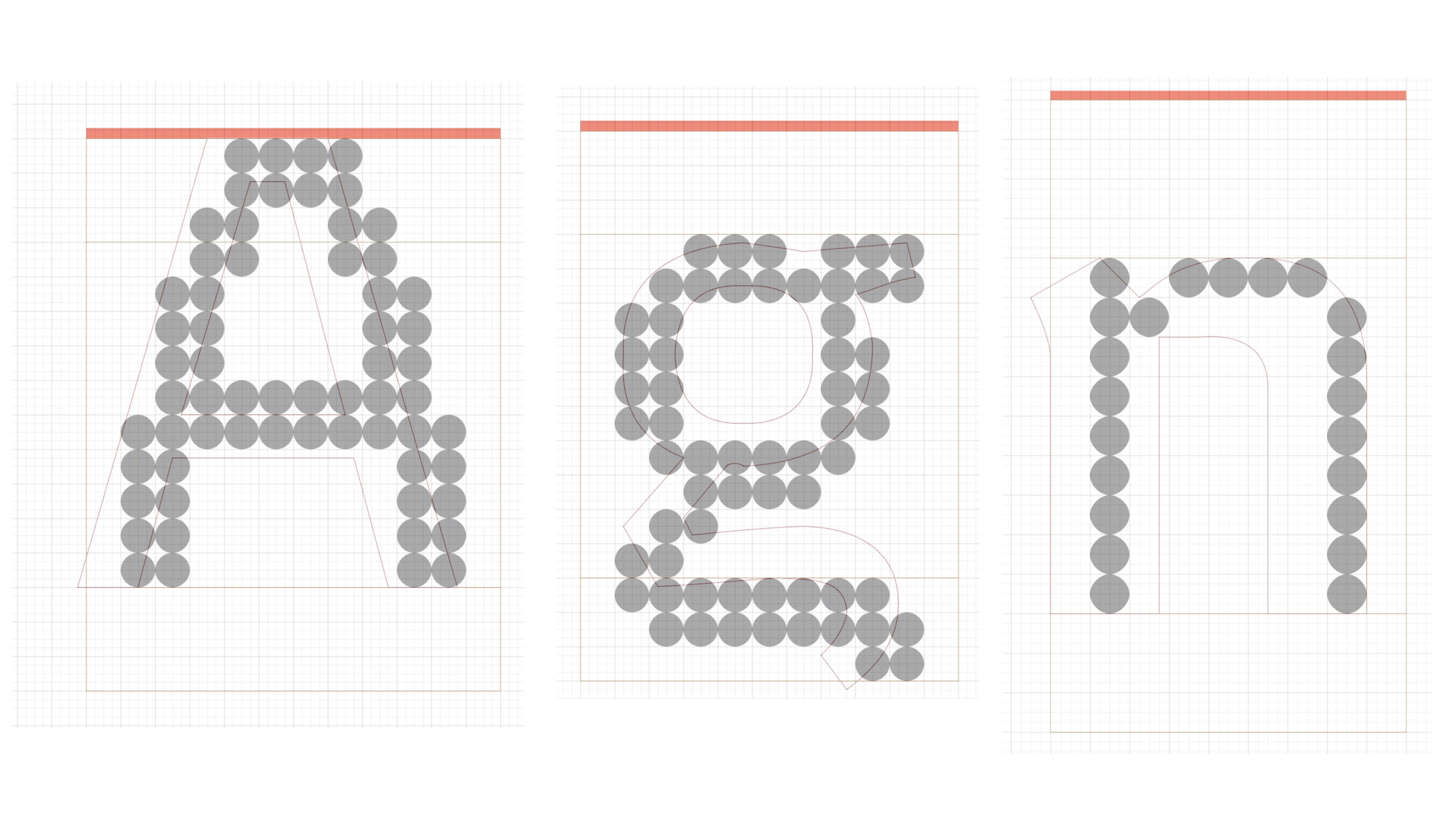
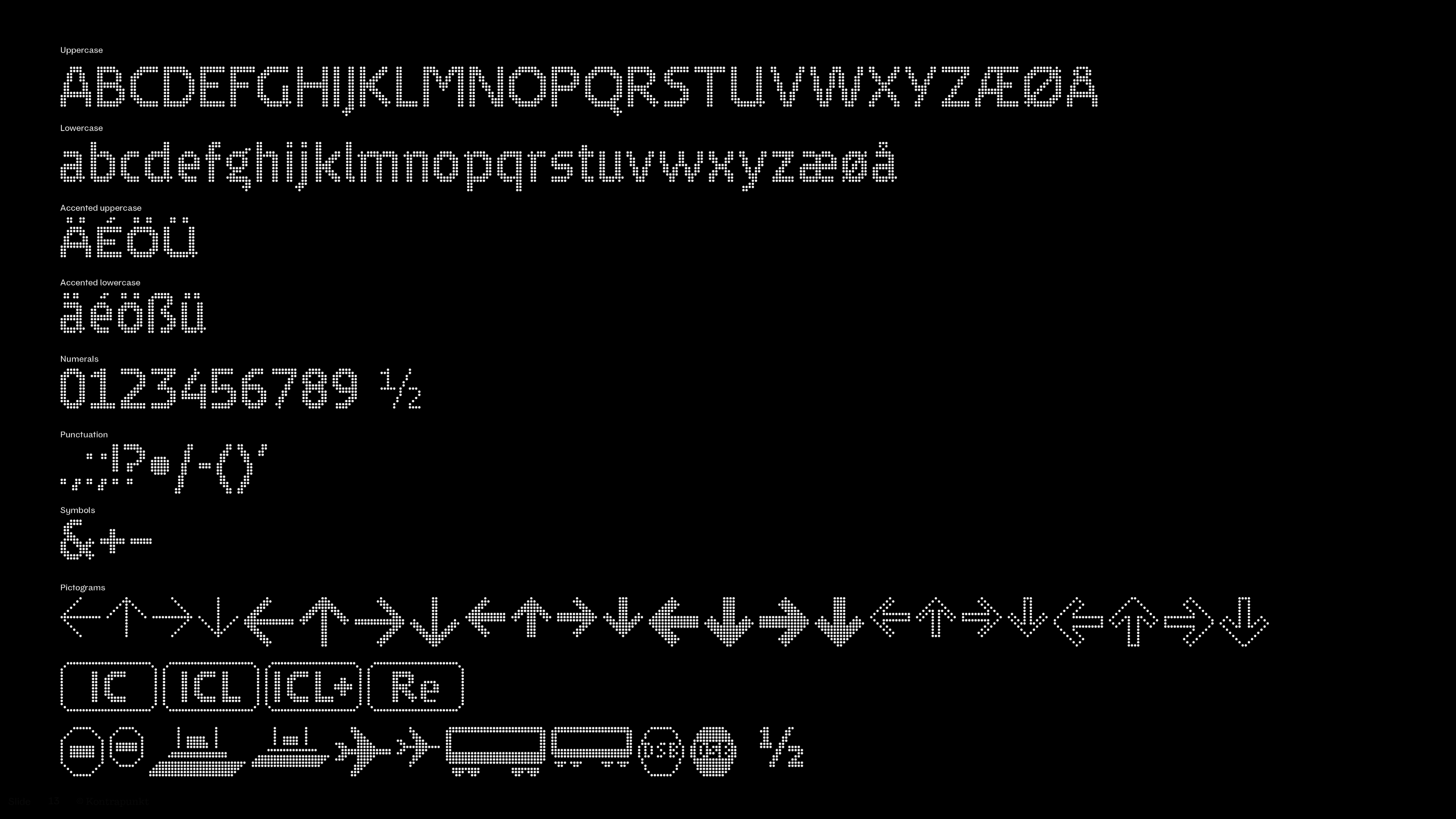
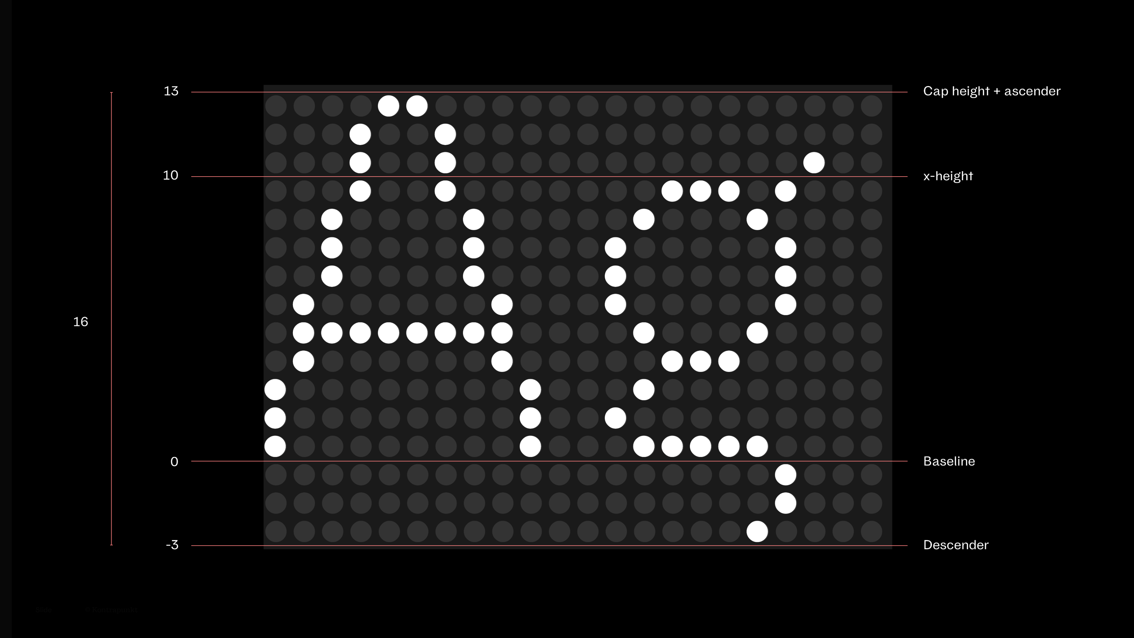
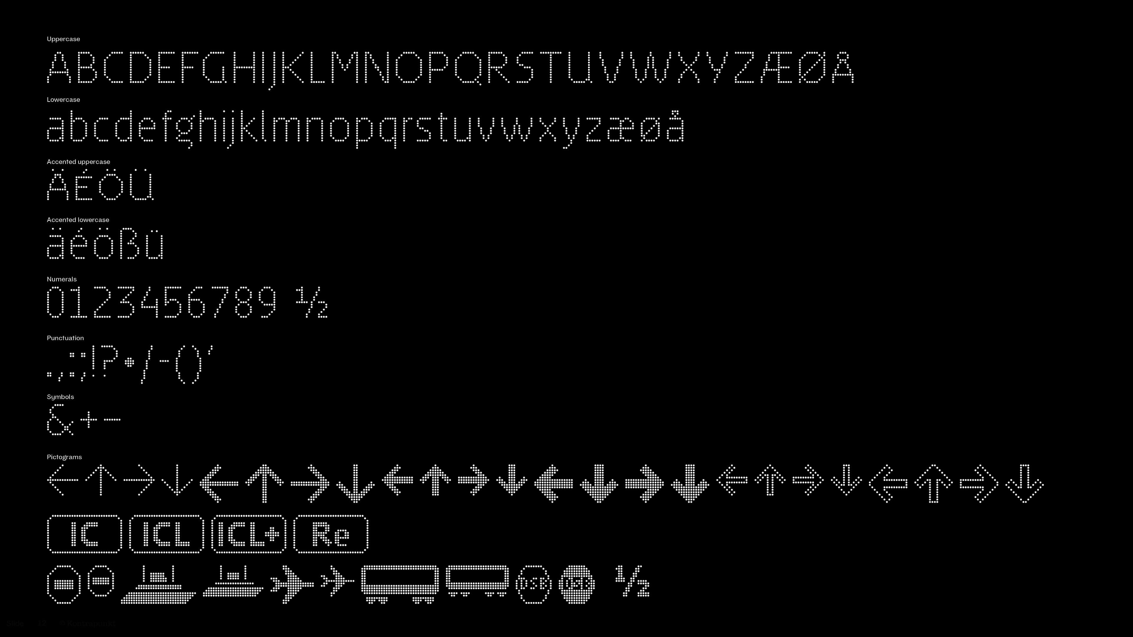
Navigating the rails with DSB dot by dot
Our journey through 25 years with DSB has resulted in various designs for various platforms, times, and transport systems. An example is the VIA Dot typeface pictured above. We continuously strive to create a design that is simultaneously distinct and open to interpretation and thus can express changes in the company for decades to come.
Learn more about the case
Copenhagen Metro goes full circle
Related stories