Binary type
The calendar is displaying December, and the year is coming to an end. At Kontrapunkt, we’re gathering with a slightly more nostalgic sentiment. Throughout the four weeks of December, we’ll delve into our archive — some entries more recent than others — and stroll down memory lane, exploring the various decades of Kontrapunkt design.
Mitsubishi Motors and Tasaki, though initiated in different years (2018 and revisited in 2022, respectively), epitomise contemporary premium brand aesthetics. Despite their three-year gap, they embody the evolving communication needs in today’s dynamic world. From pure elegance to robust vigour, we proudly present Mitsubishi Motors and Tasaki.
A wholesome, elegant family
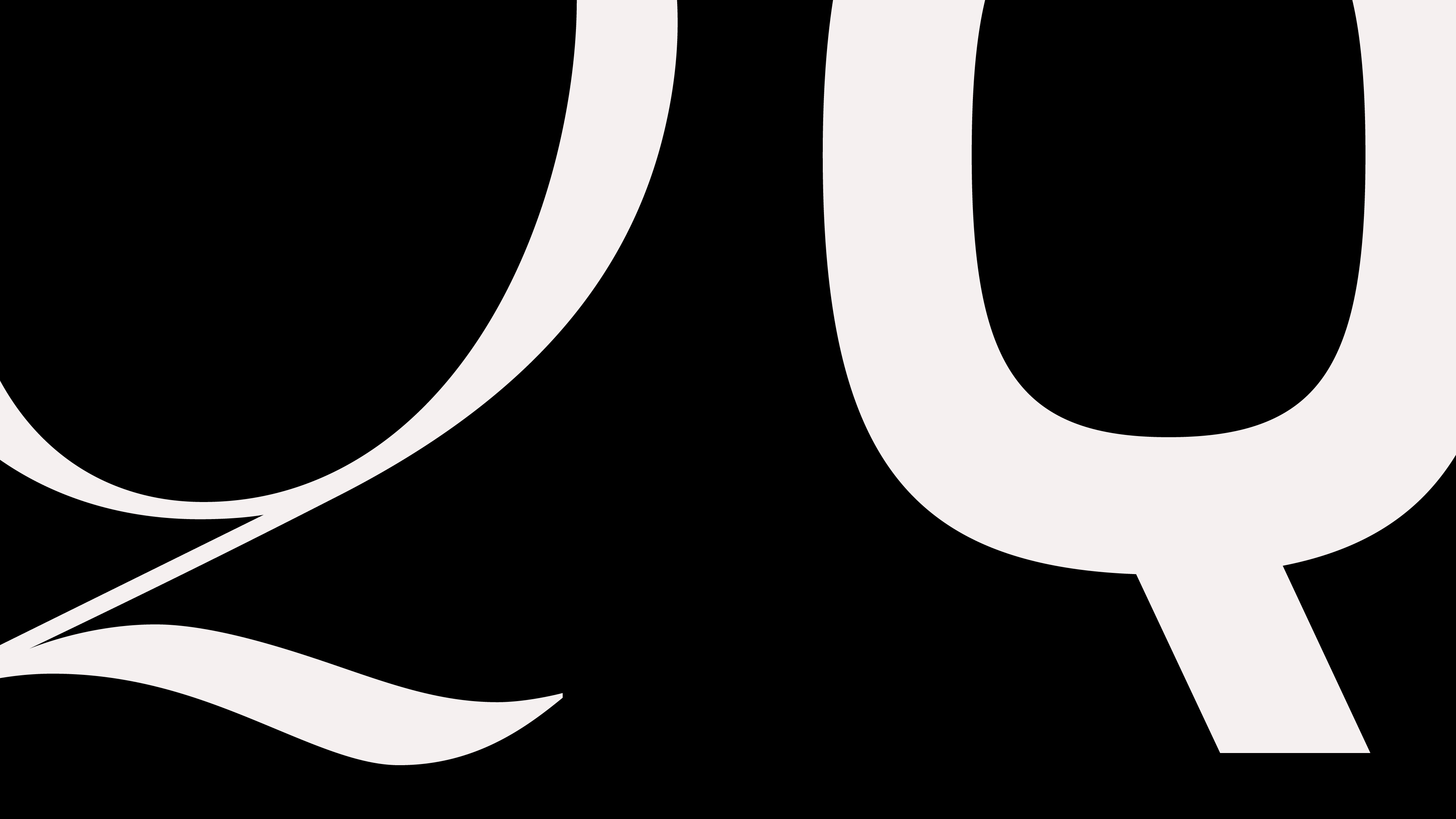
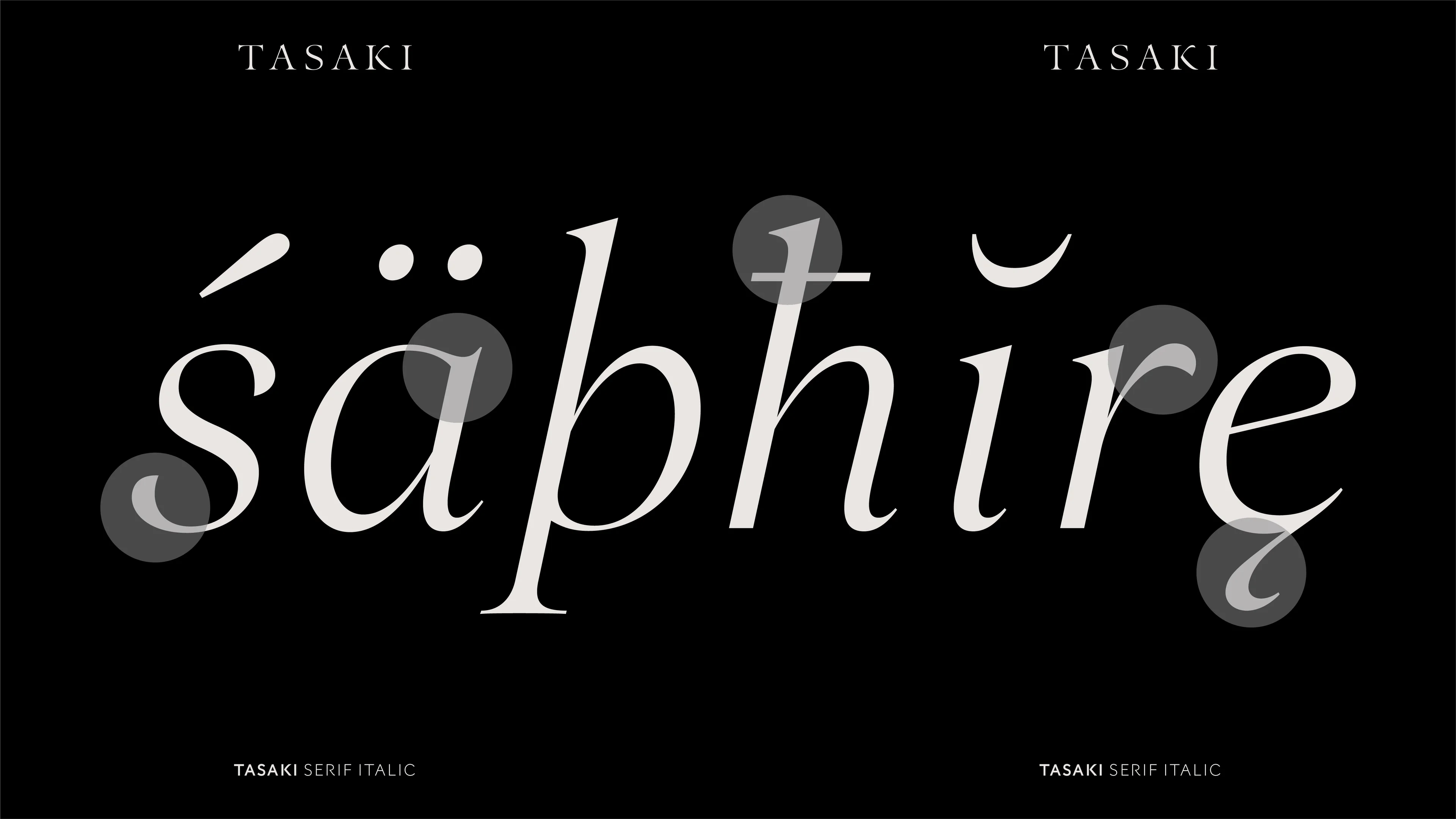
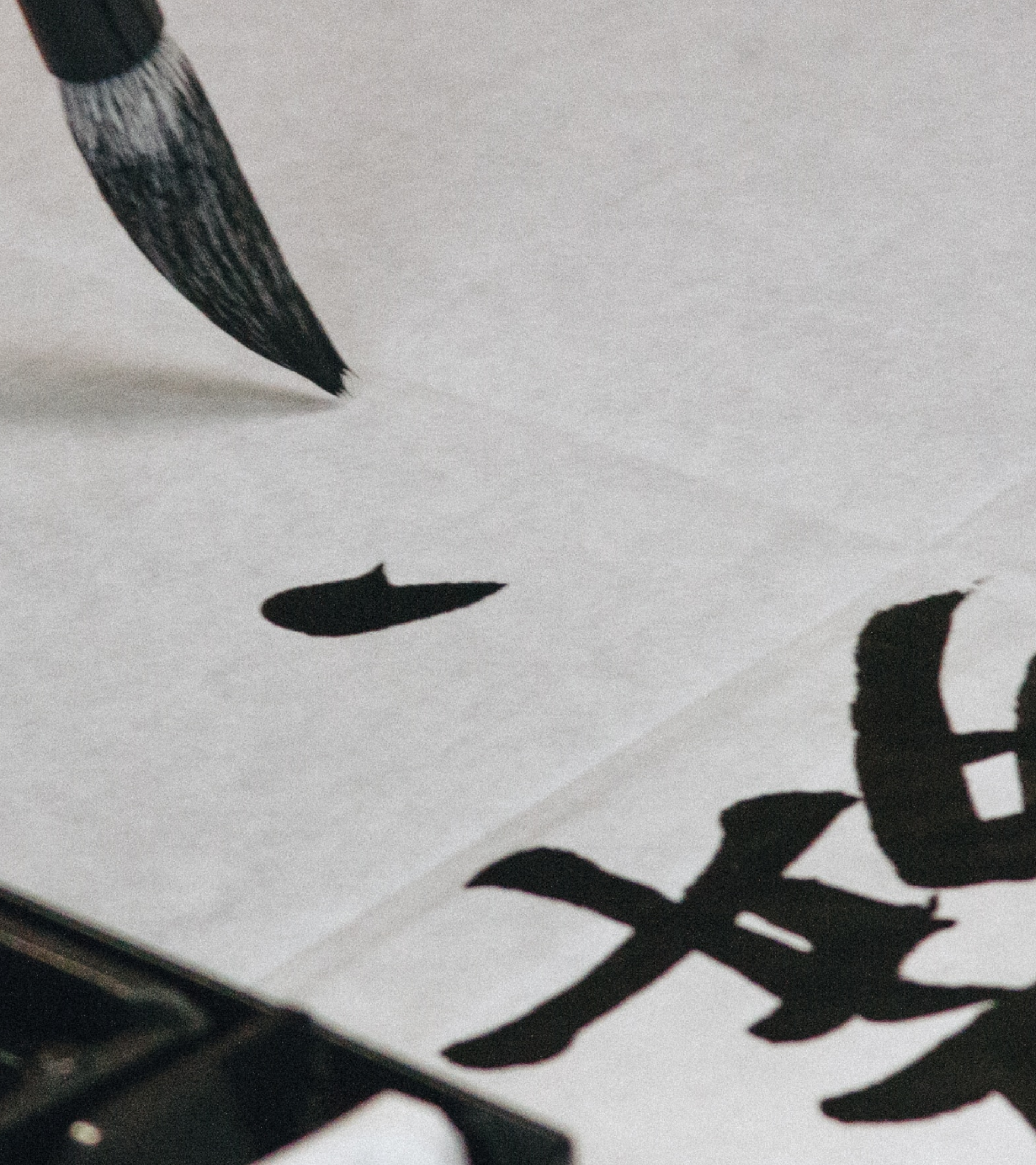
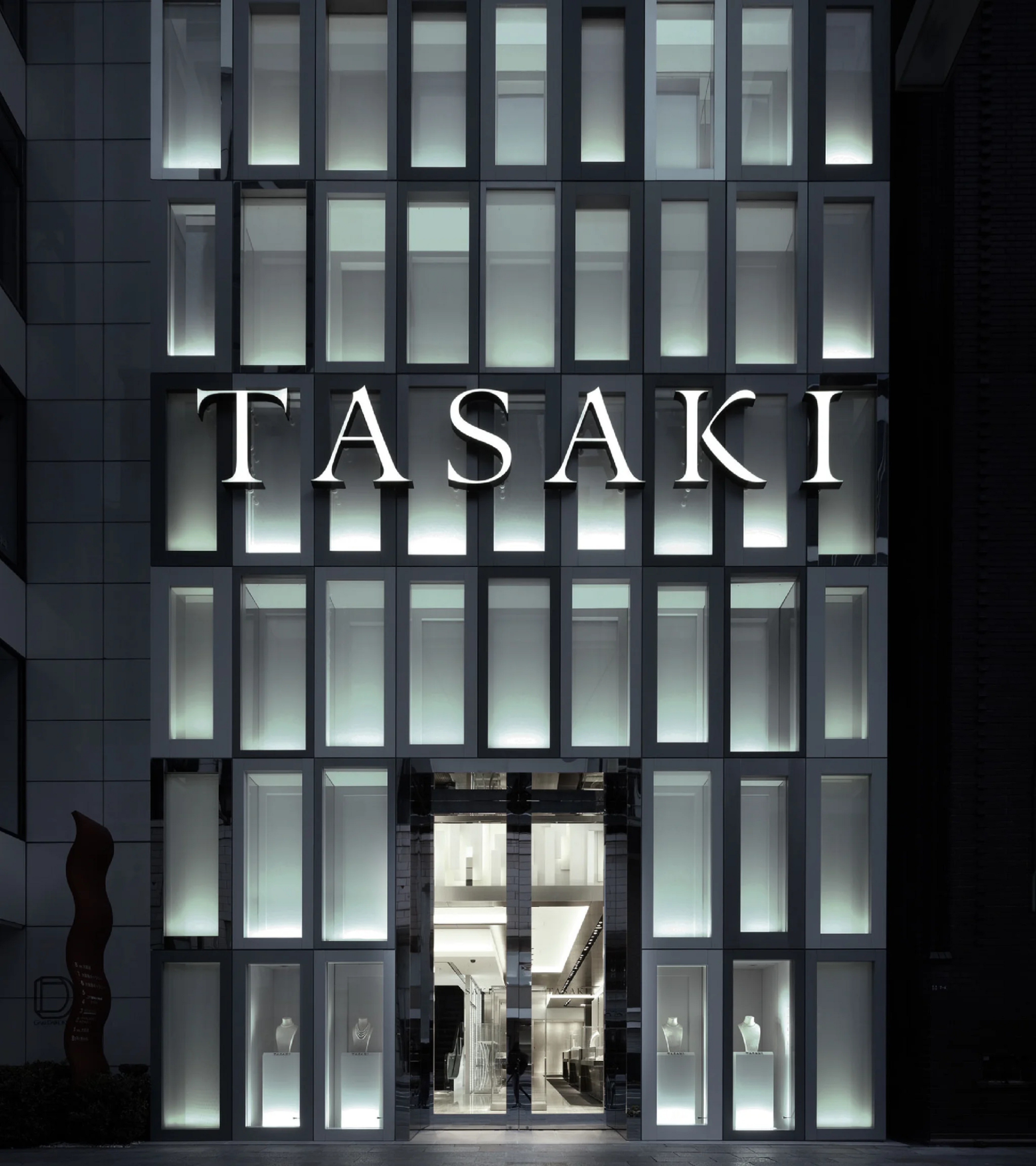
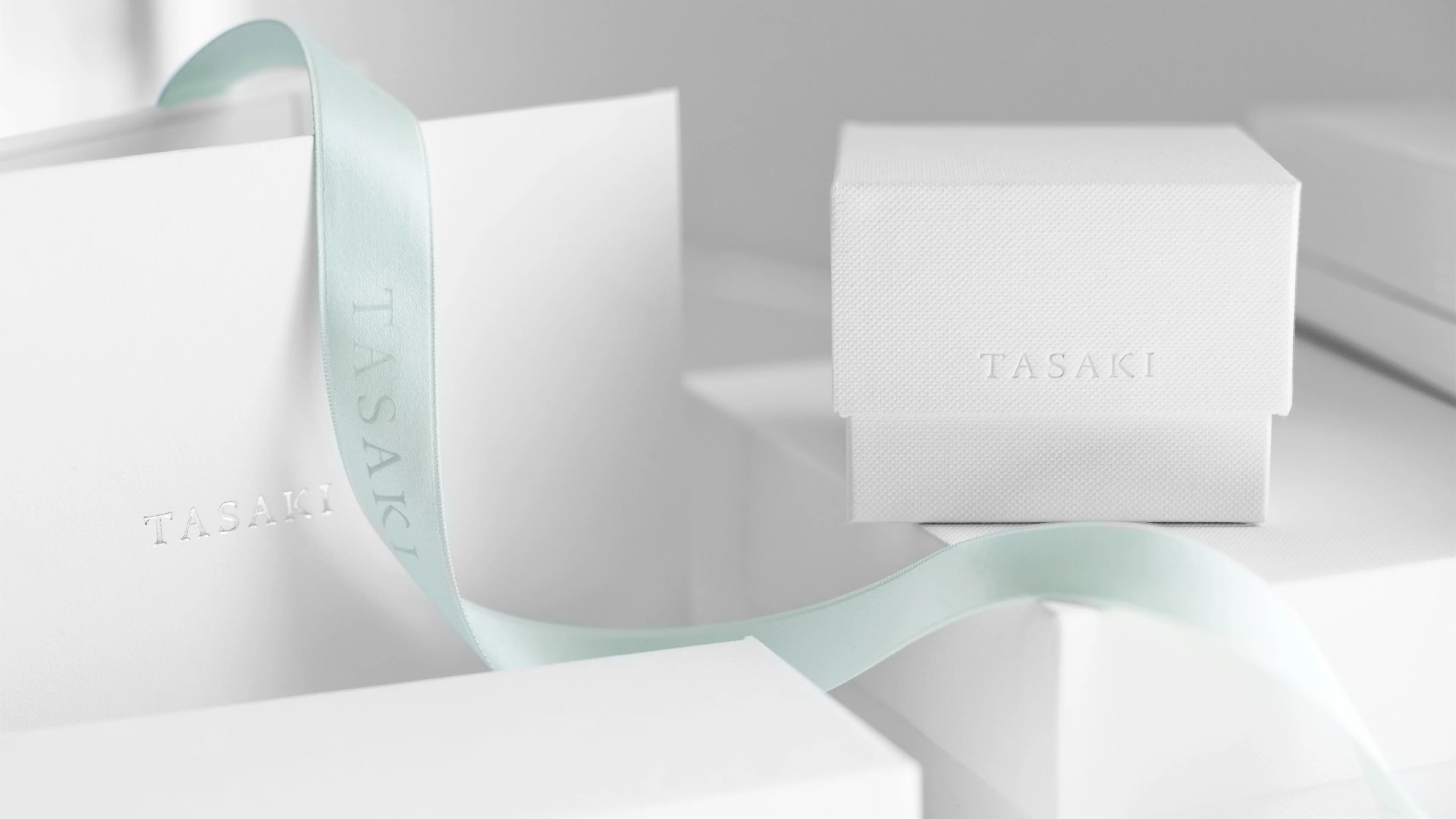
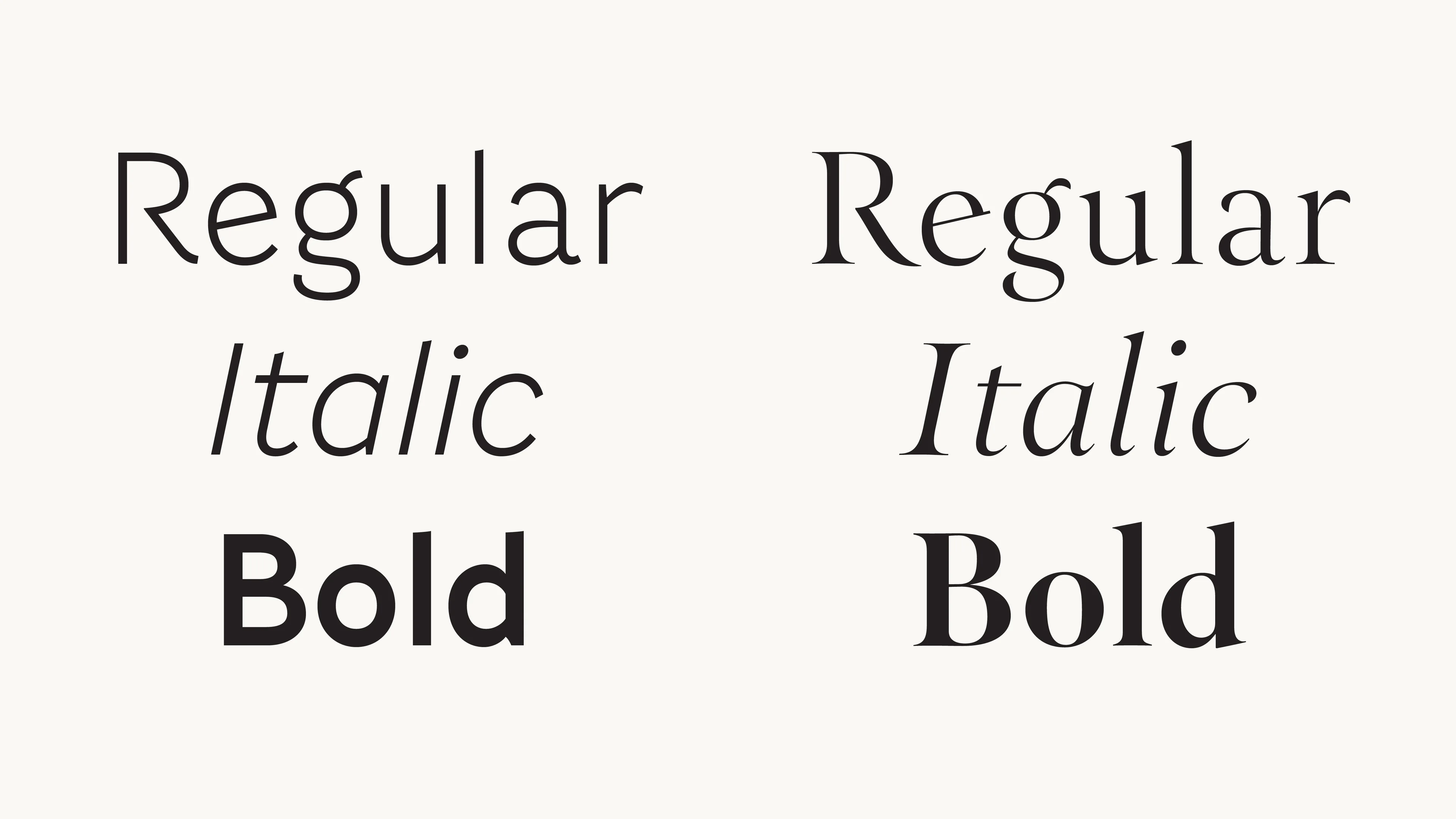
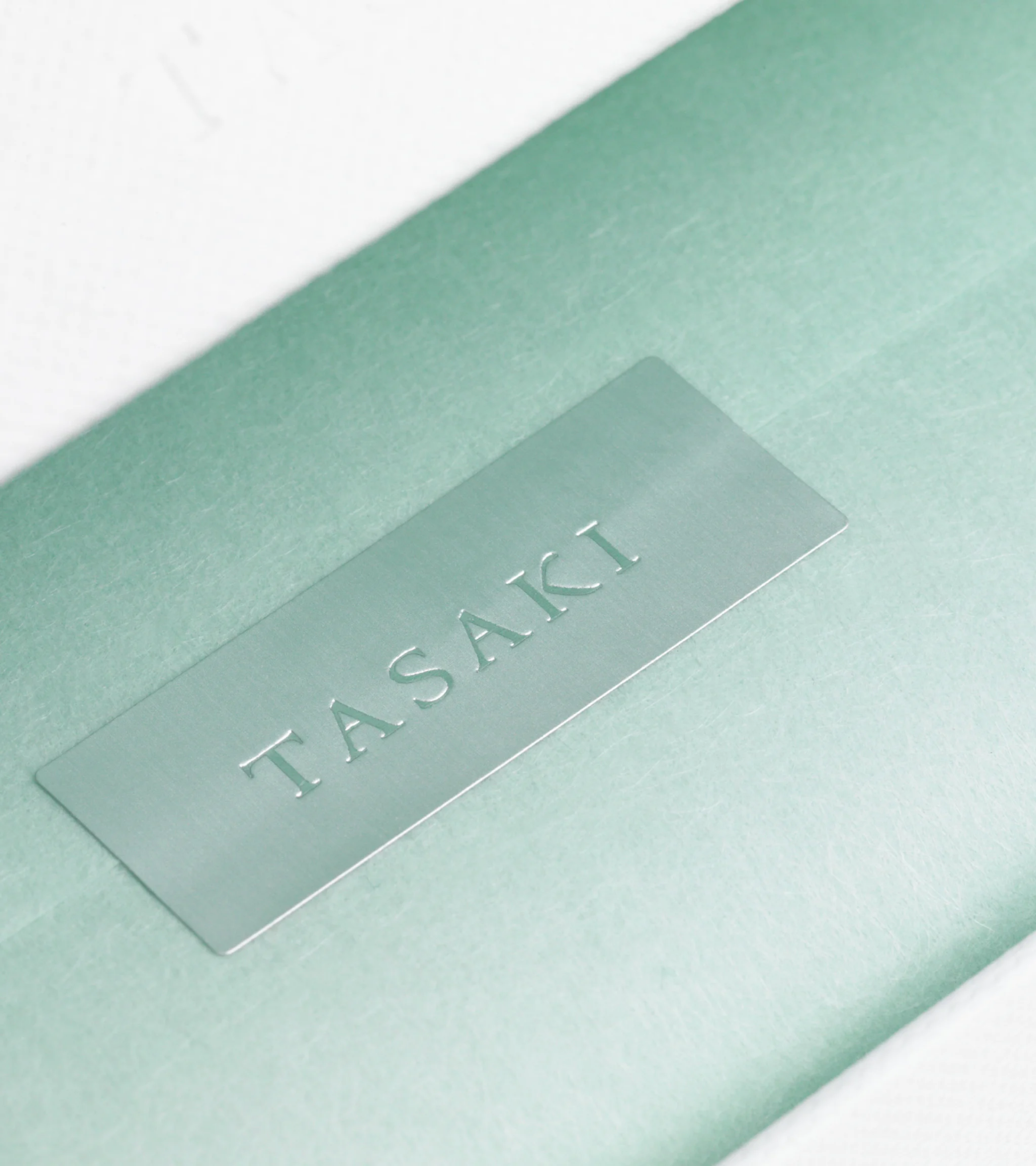
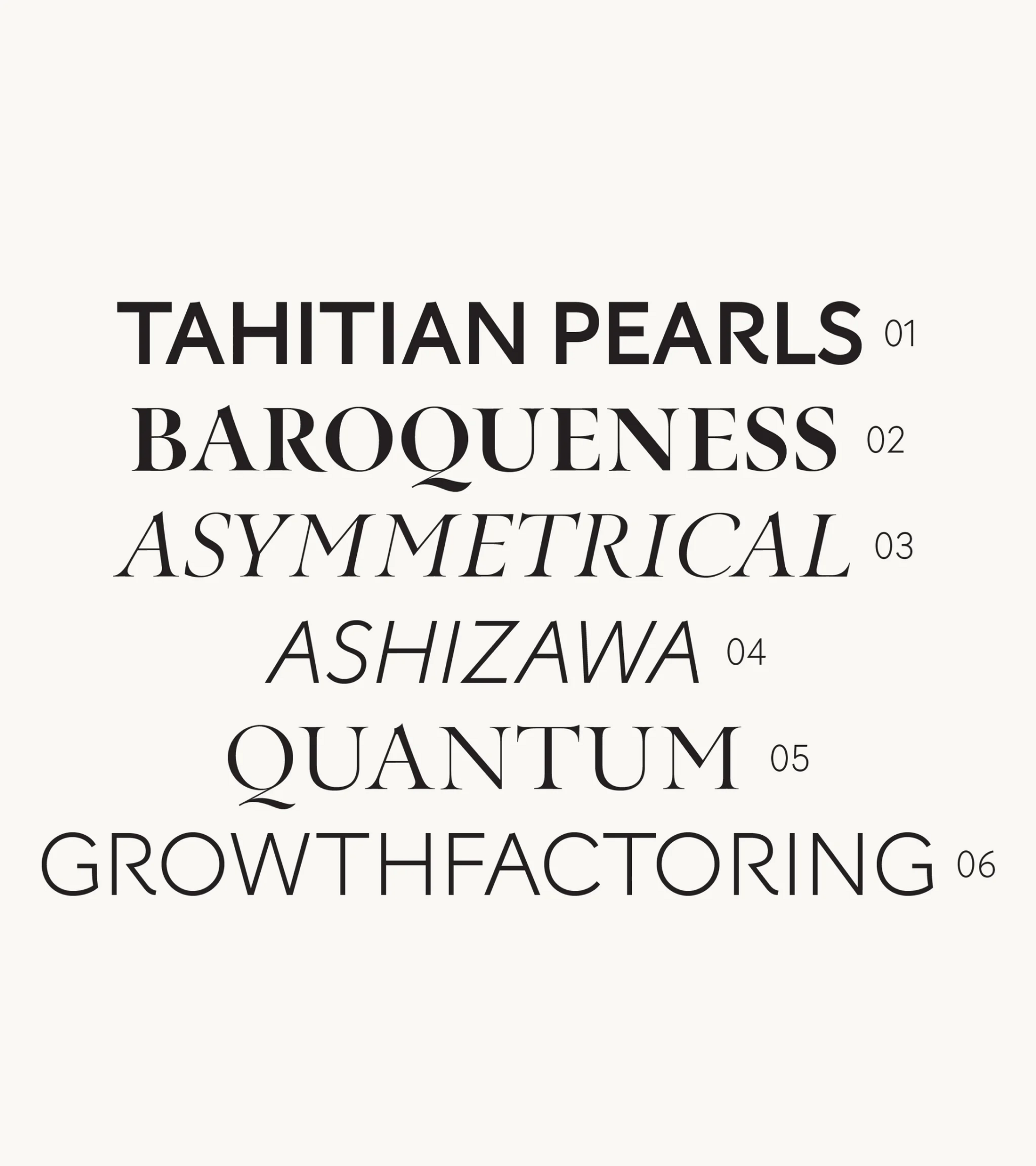
The Tasaki 2022 font expands upon the original 2009 font, drawing inspiration from Japanese calligraphy. This typeface blends traditional elegance with modernity, conveying soft, delicate strokes in serif and sans styles. Following the design of the original typeface, the extension has incorporated additional glyphs to guarantee perfect harmony with the original whilst allowing for greater applicability across all of Tasaki’s touchpoints. Used on jewellery boxes, logomarks, and brand communication, Tasaki has positioned itself among the world’s premier jewellery brands.
In essence, the Tasaki typeface is Japanese calligraphy meets modern in a fully flexible family, enabling the brand to communicate with a high-end voice everywhere you meet Tasaki.
Dynamic cuts and tires
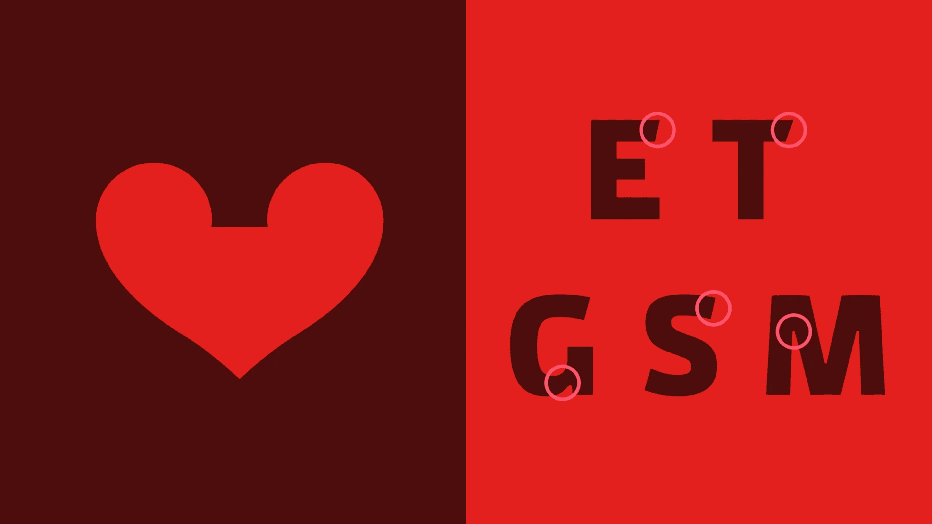
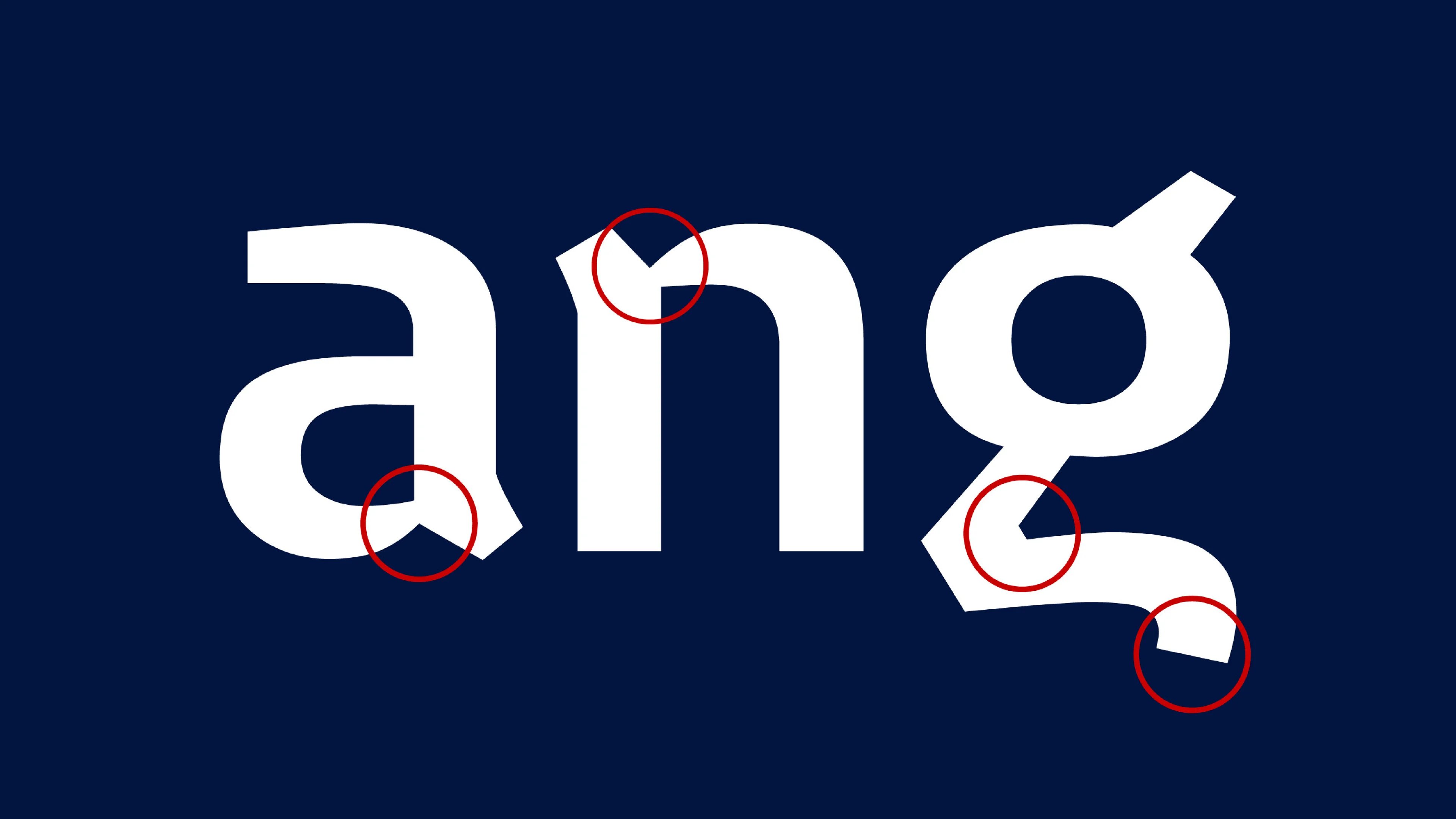
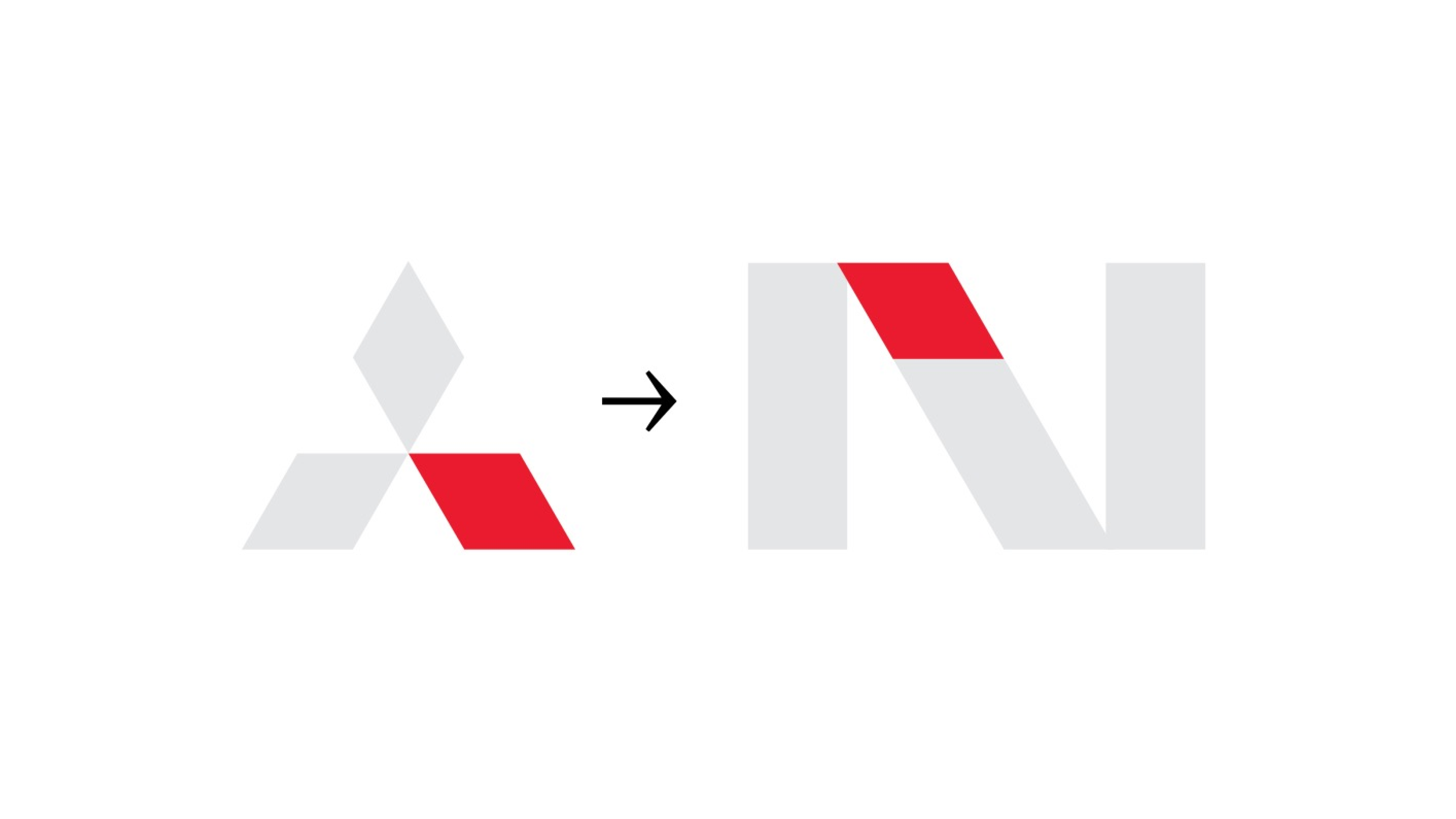
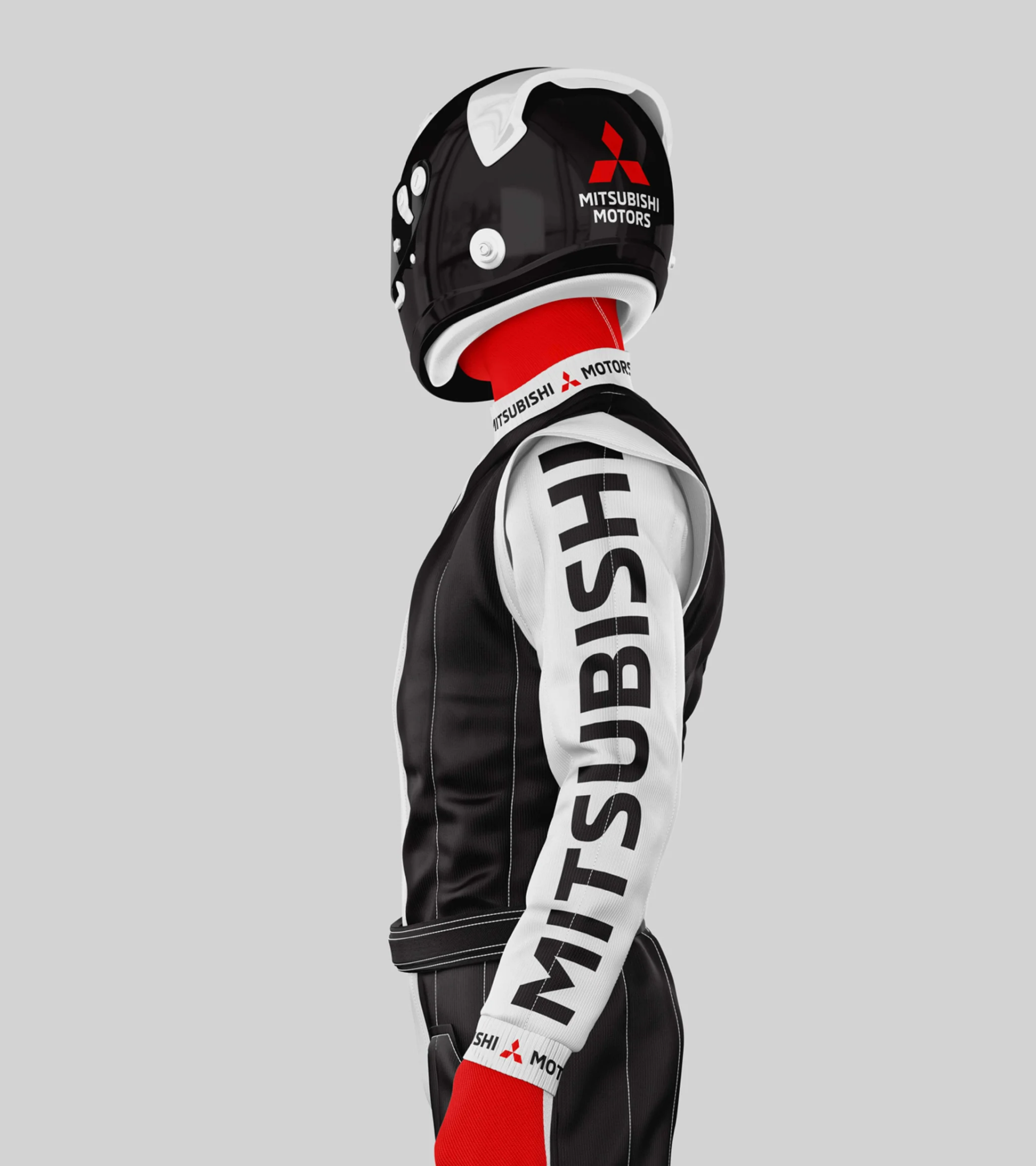
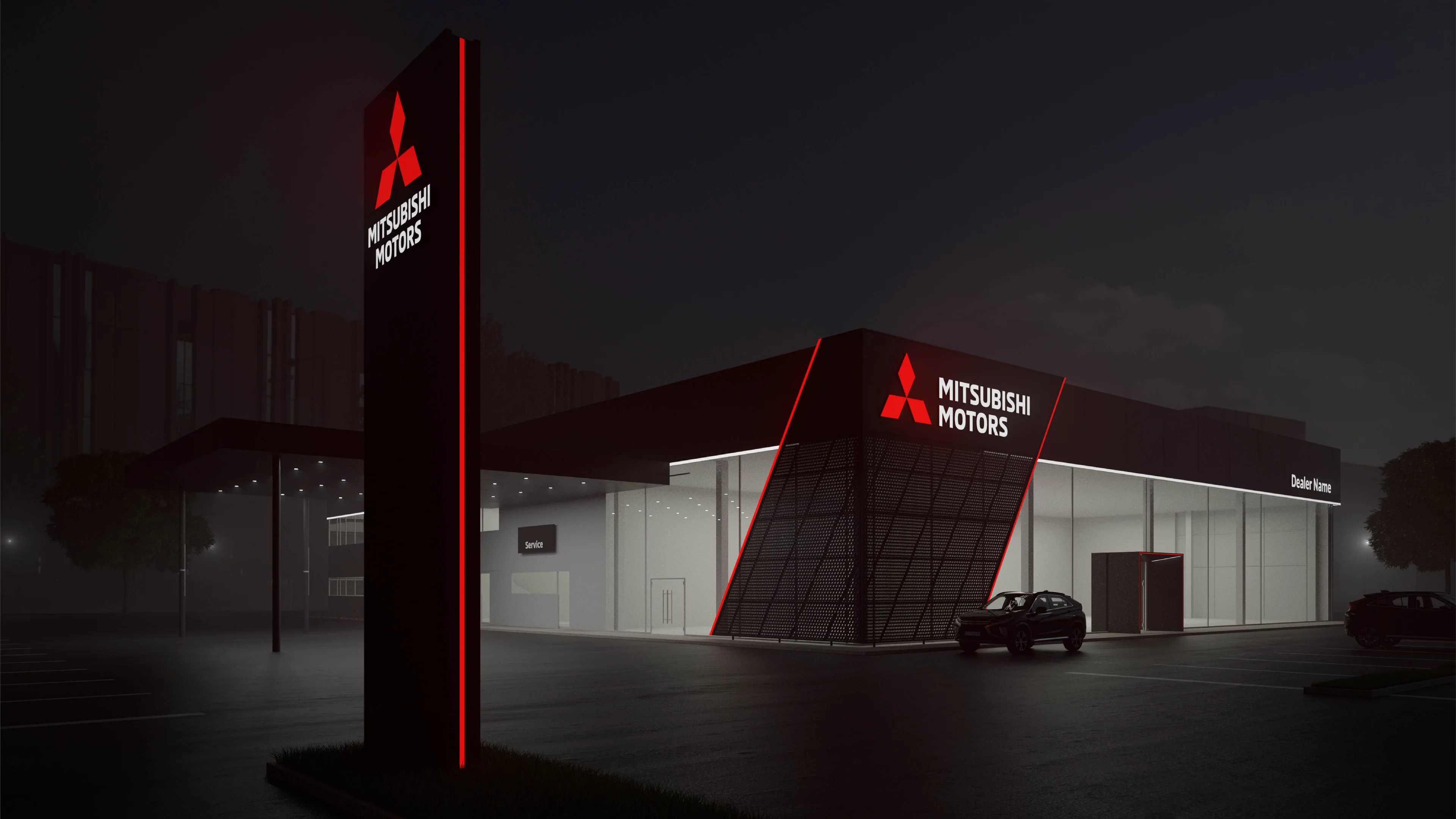
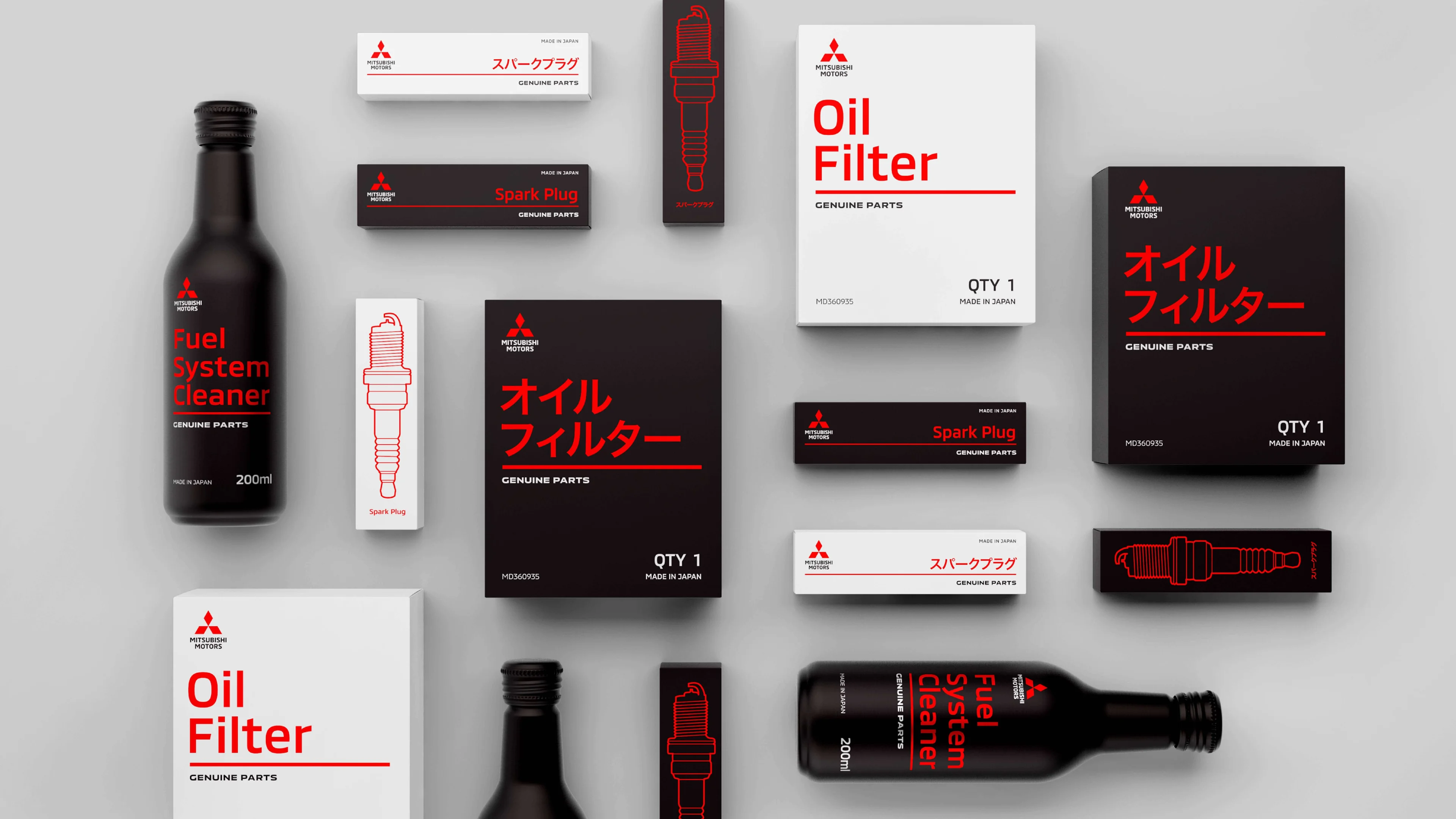
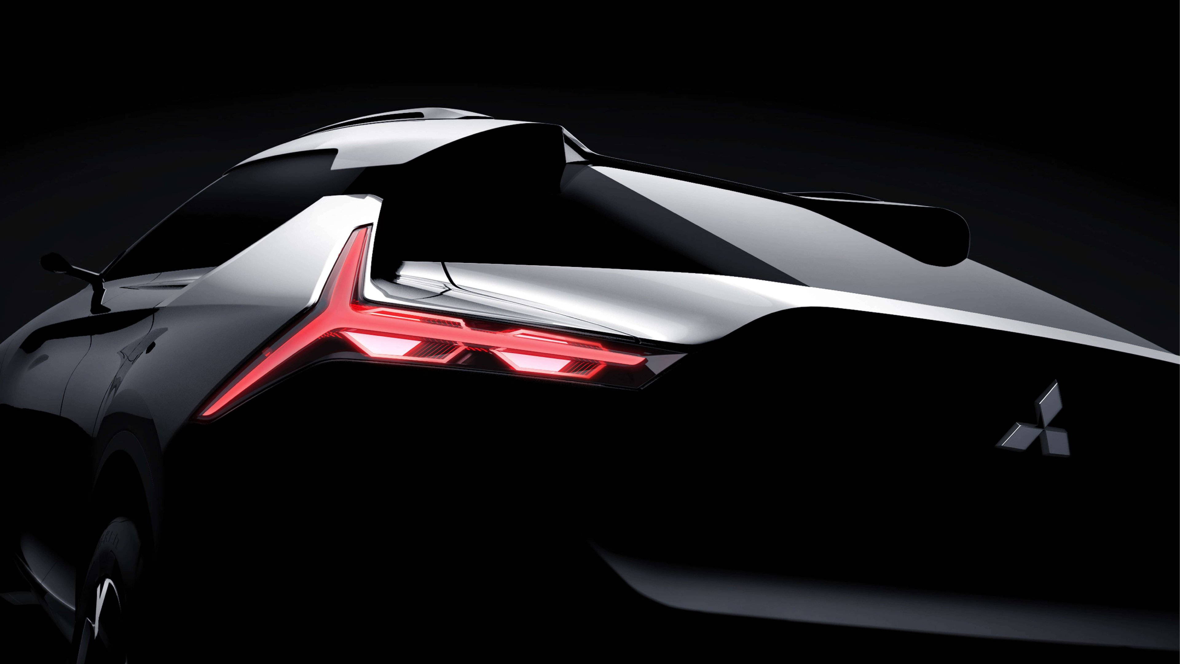
Mitsubishi Motors’ design philosophy underscores its commitment to cutting-edge vehicles. Tasked with developing a global brand identity, we collaborated closely with Mitsubishi’s design team, creating a holistic solution that included defining the brand story, crafting a compelling narrative, devising a visual identity, and designing a bespoke typeface. The resulting revitalised brand reflects Mitsubishi’s dedication to innovation and dynamism in the evolving mobility industry.
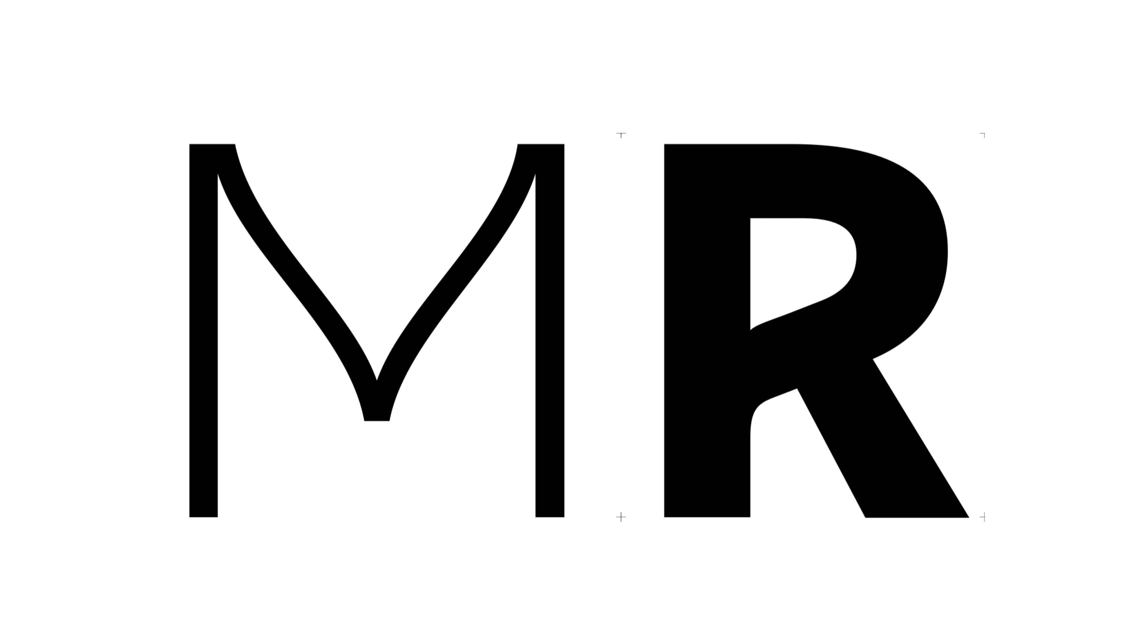
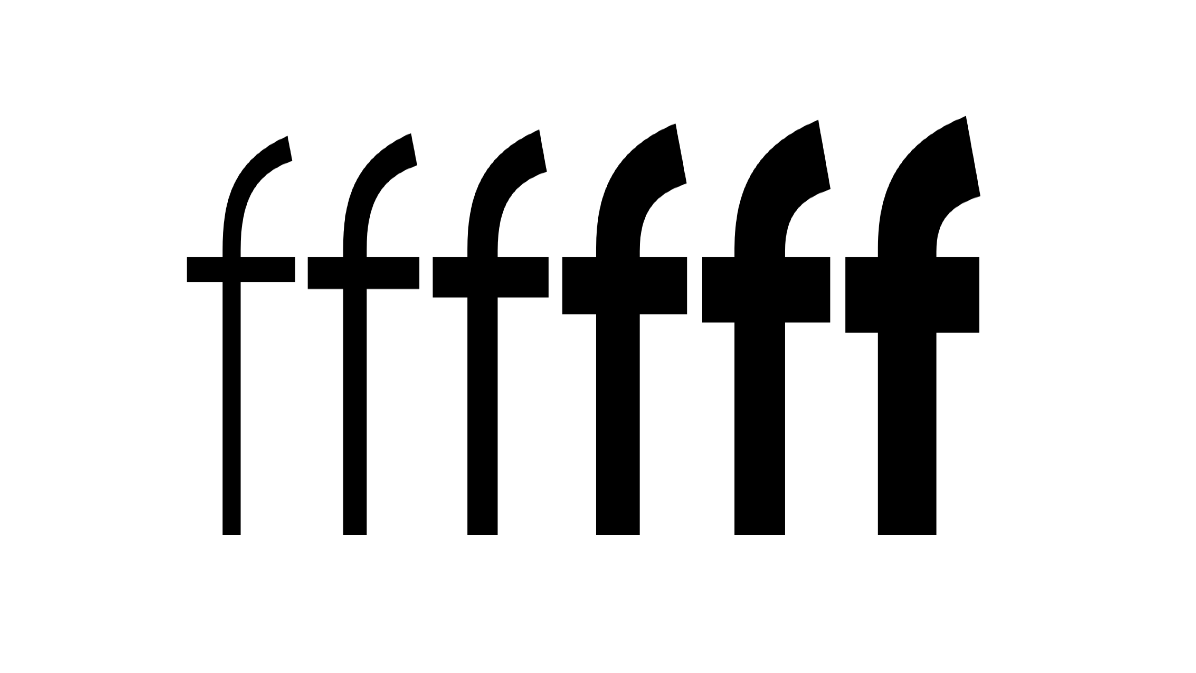
Inspired by the brand’s iconic logo and vehicles, the Mitsubishi Motors typeface embodies the same robust proportions as their cars and dynamic cuts in the logo, as depicted in the draft-carousel below. The bespoke typeface adds to the creation of a supercharged brand identity – symbolising Mitsubishi’s commitment to embracing new possibilities in transportation.
Controls space
Controls space
Controls space
![]() /
/ ![]()
When opposites meet
Tasaki and Mitsubishi Motors explore the different nuances of form and feeling. Tasaki strikes an elegant balance with soft brushes and lean curves, while Mitsubishi Motors’ firm typeface embodies a commitment to delivering cutting-edge vehicles. These contrasting elements showcase the rich diversity within the art of type design.
Learn more about the case
A global rebrand to take Mitsubishi Motors into the future