The talent of encouraging others to GIVE UP
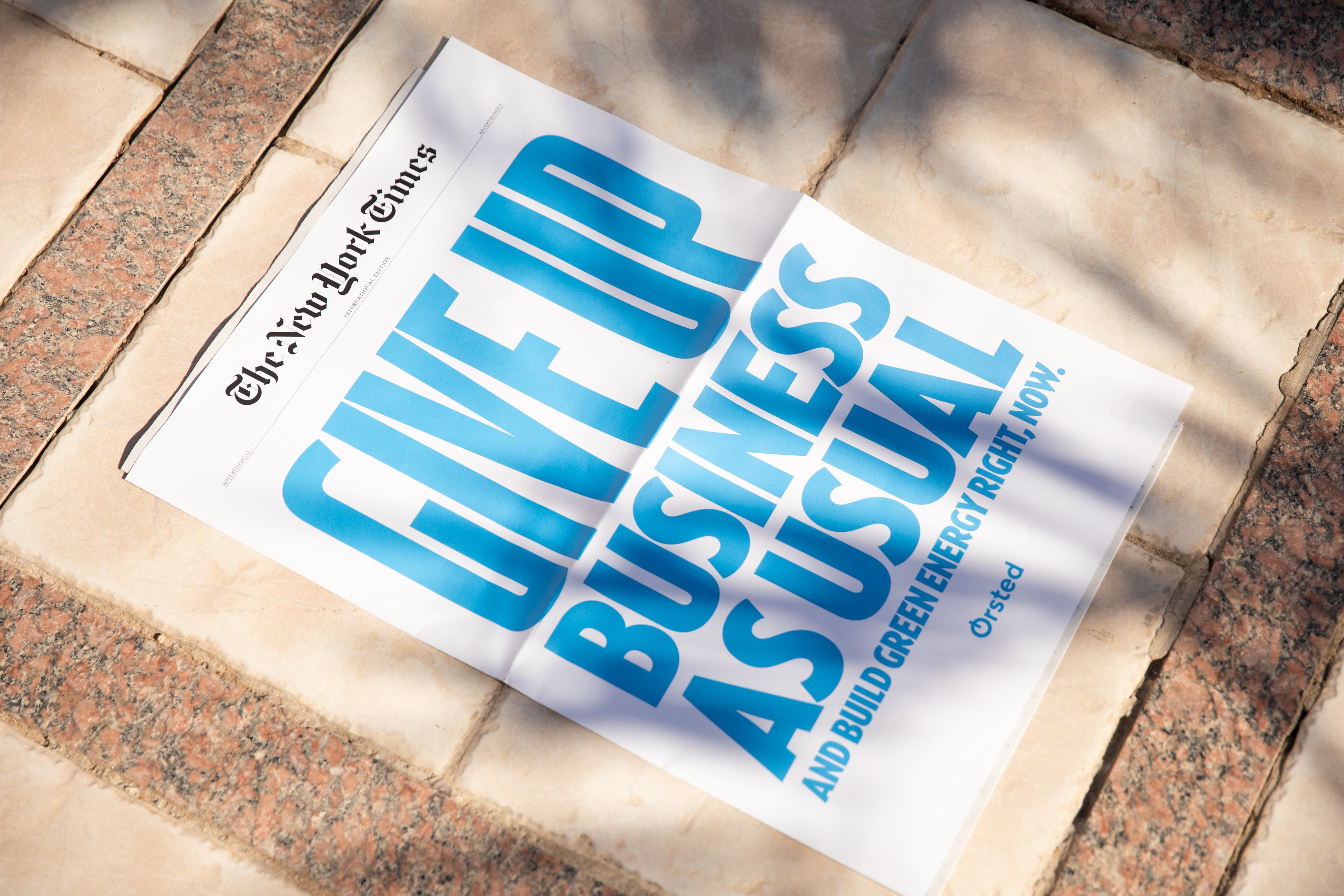
GIVE UP written in big letters followed by the statement: BUSINESS AS USUAL.
It’s blue, it’s bold, and it’s ballsy. Ørsted's take on a New York Times cover for this year’s COP27 is precisely that. Their in-house branding team has twisted the usual brand, crafting the encouraging message fit for the cover. We’re delighted to show how Kontrapunkt met the vision by putting our best type competencies into play — adding just the right amount of boldness to the vital message.
“
It’s never been more clear that it is actually possible to create a world that runs entirely on green energy. And it is the right time to change our brand to demonstrate that we want to help create such a world.
Henrik Poulsen
2017 (Former CEO at Ørsted, 2012–2020)
Breaking boundaries
In 2017 Ørsted positioned itself as a global energy company going green. Kontrapunkt went along on that journey and assisted Ørsted in breaking the boundaries of the traditional energy sector. The result was a bold brand redefining what it means to scope a new direction towards more sustainable energy.
In other words, Ørsted gave up on business as usual. A transition Ørsted firmly reminded everyone at this year’s COP27. Not only one but 5.000 times, on The New York Times cover.
The cover proves that change is possible — even for international corporations within the energy sector. The cover demonstrates how brands, in general, should strive to position themselves as inventive and optimistic. The potential for going beyond “the usual” is very much present, especially if the foundation is flexible and solid. In our humble opinion, this is the case with the 2017 rebrand of Ørsted.
An organic typeface
Ørsted’s bespoke brand typeface is inspired by early 20th-century modernist typefaces. It is geometric and approachable, with curly details and shapes inspired by wind. During its five years on earth, the typeface has become a core brand tool and Ørsted’s loyal companion present from the Ørsted logo on the windmills to the app on your smartphone.
For the COP27 New York Times cover, we transformed the Ørsted font into an activistic and impactful typographic front page tool — simply by adding a condensed weight to the Ørsted typeface family — in a style that resembles the Ørsted typeface.
Rubber band brand
The Ørsted brand and typeface are great examples of how well-designed brands work as rubber bands. It can be moulded, stretched and pulled together to support a specific story.
In this case, we present you a variation of the Ørsted font. An interpretation which stays true to its origin but has another path to wander. It’s an unusually lovely variation of a recognisable brand, and it’s a witness to how brands and businesses are organic entities that can adjust and diverge from business as usual.
Photo credit: Craig Gibson / The New York Times