Work
09.02.2024
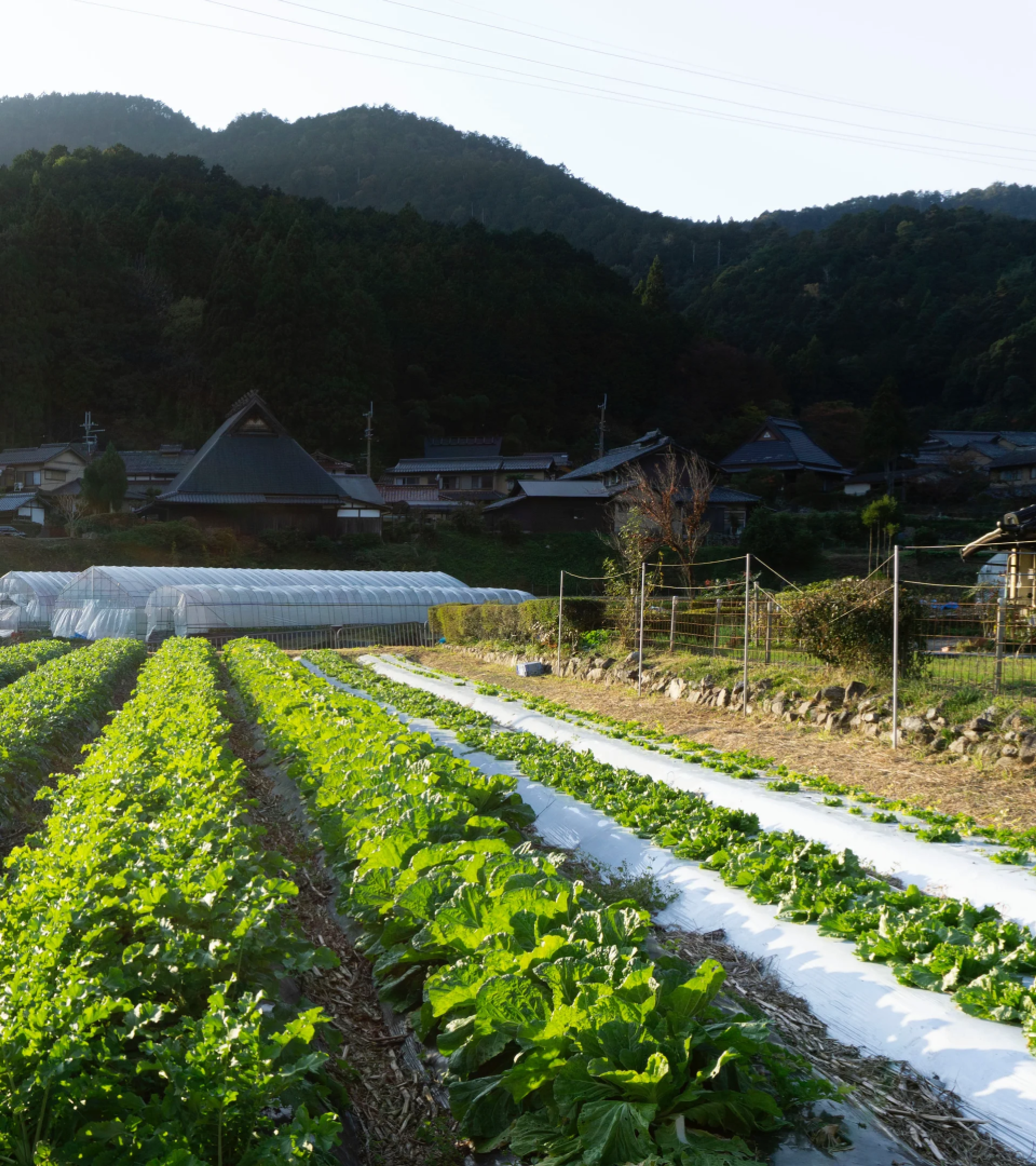
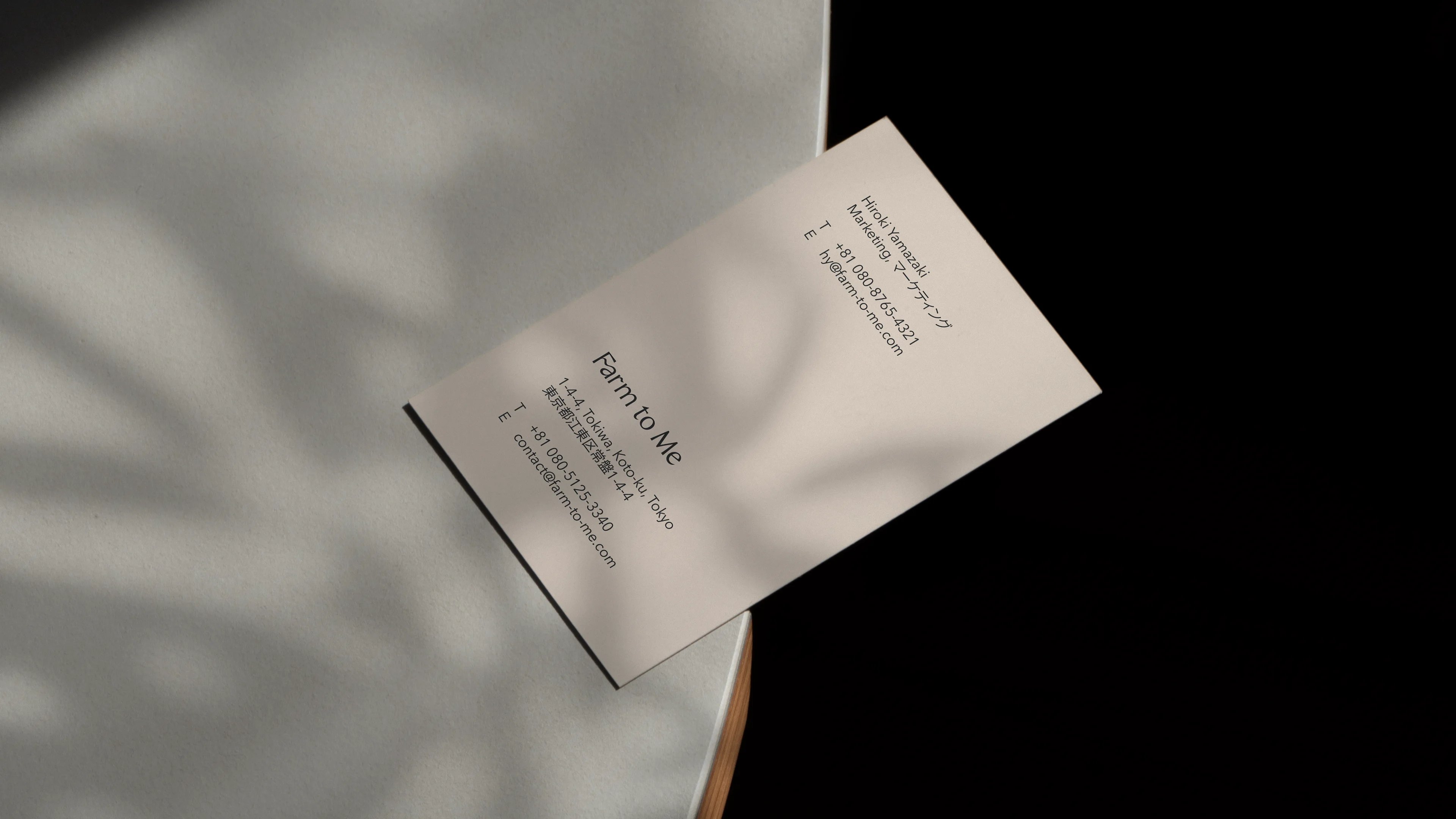
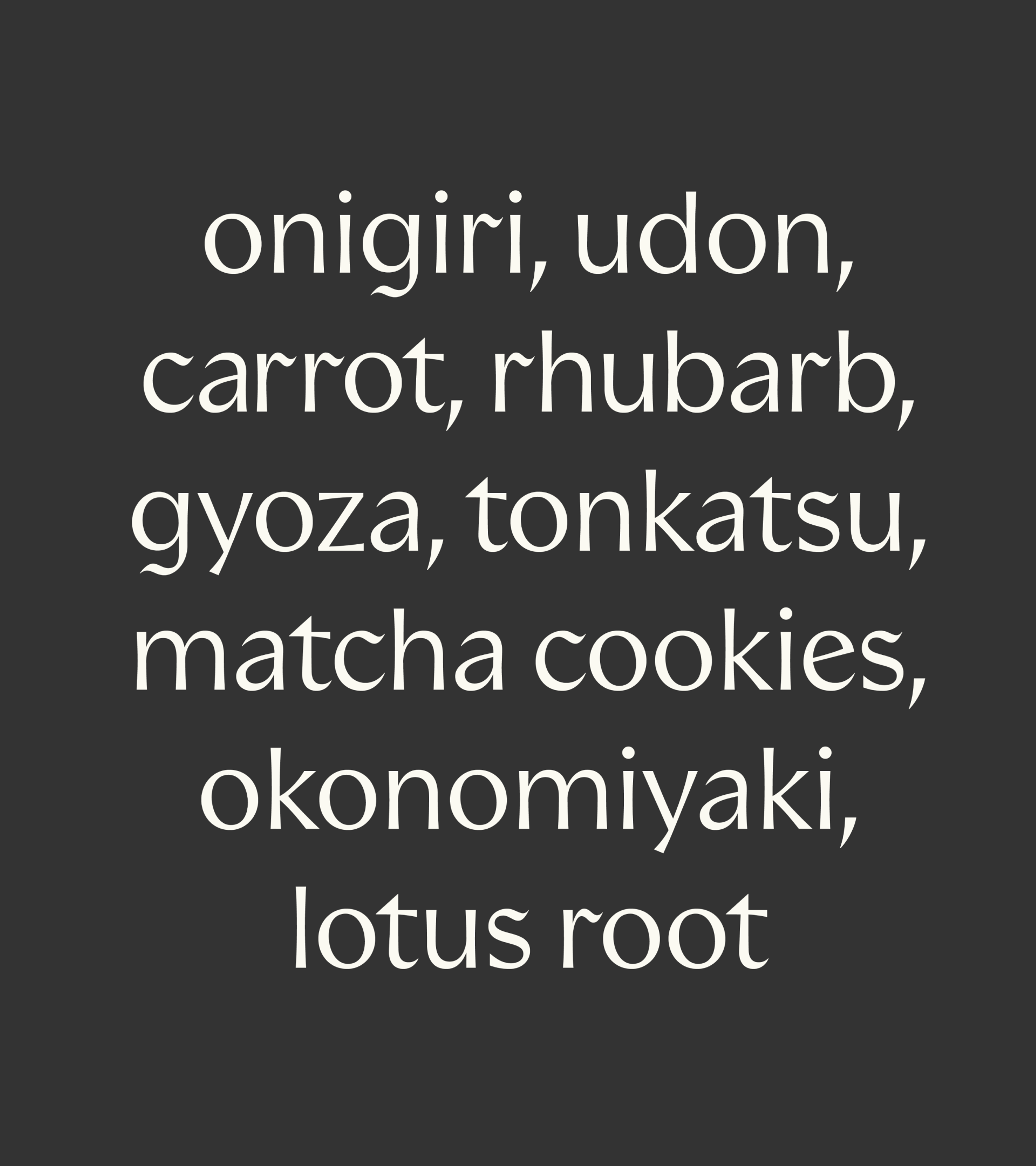
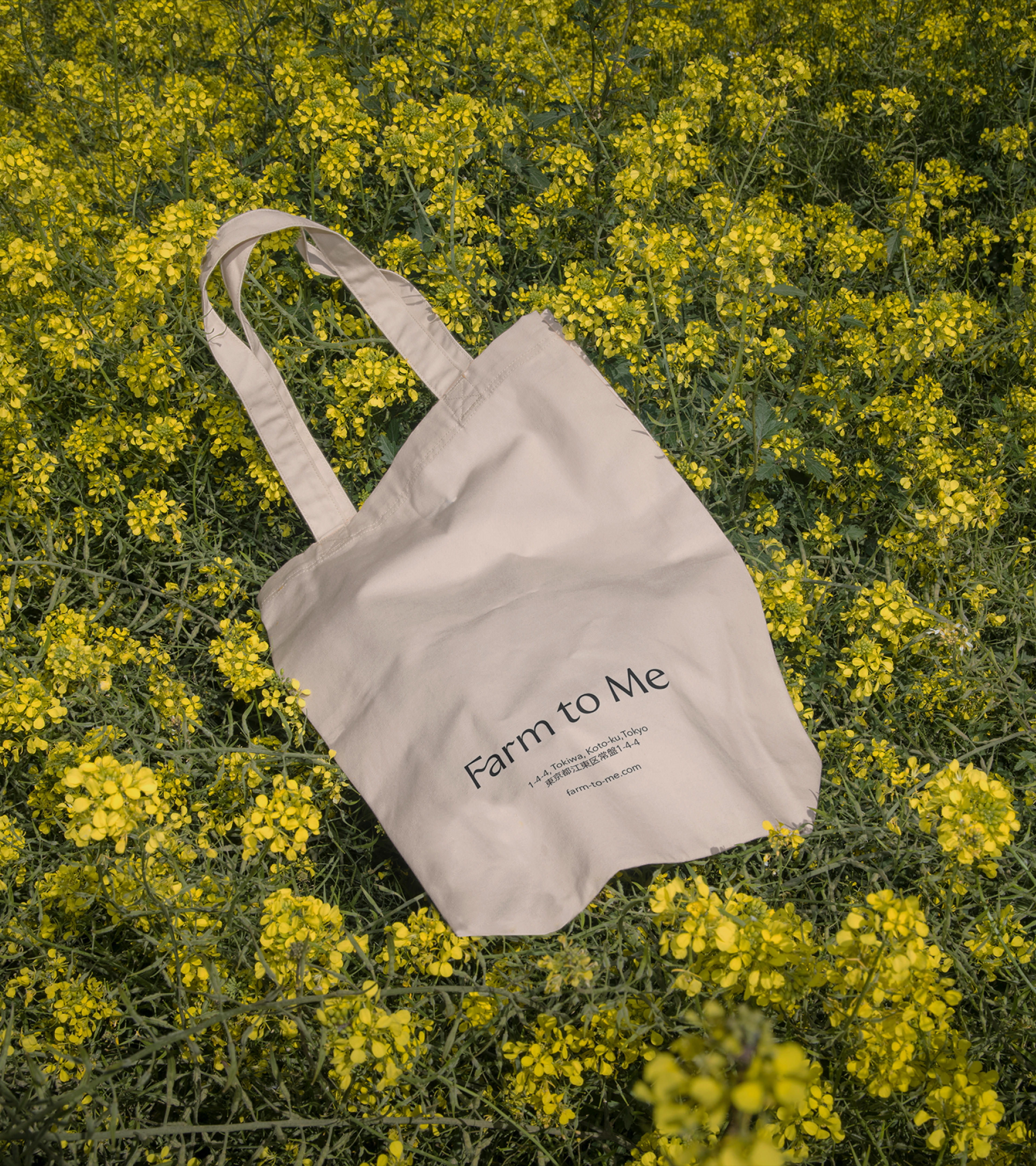
Soil to sans-serif
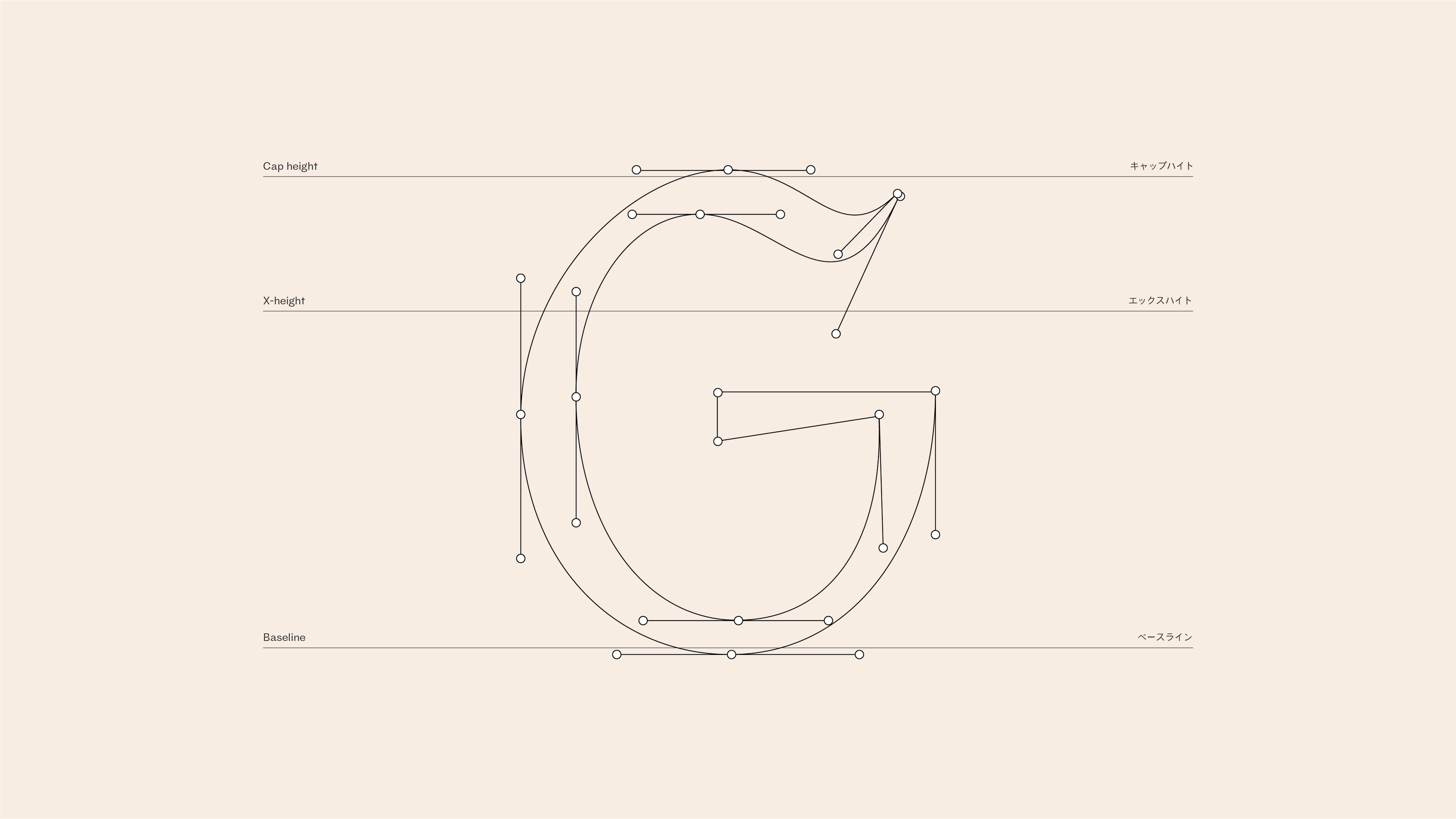
New year, new letters. This week’s highlight from our Type team is an embodiment of refined simplicity, drawing inspiration from nature’s gentle curves.
“
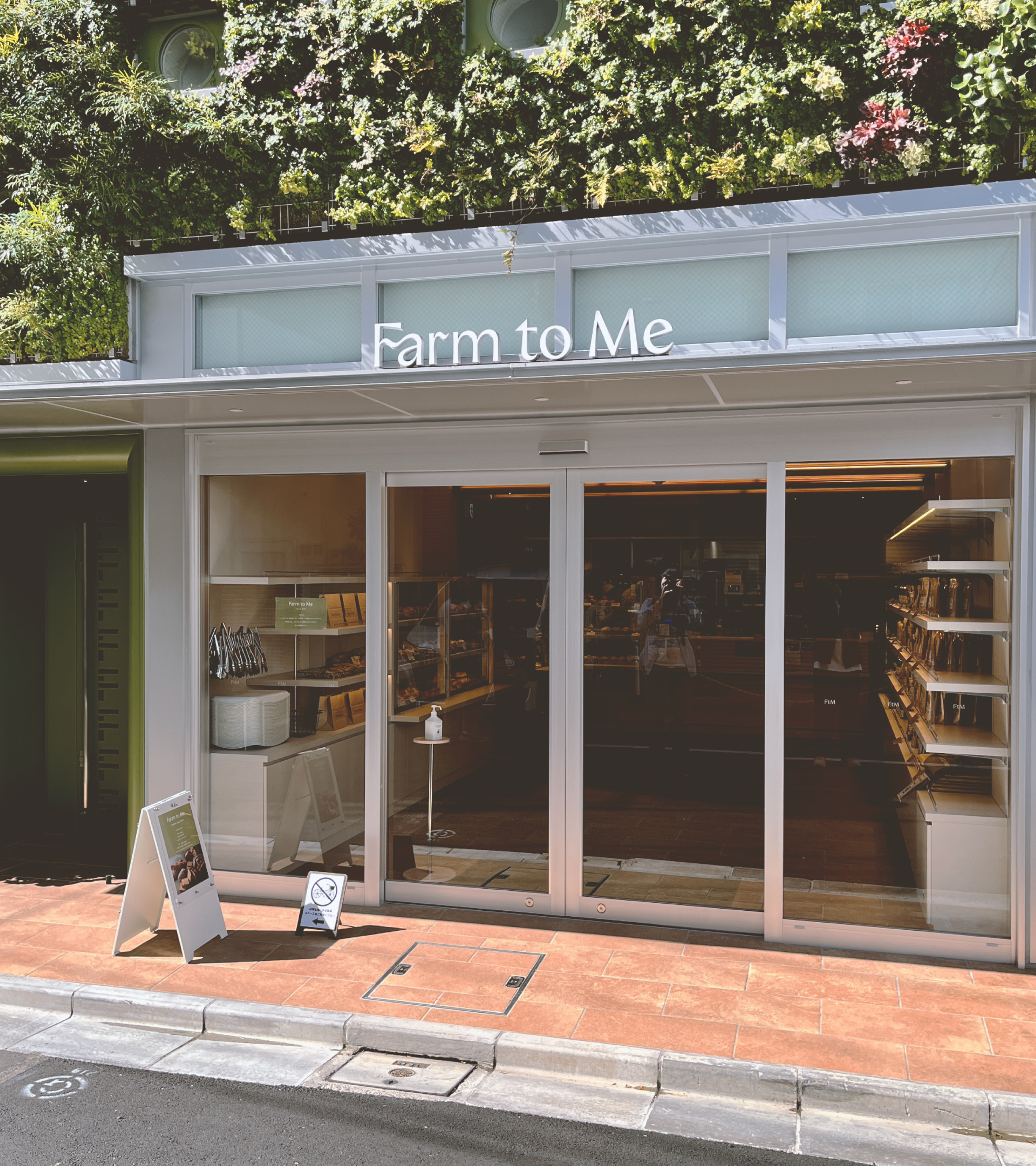
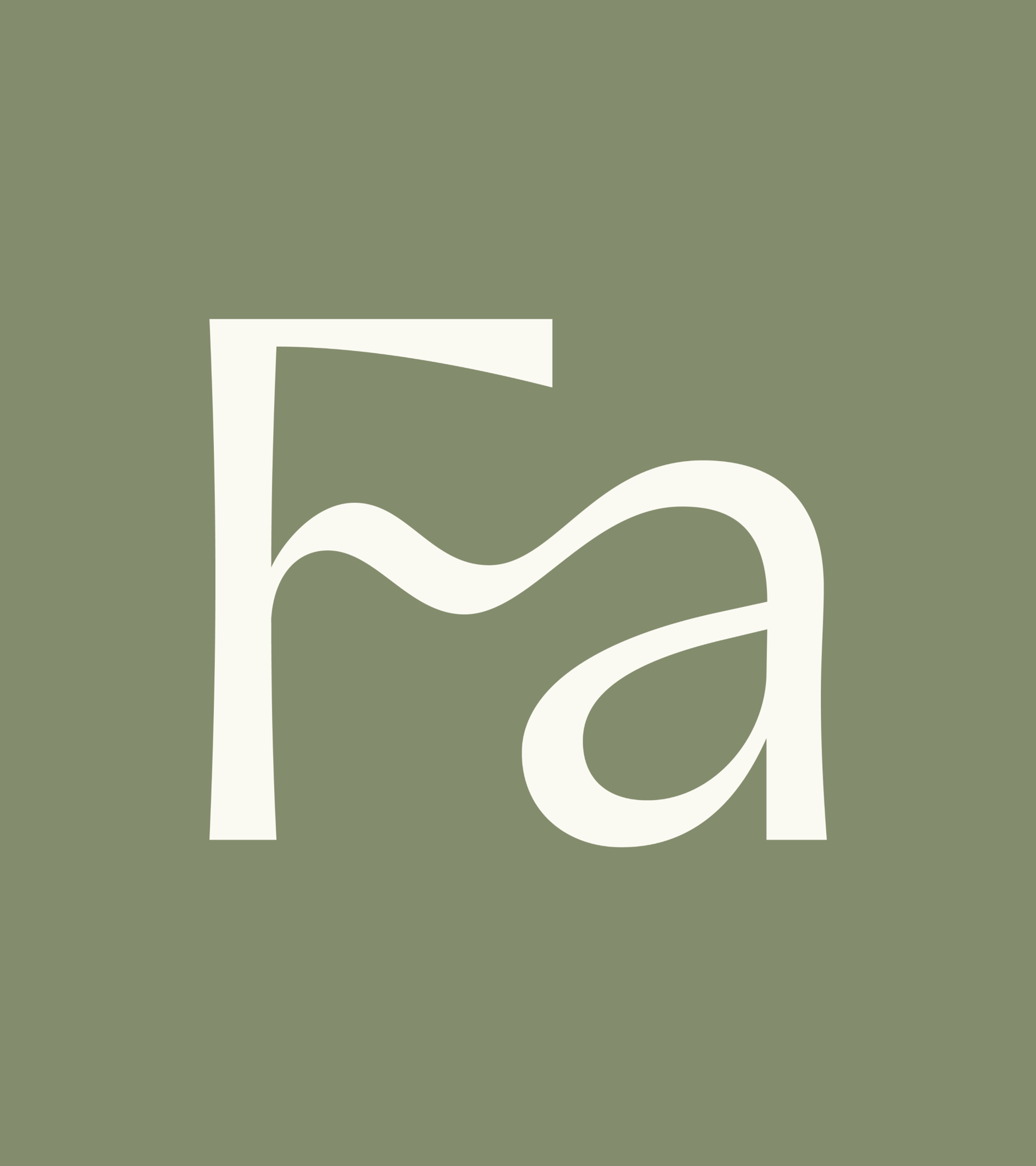
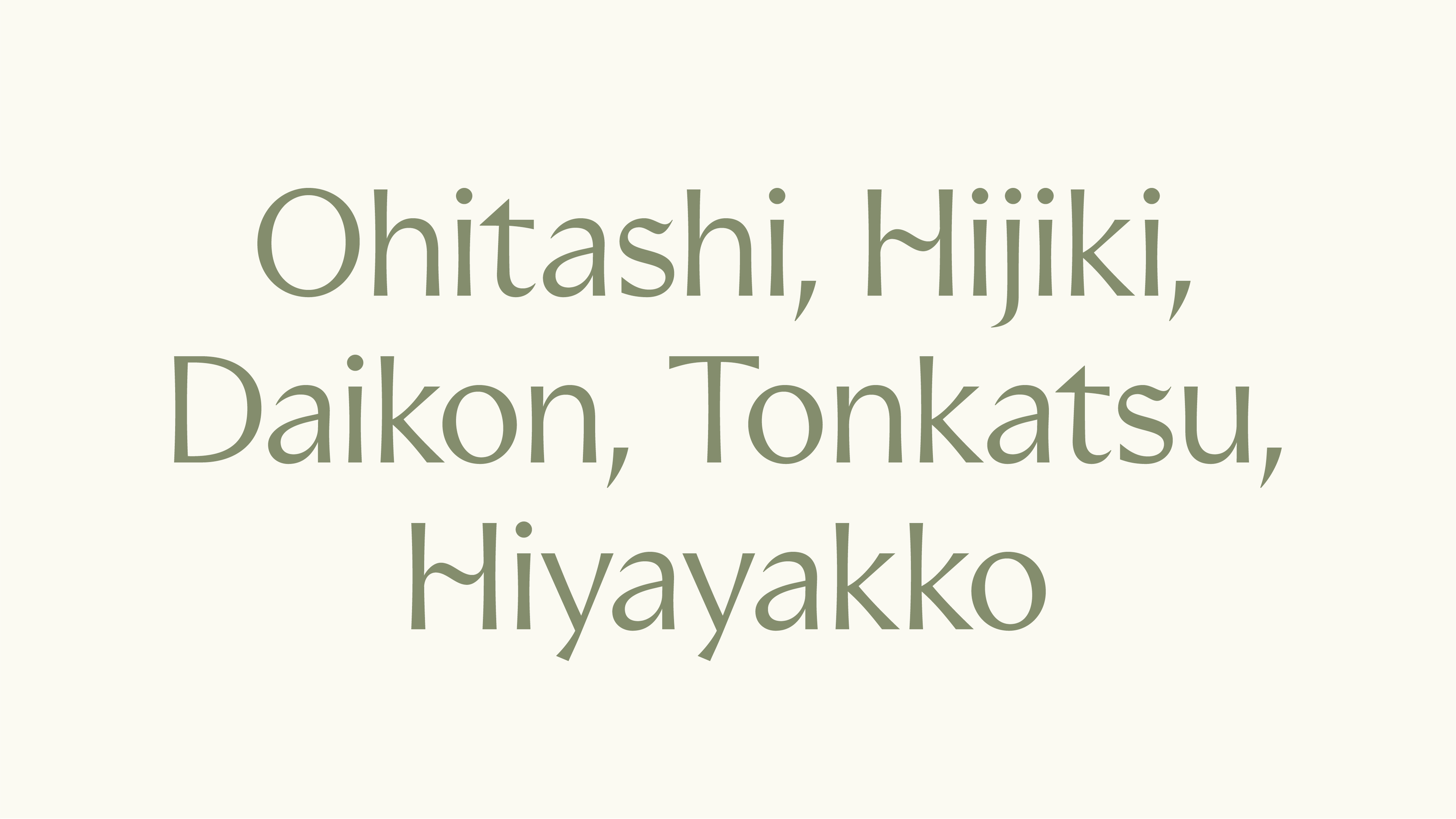
The Farm to Me typeface embodies their commitment to bringing together our earth’s raw simplicity and a refined touch of human culture. Organic, flowing pen strokes and unexpected ligatures against a high-contrast, delicate sans-serif. No stem or stroke is a straight line; they are all tapered and carry a subtle curvature — just like the rhythms and lines of our natural world. Every written word feels as down-to-earth, elegant and inviting as the goods they offer.
Rasmus Michaëlis, Head of Type Design & Partner